I first drafted this post in September or October, 2022. But I’ve only now finally gone back to and finished it!
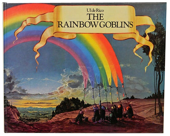
If I’m honest this isn’t my normal mug o’ Java. But I’ve been softened up for it by Masayoshi Takanaka’s wonderful double-album of the same name, that’s both based on the story, and uses Ul de Rico’s art on’t the packaging.
I love this!
Sometimes getting an entry into something this way – so, the fabulous Takanaka album predisposes me to being more receptive to the artwork/story that inspired it – widens one’s aesthetics. If I’d only seen the book, I might’ve rejected it out of hand.
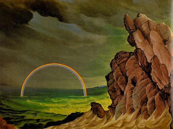
Pretty amazing, eh!?
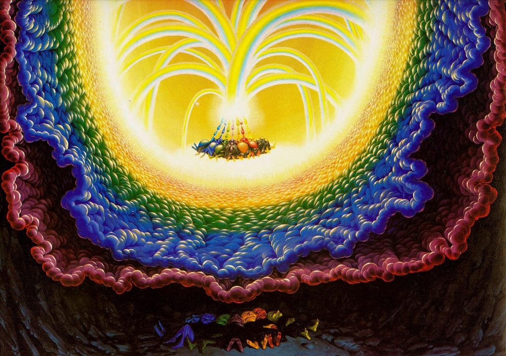
Some of the artworks, such as the one that adorns Masayoshi’s album cover, or the one directly above this paragraph, really do draw me in, and seduce me. Others, like the one directly below, I’ve grown to love.
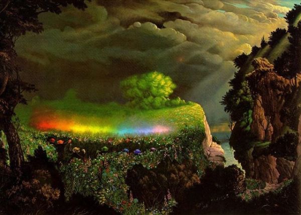
And this in turn leads me to dig stuff like this:
The rainbow goblins’ dream. Far out!
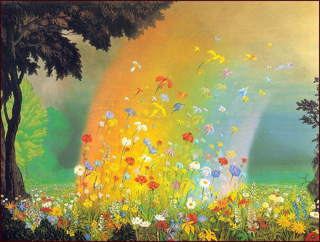
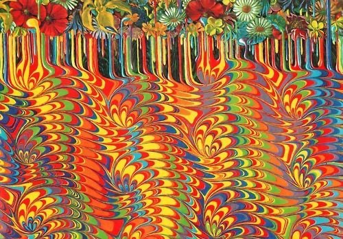
And in the end I’m won over, and full of admiration for the simple charms of the story, and the intensity of the artworks. How about this for endpapers:
Flowers melt into a marbled ink pattern.
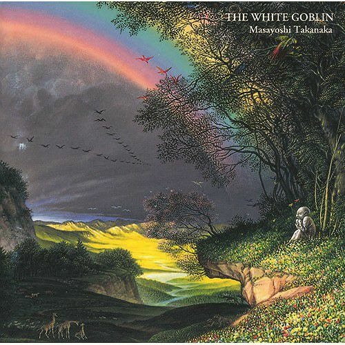
Ul de Rico did a follow up, called The White Goblin. And Masayoshi Takanaka followed suit! I’m listening to the latter right now. I’m not as immediately smitten by it as I was by his Rainbow Goblins project. It’s a bit more mainstream rock/pop.
The saga continues!
But, truth be told, I feel myself being sucked in and won over. Seduced ever further from my own usual aesthetics. In the end, it feels to me as if I’m relaxing and letting Ul de Rico and Masayoshi Takanaka take me, one by each hand, into their visual and sonic worlds.
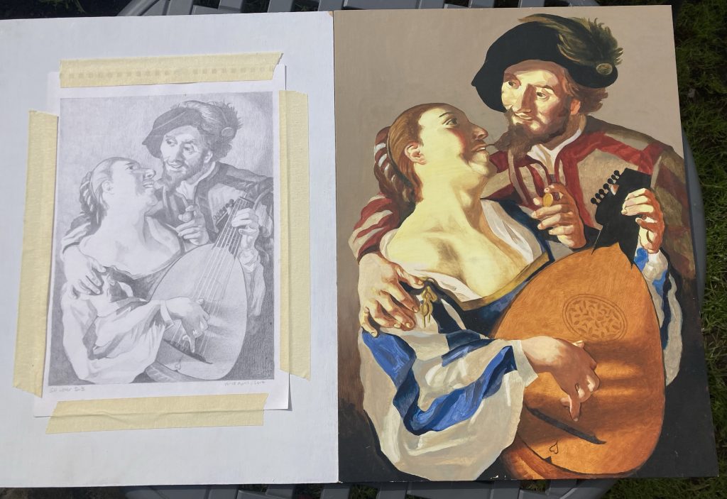
When I found these two art works recently, whilst putting yet more stuff into our attic, I brought them down, to have a fresh look at ‘em. And I’m pleased with how they look.
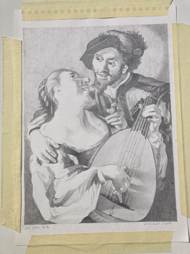
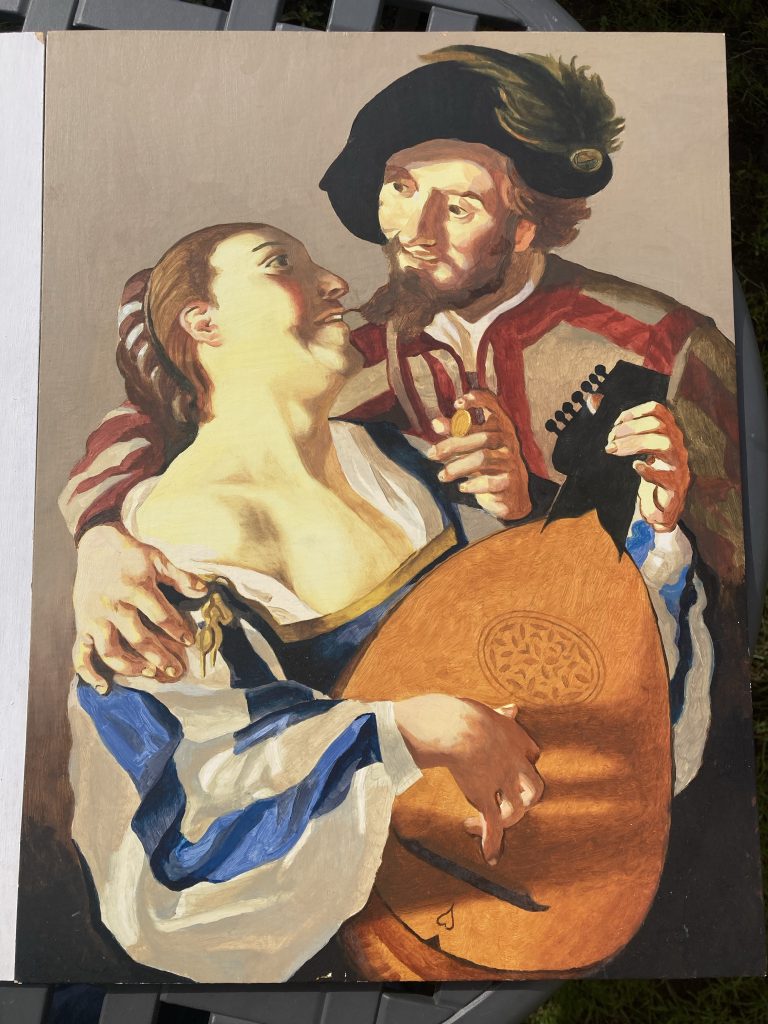
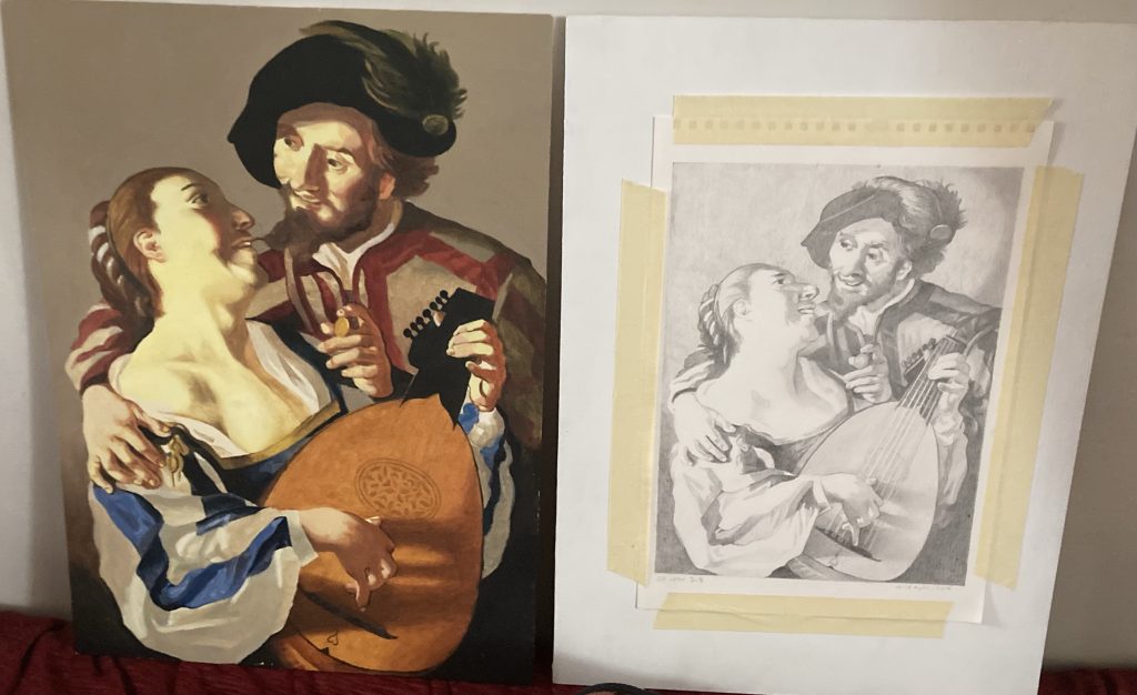
The pencil drawing was my first look at reproducing Dirck van Baburen’s The Procuress. I actually chose to leave the Procuress herself out of the picture, which also changed the overall format of the piece (from off square to a portrait type rectangle). Instead we have just the young dandy and his lute-plucking lady.
A terrific book! And the source of this project.
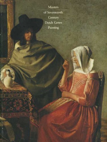
I found van Baburen’s The Procuress in this rather lovely book. It’s an old’un, but a good’un! My mum had a copy back when’s he did her degree. I think I’ve posted about this book here before? But I’ve not found that post, so can’t link to it yet!
16-18th, April, 2014.
Here they are individually, for a bit of a closer look. The pencil drawing is finished. But the oil stalled before completion. So I need to finish that off.
These two pieces are both for sale, should anyone want either. The pencil drawing for £89, and the oil painting for £239. That’s unframed. I can frame them as well, if required. Or a buyer could do it themselves.
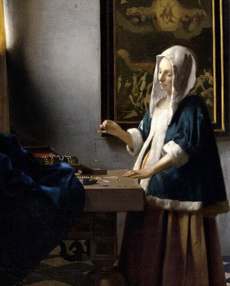
Woman Holding Scales, Vermeer, 1664.
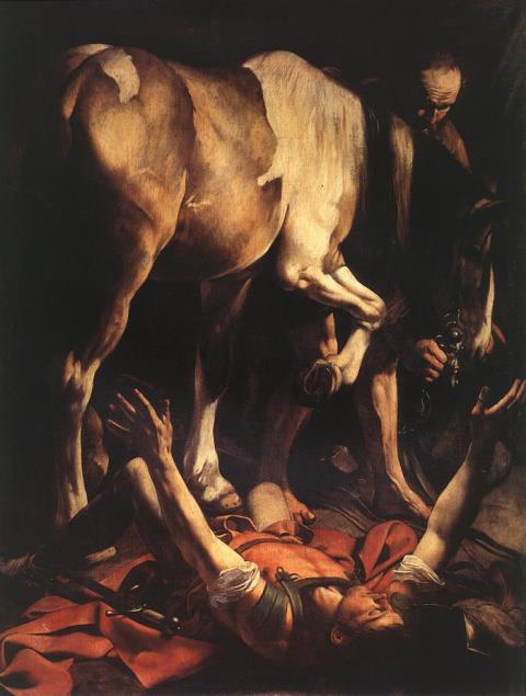
I’m planning to do more in this line, as I enjoy it, and it teaches me a lot. I have a few favourite paintings I’ve long wanted to reproduce, such as Vermeer’s Woman Holding Balance, and Caravaggio’s very theatrical St Paul.
Caravaggio’s dramatic vision of St Paul.Together again. Indoors this time.
The first three pics of my efforts, further up this post, were taken outside in the sunshine. These last were shot indoors. But all the pics in this (and almost all my blog posts) are taken on my iPhone. So, hardly pro/ideal! But hopefully they get the idea across?
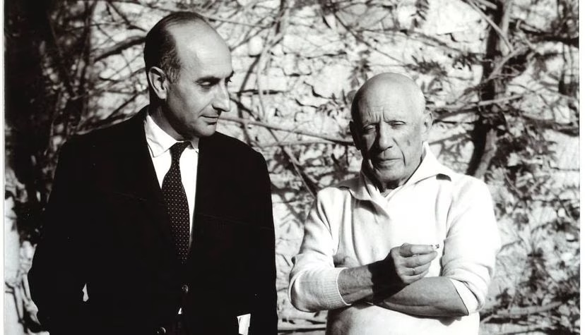
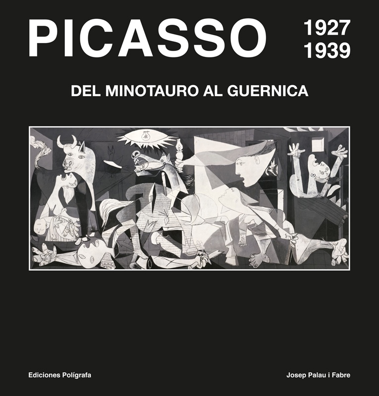
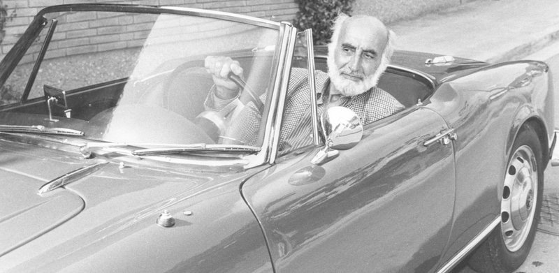
I posted about this dude and his passion for Picasso quite a while ago (read that here if interested). And I find myself wanting to post about this pairing again.
Here they are together.
As per my previous post, I have three of the four ‘whoppers’ i Fabre published. And I really want to get hold of any more there might be. I’m aware of just one more, as things stand. Which, alas, seems both rarer, and consequently more expensive.
This is one version of the book I don’t yet have.
I’ve learned, thanks to my search for the cheapest way to buy this book, that it can be bought brand new, for €150! From Poligrafa, the Spanish publishers responsible for all these fabulous books. And in English (or Catalan!), as well as Spanish.
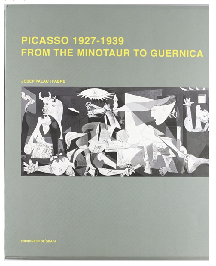
Here’s another edition.
Second-hand editions of this title are all more expensive. But sadly anything at all, let alone say £20-30 (roughly what I paid for the third volume in this series), is way too expensive for me right now.
I exchanged some emails with a chap called Carlos at Poligrafa today, thereby learning of the newer/cheaper buying option. But thanks to me not speaking Spanish, or quite following all his English, I’m none the wiser as to whether any more posthumous (to i Fabre’s passing, that is) volumes are in the pipeline.
Looking exceedingly cool!Nice wheels, Josep! What a dude.
Exciting news! I’ve located a decent looking copy of the 27-39 Minotaur to Guernica book, in the UK. It’s expensive, but affordable. Just. I might see if I can buy it today… (Feb, 17th, 2015)
Today I’m mostly confined to bed. By my own decree. Teresa’s at work. And I am on Easter break. Although it may be a bigger hiatus? That’s partly why I’m in bed!
I woke when Teresa got up, at 5.30am (mad!). But most of the time between about 9am and 3pm I’ve been in a 50/50 mix of resting/dozing, and outright sleeping. Snooker, with Kieran Wilson thrashing Ali Carter, on the Tour Championship, is helping on all fronts with rest and sleep!
An ornery mule, with an artist’s soul.
But around 2pm, after a second long chat with the alphabet soup brigade (the bouillabaisse of acronyms for mental-health organisations), I felt I needed an injection of culture and inspiration. So I hoyked a few art books off the shelves.
Angst meets beauty, in mixed media on canvas.
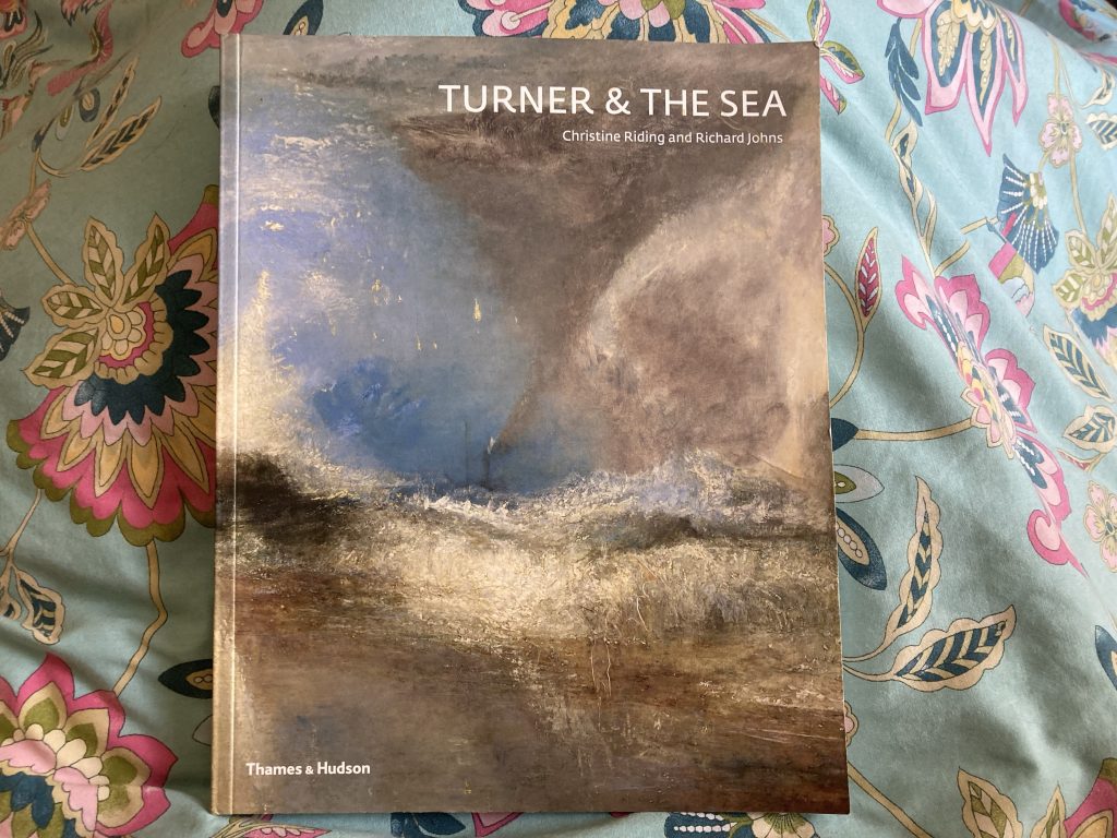
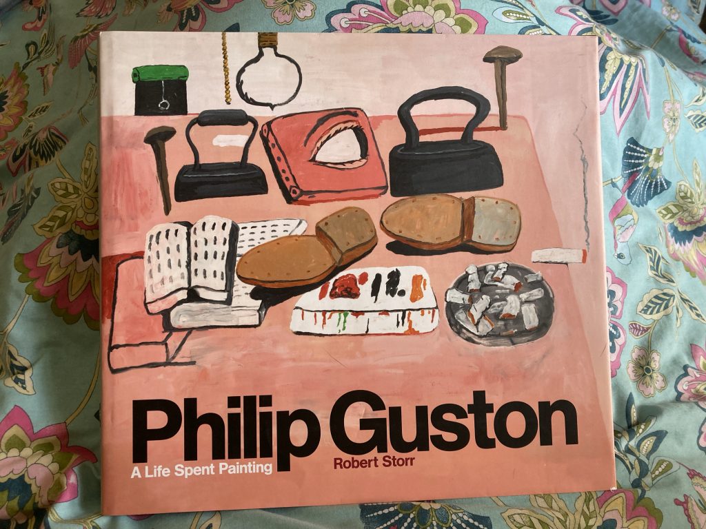
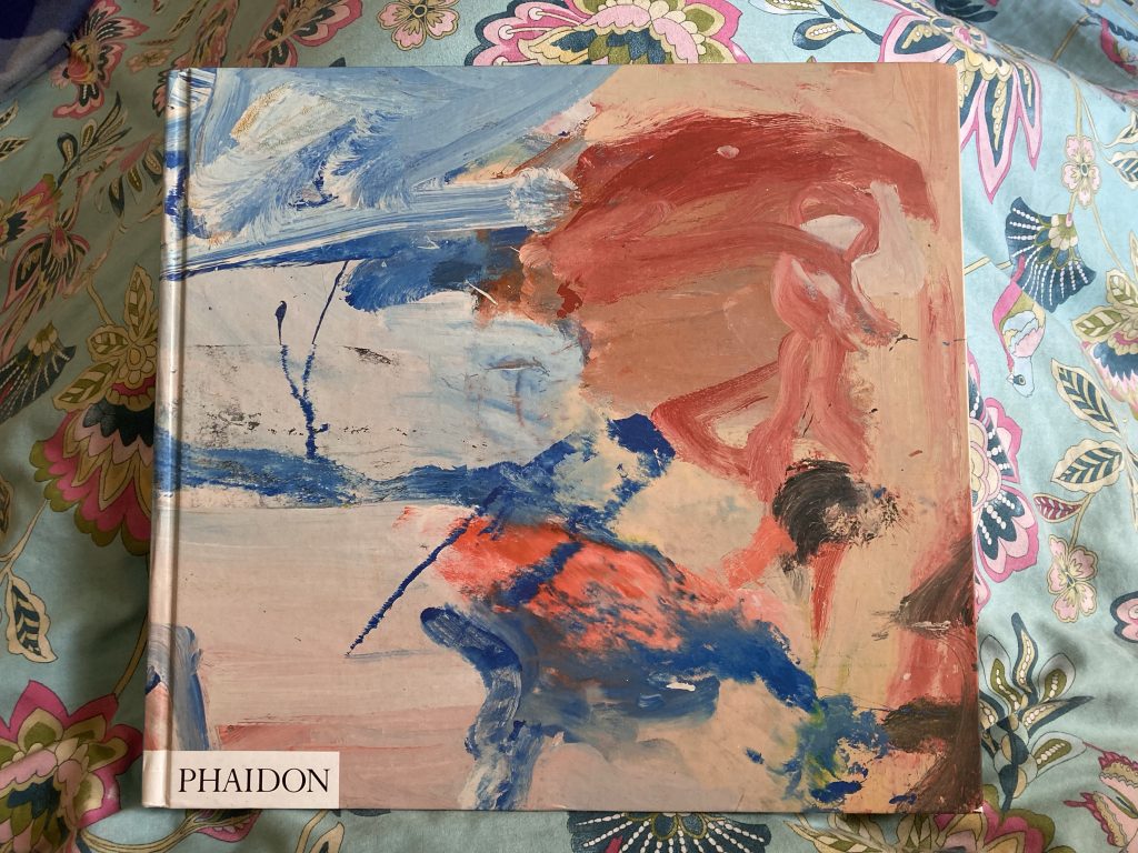
Having resumed a long derelict interest in making art, I thought I’d also resume the act of feeding on the soul food that art can be. Hence getting these tomes offa the shelves. Turner and The Sea, Guston, and de Kooning. Endless hours of fun and nourishment!
Not so eyebrow, n’est ce pas!?
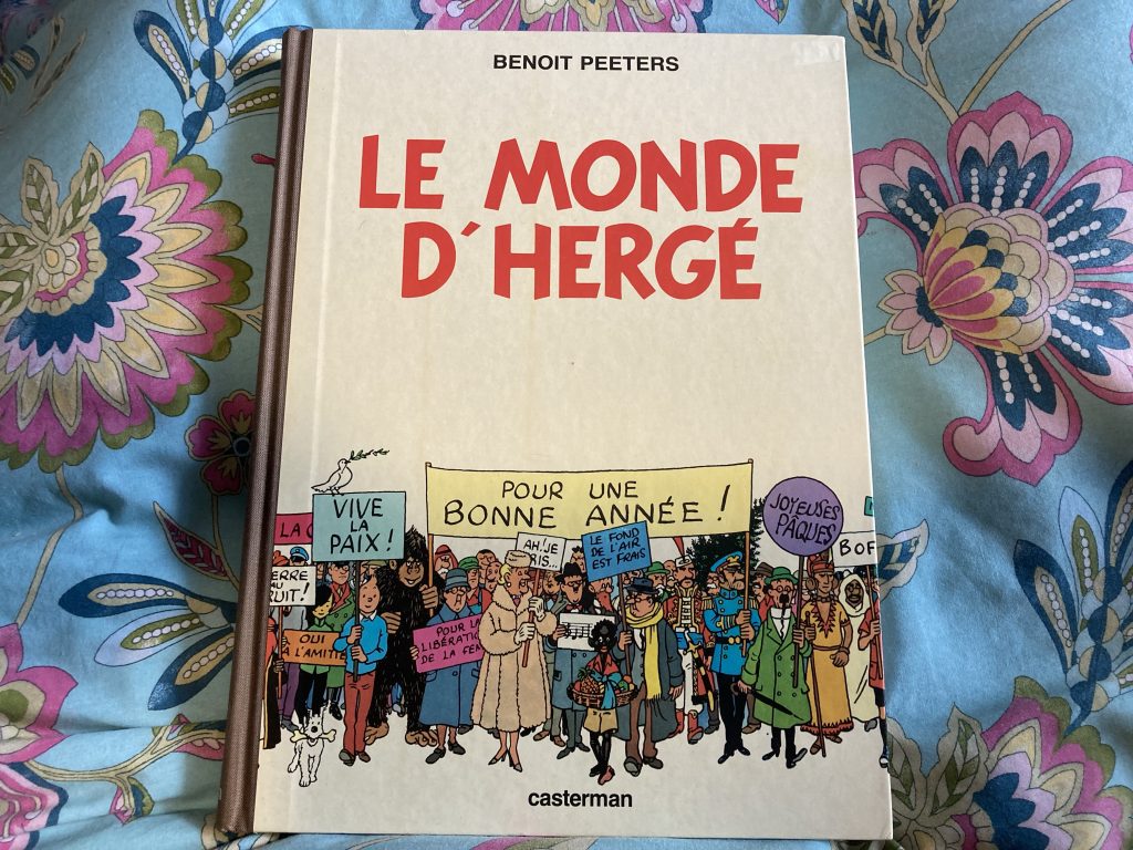
And to keep my furrowed brows at the correct elevation, something a bit ‘Felix’ lighter!
No-brow? Love the Tintin style cover!
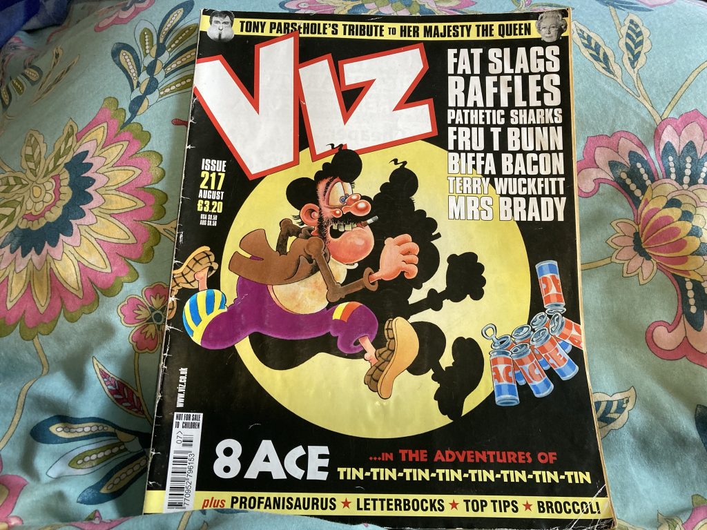
And of course, Viz. Thanks to the Viz Team I nearly died laughing last night.
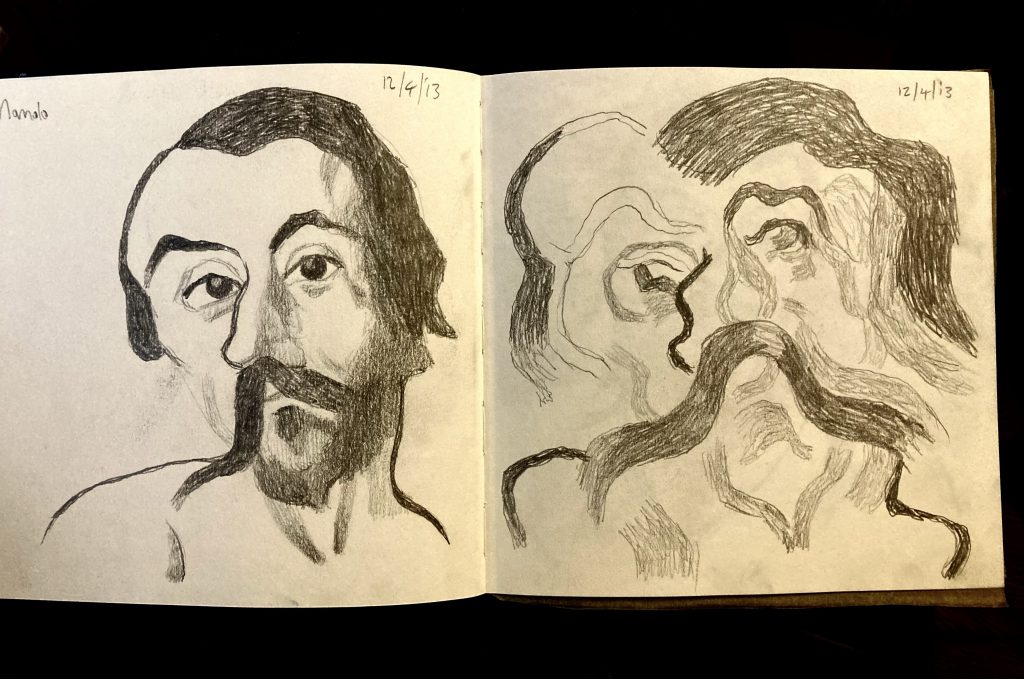
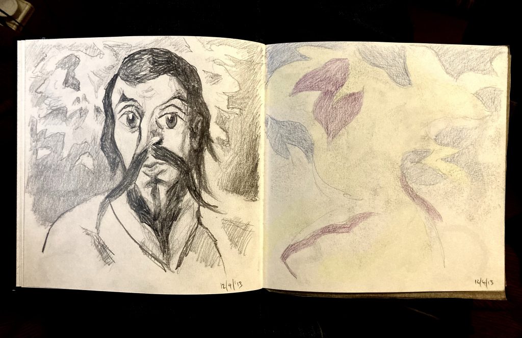
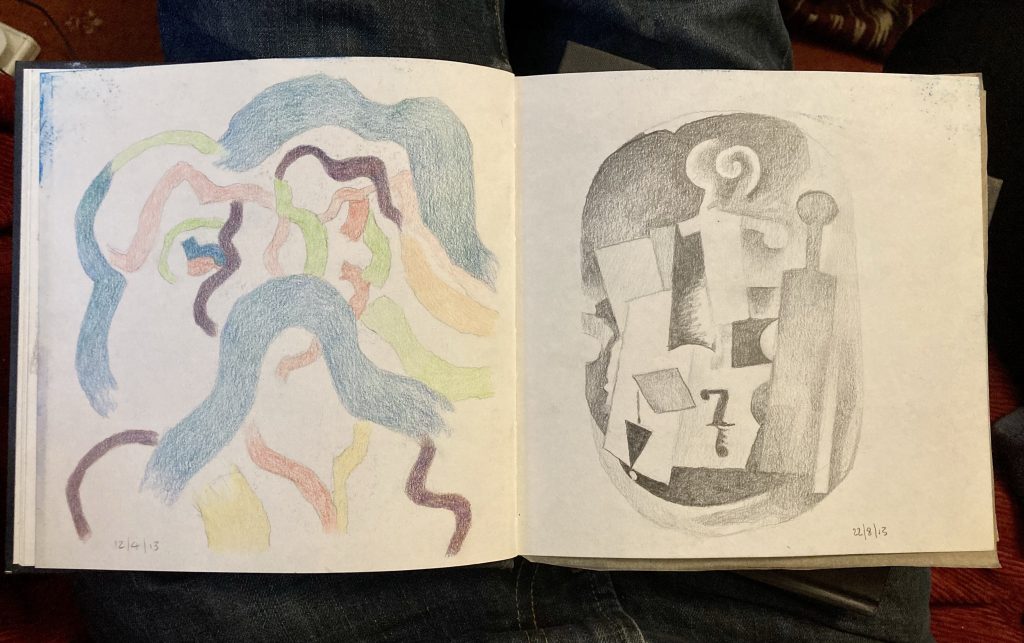
Without checking back, I think this little series of sketches, again from a decade ago, started with looking at an El Greco painting.
He distorted his subjects a fair bit, in a series of ever more stylised manners, as his style evolved. Taking his distortions as a starting point, I have, from the get go, been distorting further.
Manolo, Spread #2.
In the second spread, at left, I went back to the source again, but this time with a slightly more cartoonish feel. The one on the right is devoted solely to the background, in particular the cloudy sky; extrapolating shapes and colours. The yellow in this image is lost a bit in the photograph.
Manolo, Spread #3.
The third spread combines further abstraction of ‘Manolo’, at left, and an homage to (or poss’ even a straight copy of) either Picasso or Braque. Picasso’s my main man. Braque much less so. Though having said that, I do like the latter’s work. Just not as much as Picasso’s!
My sister Abbie and her husband Dan have commissioned me to paint an artwork for their home. That’s so lovely! Thanks, guys.
I’ve been given some photographic reference. I won’t say what that is, nor will I show it. For me the idea with the abstract side of my work is to work from the real world away, into something more dreamlike, and poetic; evocative yet imprecise, difficult to pin down.
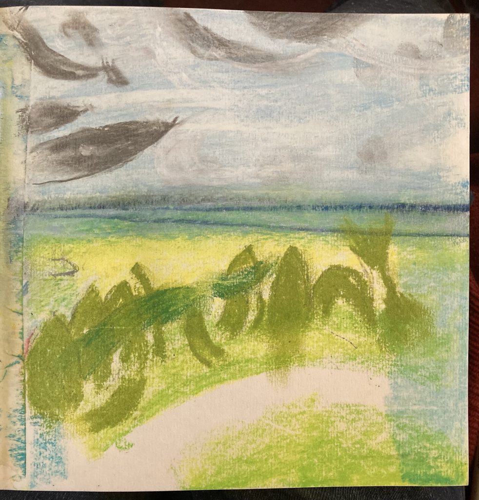
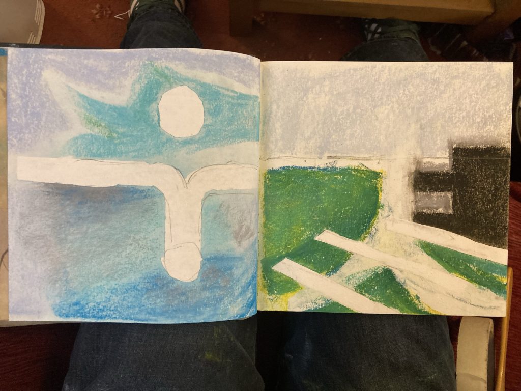
Sketch#2, 1/4/23.
Sketch#1 was a first overall reaction to the photographic image. Whilst a lot is left out, it’s still quite dense and busy. So the next three sketches unpack certain elements.
Sketch#2 catches some of the organic green growth, a very small but visually potent or significant element in the overall scene.
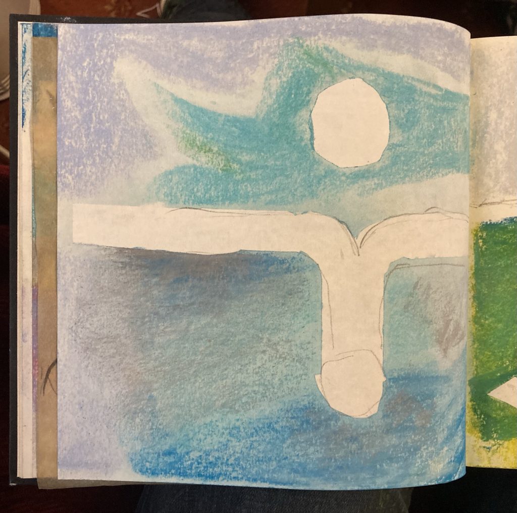
Sketch#3, 1/4/23.
Sketch#3 is the lighter stuff, the air and the water, the sun making strange reflections. This view is probably a second layer, to be rendered over Sketch#4.
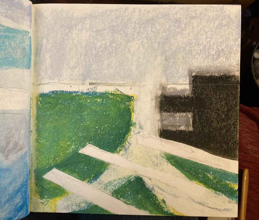
It seems odd in retrospect that I’m ending where one might have thought I should start, with the hard, solid architectural stuff; the landscape itself, and the straight lines of the man-made stuff.
So it is that Sketch#4 might well constitute the basal architecture of this painting? It might be the first layer?
Sketch#4, 1/4/23.
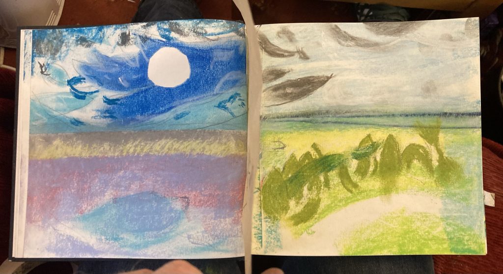
Here are the same four images as two double-spreads…
Sketches #1 and #2 …… and #t3 and #4!
I like seeing these four images together… or should I be saying juxtaposed, for the cognoscenti? They are, after all, derived from the same source.
What might prove tricky – and it ought to be, frankly – is amalgamating (what a word that is!) all these extractions. Can it be done? Should it be done?
Anyway, these sketches are a first draft response to a recent commission. I’m hoping that this process will bring my art practice back to life. It felt good to be sketching again today!
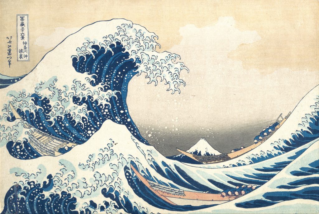
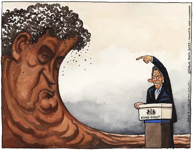
Hokusai’s Wave is a beautiful piece of art. I’m choosing it for today’s post because it represents the tidal wave of sh!t I’m currently facing.
The politics of this obscure it’s personal resonance!
My tip-top favourite political satirist, Steve Bell, has done this great scatalogical reimagining of Hokusai’s masterpiece. The specific topical political baggage with this image – King (Tony) Cnut trying to face down a literal (Gordon) Brown tsunami – somewhat obscures my more generalised reading of it.
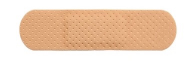
My only defence!
And how am I to stave off this towering wall, this fast-flowing fecal apocalypse? Naturally enough, with naught but a sticking-plaster. A Band-Aid. Well, it does say it’s ‘water-proof’!
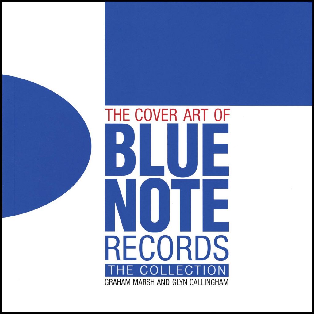
I have a few ‘coffee table’ art books on the subject of jazz record covers. And whilst all of them contain great stuff, none of them quite capture or distil the real magic of the best album covers as I wish they would.
This one’s actually an homage…
I think to do that they’d have to be bigger than LP-sized, and reproduce all the covers at full size. Ideally with room to spare. There’s naught worse than beautiful images that run into the gutter/spine of a book! Well, I admit, there’s a lot that’s worse. But you know what I’m saying.
How can you not love this?
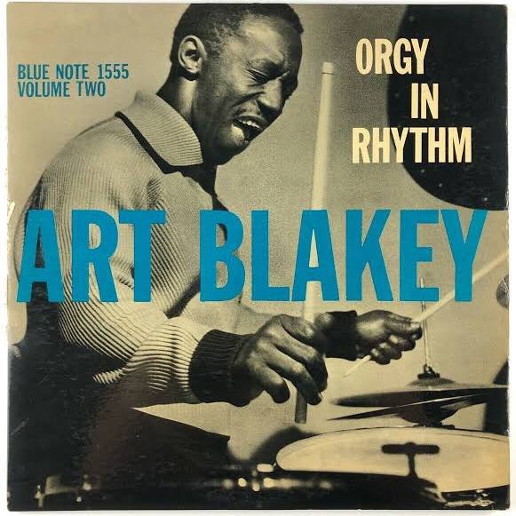
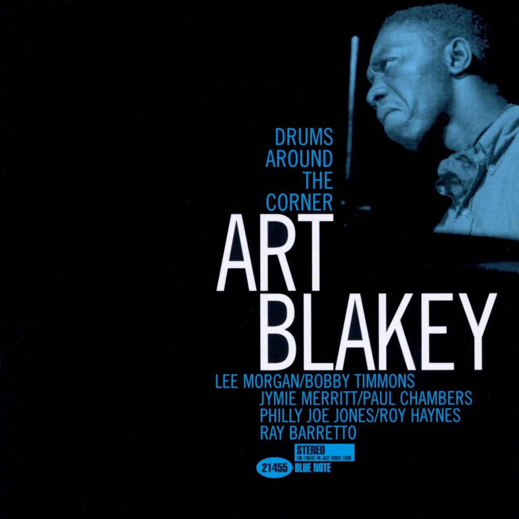
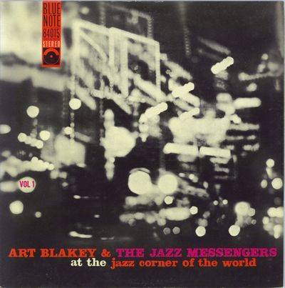
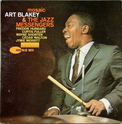
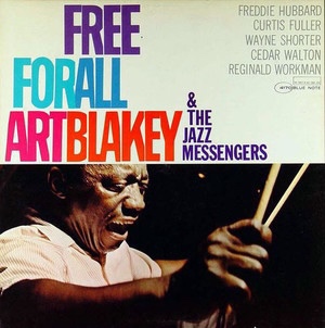
This post isn’t meant to be in any way comprehensive. For starters I’m limiting it purely to one record label and one artist: Art Blakey on Blue Note. But isn’t it amazing how great these covers are? For my money they elevate the packaging to a plane very much akin to the music.
This one belongs to a weird sub-category!*
And when both music and art are sublime, that kind of sympathetic synergy is a wonderful thing, to be savoured, treasured, and just plain enjoyed/appreciated… so feast your eyes. And, ideally, put on some Blakey, and feast your ears as well!
Sublime! What a face.
In Art Blakey Reid Miles and Francis Wolff found someone who had the musical spirit they loved, plus seemingly unbounded energy and charisma, and really striking looks to boot. He’s a funny looking dude, in some ways. But he’s incredibly photogenic with it.
Fontastic.
Wolff would be busy, snapping away at recording sessions. And then later Miles would work his hyper-aesthetic design magic. The resulting package is on a par with the music, as art in its own right. And it helps lend the era/genre a hard to define but instantly recognisable vibe, both rootsy and yet sophisticated.
A typical Wolff studio portrait.
Above is the kind of raw material Wolff would provide Reid Miles with, a fantastic studio shot of the artist at work. Interestingly Wolf’s photographic estate is handled (at least in part?), by the specialist jazz label Mosaic, who might very well have taken their name – they certainly share it – from a Blakey track.
A lot of the covers use black and white photos with single colours as screening tints. And the use of typography is just phenomenal. But as the images directly above and below demonstrate. Miles could still weave his spells with full colour imagery, and more colourful font palettes.
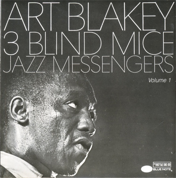
Whether using a fuller range of colours, or going super stark and minimalist, as on Three Blind Mice (below), these covers have a tremendous power. I absolutely adore them!
Sweaty, intense and stark.
Pictured below is one of the books mentioned at the top of this post.
Also worth noting is how the Wolff/Miles house style lives on. The following images are all later non Wolff/Miles productions that clearly owe a debt to and seek to emulate (with varying degrees of fidelity/success) the classic Blue Note house style.
The above is, by normal standards, a great cover. But frankly it’s not in the same league as the real deal. The effort below is a lot better.
Another later ‘in the style of’ example.
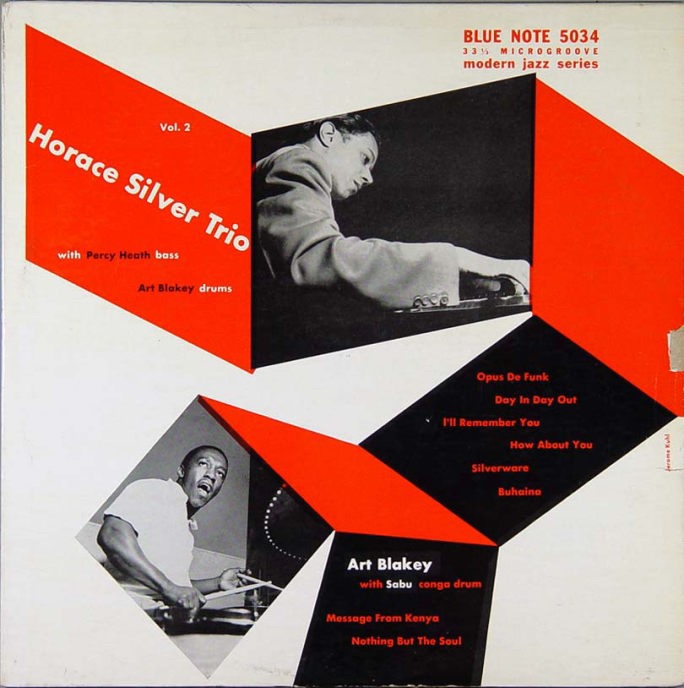
I intend to get a body of these and similar record covers decently printed, and then frame and display them myself, both in my office/home studio, and around our home. To finish, a very early example, from back when Blue Note issued 10” discs. And this last one finds Blakey sharing the billing with another Blue Note legend, Horace Silver.
Wow! So g’damn groovy.
* I’ll prob do another separate post on the sub-category of Blue Note album covers that favour semi-abstract photos, often either out of focus, or treating imagery in almost purely textural terms.
It’s incredibly rare that I hear of this sort of thing before it happens. More typically I learn about it long after. And frequently – the Burt Bacharach or Magma complete box-sets, for example – it’s so long after that they are no longer available at anything but insanely high prices, if at all.
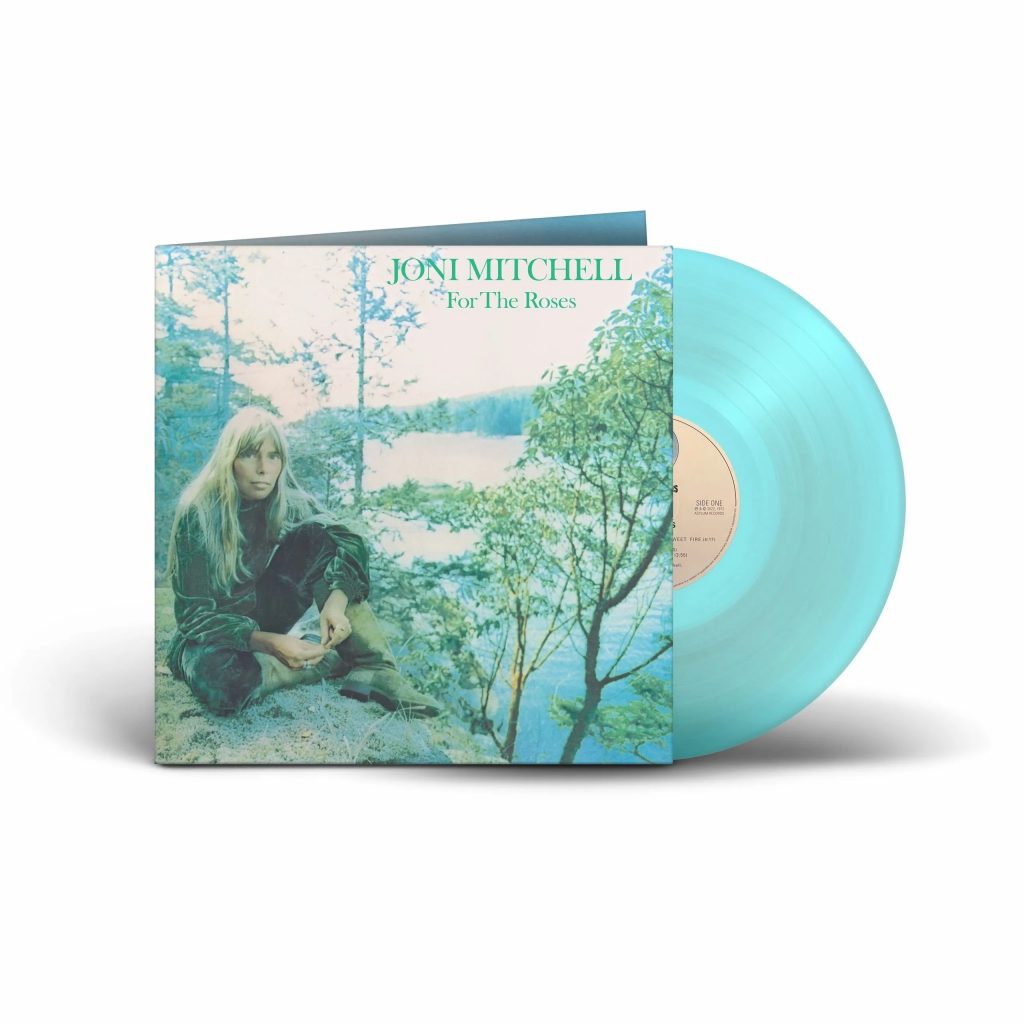
But, for once, I’ve heard some fab news with almost perfect timing. Joni’s For The Roses, released in ‘72, the year I was born, is now, like me, 50 years old. And it has been released in a remastered form, on vinyl. Including a rather snazzy blue version. So I’ve ordered me a copy.
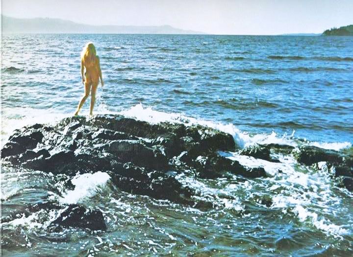
Joni, Nordic mermaid nature girl Goddess.
Teresa and I are currently on holiday in Cardiff, with family, visiting my sister Abbie, and her husband Dan, who’re now living here, in the Welsh capital. When I learned of this reissue, yesterday, I immediately ordered it. And today I got an email confirming it has been dispatched. We travel home today, so I’m looking forward to it arriving soon.
For The Roses, her fifth studio album, is part of Joni’s early years run of pure gold. Rather like Woody Allen’s purple patch, or Tom Waits in his prime; such artistic genius and musical gloriousness is to be savoured and treasured.
Overshadowed by her two best-selling albums – Blue, which was her previous release, and Court And Spark, which came next – I hold Roses to be an overlooked meisterwerk. My picks/favourites are Barangrill, Electricity, and Woman Of Heart And Mind.
According to the Wikipedia article on For The Roses ‘she originally intended for the cover to be a drawing entitled For the Roses, the imagery in which relating to her feelings on the music industry.’ I’d love to see the artwork in question! I wonder if I can do some sleuthing in that direction?
AI generated – I think? – by the lyrics of the ‘Polygondwanaland trilogy’, by King Gizzard & The Wizard Lizard.
I was all set to not even watch this. Then to dislike it… and now I’m bemused, as I really rather like a lot of aspects of the resulting ‘art’. And I’m intrigued as to how it’s done.