I first drafted this post in September or October, 2022. But I’ve only now finally gone back to and finished it!
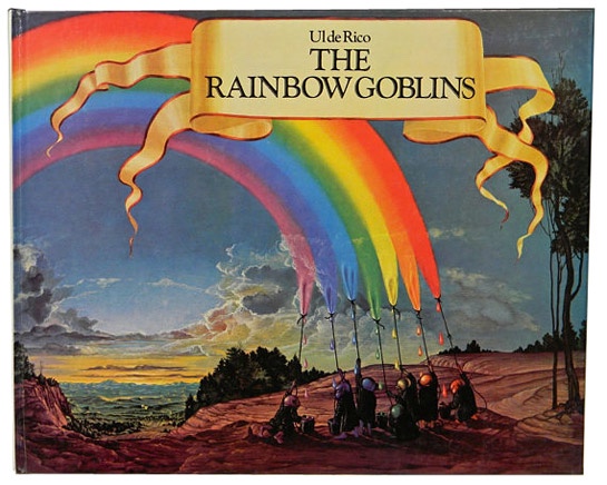
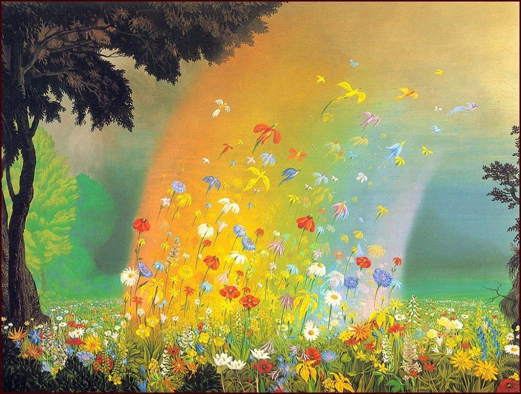
If I’m honest this isn’t my normal mug o’ Java. But I’ve been softened up for it by Masayoshi Takanaka’s wonderful double-album of the same name, that’s both based on the story, and uses Ul de Rico’s art on’t the packaging.
I love this!
Sometimes getting an entry into something this way – so, the fabulous Takanaka album predisposes me to being more receptive to the artwork/story that inspired it – widens one’s aesthetics. If I’d only seen the book, I might’ve rejected it out of hand.
Pretty amazing, eh!?
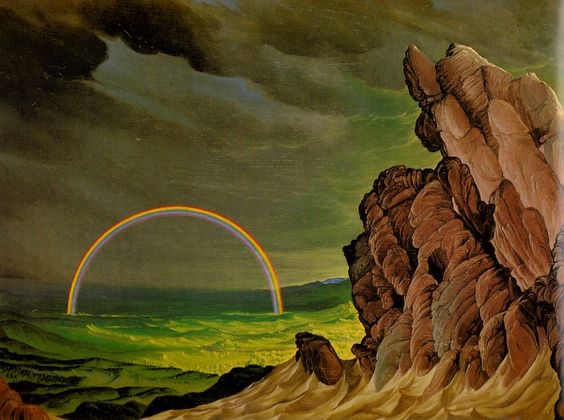
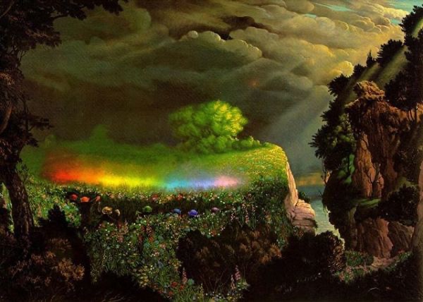
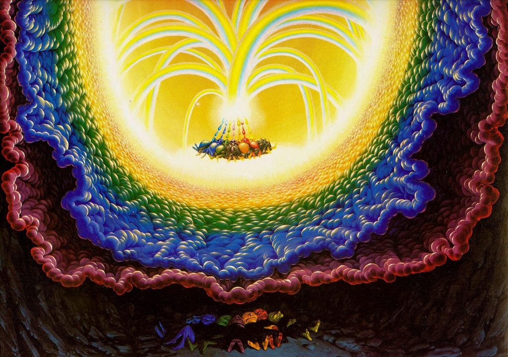
Some of the artworks, such as the one that adorns Masayoshi’s album cover, or the one directly above this paragraph, really do draw me in, and seduce me. Others, like the one directly below, I’ve grown to love.
And this in turn leads me to dig stuff like this:
The rainbow goblins’ dream. Far out!
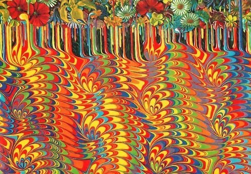
And in the end I’m won over, and full of admiration for the simple charms of the story, and the intensity of the artworks. How about this for endpapers:
Flowers melt into a marbled ink pattern.
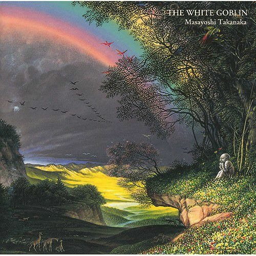
Ul de Rico did a follow up, called The White Goblin. And Masayoshi Takanaka followed suit! I’m listening to the latter right now. I’m not as immediately smitten by it as I was by his Rainbow Goblins project. It’s a bit more mainstream rock/pop.
The saga continues!
But, truth be told, I feel myself being sucked in and won over. Seduced ever further from my own usual aesthetics. In the end, it feels to me as if I’m relaxing and letting Ul de Rico and Masayoshi Takanaka take me, one by each hand, into their visual and sonic worlds.
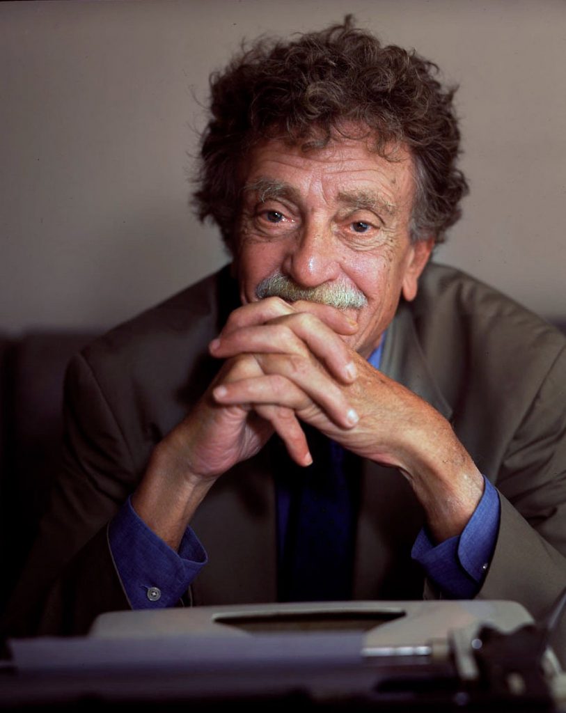
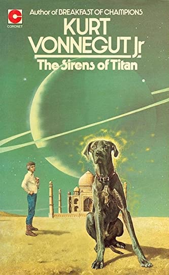
I have to thank a secondary school English teacher (Mrs Martin?), for introducing me to Kurt Vonnegut. Truth be told it was her sex appeal – a bright and beautiful young woman, with a fascinating looking book – as much as the literary appeal that first took me. Ah, Mrs Martin, where are you now?
The edition Mrs Martin had.
Well, today, on FB, he was quoted by one of those weirdly intrusive ‘you might like this’ meme-things. I reproduce the quote below, keeping the bit about homosexuality that they omitted:
‘If you want to really hurt you parents, and you don’t have the nerve to be gay, the least you can do is go into the arts. I’m not kidding. The arts are not a way to make a living. They are a very human way of making life more bearable. Practicing an art, no matter how well or badly, is a way to make your soul grow, for heaven’s sake. Sing in the shower. Dance to the radio. Tell stories. Write a poem to a friend, even a lousy poem. Do it as well as you possibly can. You will get an enormous reward. You will have created something.’
According to online sources this quote comes from Man Without A Country. I must get/read that!
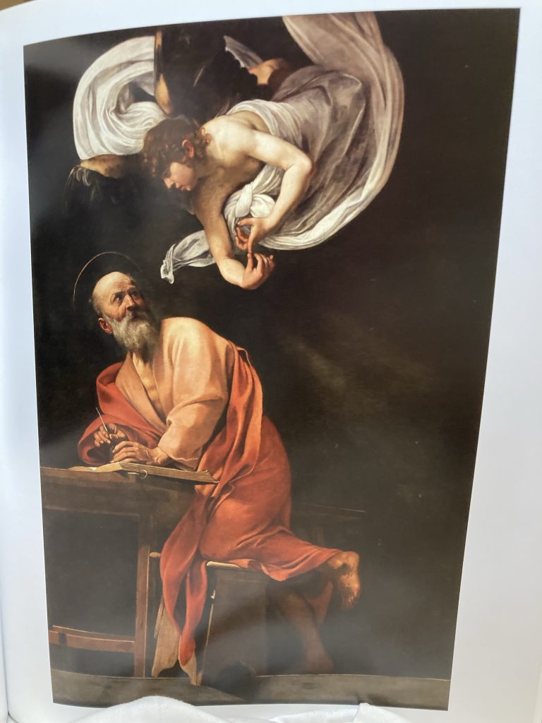
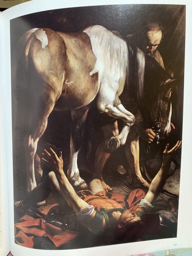
Mention of Caravaggio in a recent post set me to poring over a couple of art books we have on this incredible artist. I recently mentioned in another post having sketched a pencil version of The Conversion of St Paul years ago. But I’d like to try and paint it, as well.
But whilst perusing Gilles Lambert’s Taschen 25th title on Caravaggio just now, it was Saint Matthew and The Angel that really clocked me one upside the head. What an incredible composition! Flat and empty to the point of being almost frieze like. Yet rich with light, shade, colour and volume.
The rendering has the strength of sculpture. And yet is richly vibrantly colourfully alive. Caravaggio’s eye and aesthetic sensibility imbue his art with an intensity that I can only reach for poetically: chestnuts, leather, velvet, red wine, red meat, incense, lace or muslin, the scent of candle wax and smoke.
Incredibly dramatic!
In both St Matt and The Conversion the pictorial space, whilst rendered with surreal photo-realist clarity, remains so shallow as to be effectively flat. I love that! It’s simultaneously modern, and timeless. It lives in the present.
As many have said, including my hero, Picasso, the best art of any era is most potently alive in whatever ‘present’ the viewer sees it. Great art loosens the shackles of short-lived fads, or era-specific parochialism/opacity, and rises above time!
Details of Victorious Cupid, 1602.
Some of Caravaggio’s stuff looks, to my eyes, very blatantly homo-erotic. Check St Paul’s torso in the painter’s two versions of The Conversion. When the subjects are young male nudes of a childlike appearance, that can sit rather awkwardly with current social mores, and indeed laws.
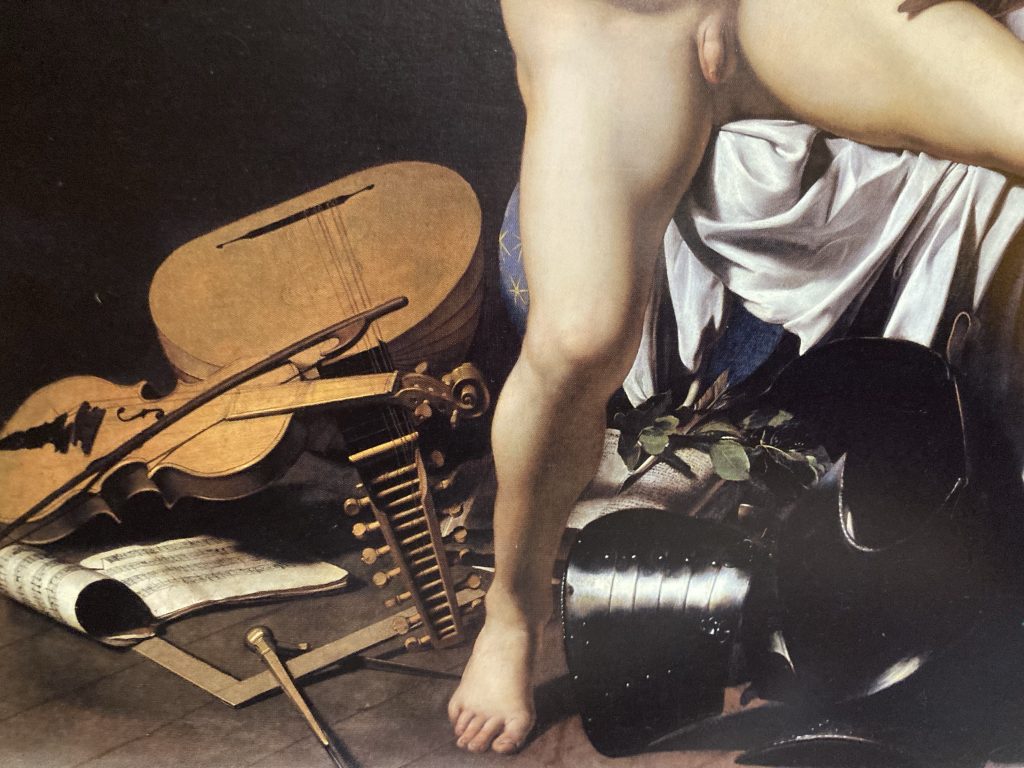
Victorious Cupid is a bit icky, to me. I call it Cupid Scratching His Arse! But it’s still an amazing artwork. And just look at the detail in the lower part of the painting. The musical instruments, armour, and textiles, are like a somber symphony in paint!
Anyway, it’s great to be nourished by fabulous art. I am very grateful for the luxury of being able to indulge in such a hedonistic yet refined pursuit!
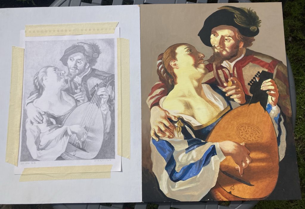
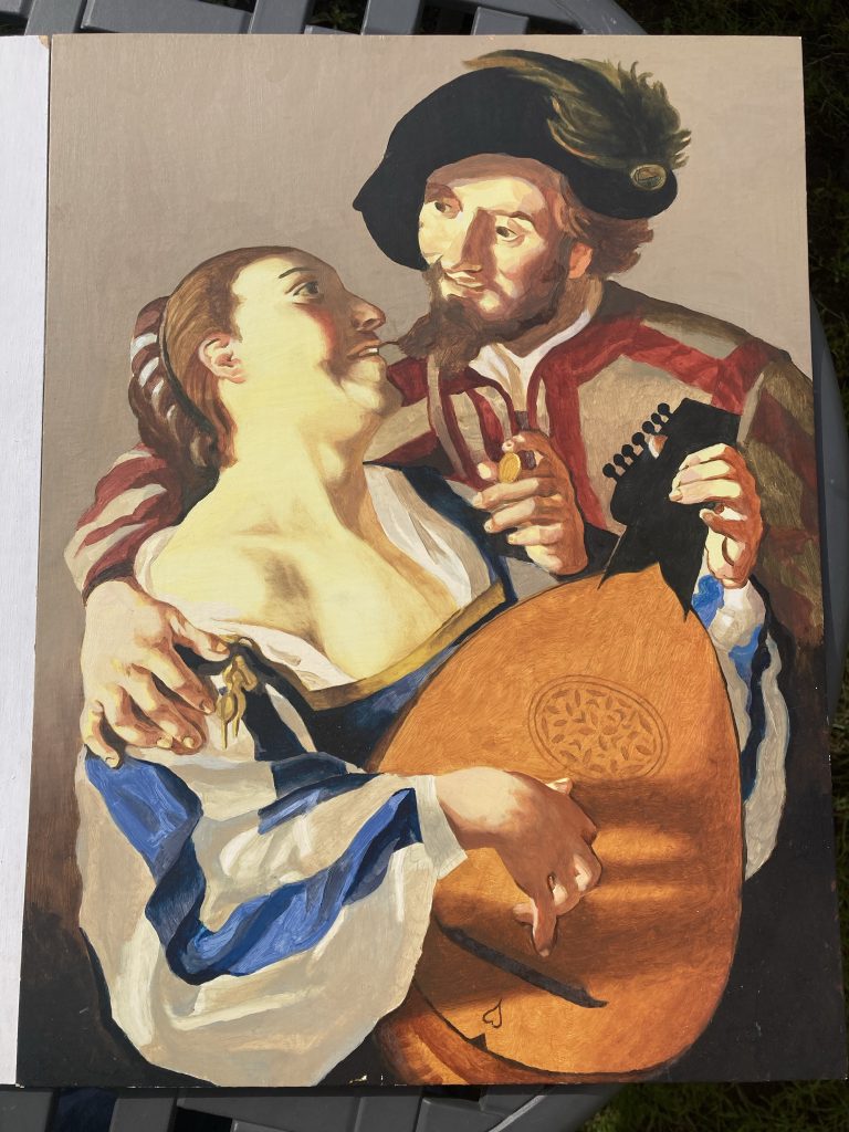
When I found these two art works recently, whilst putting yet more stuff into our attic, I brought them down, to have a fresh look at ‘em. And I’m pleased with how they look.
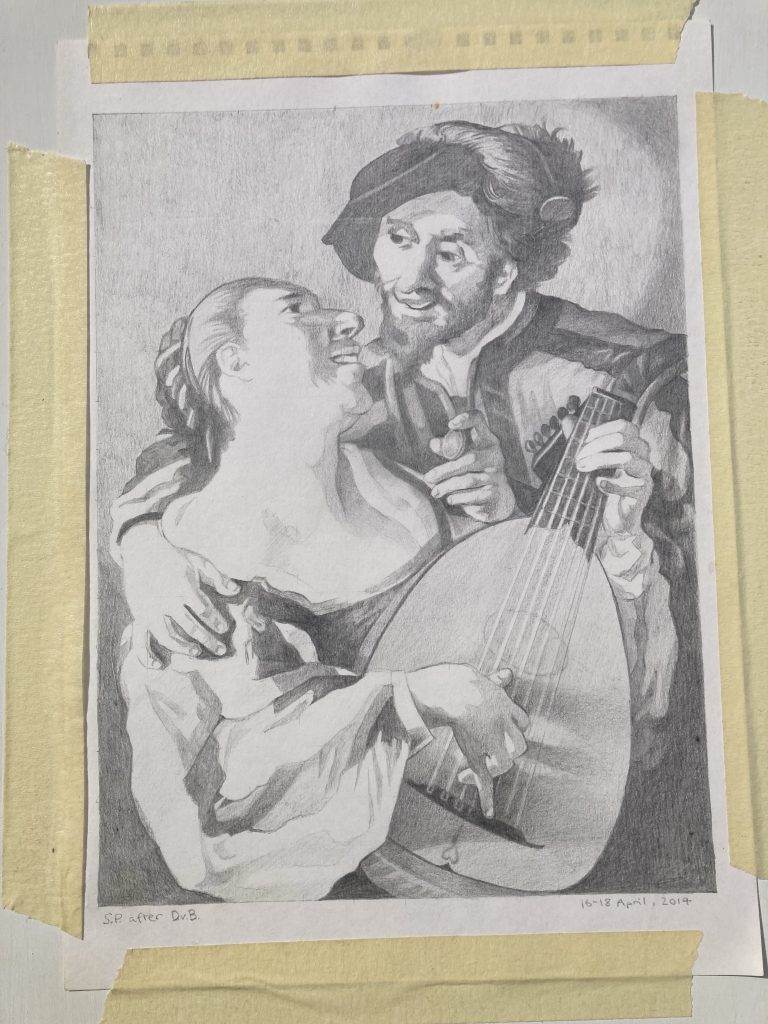
The pencil drawing was my first look at reproducing Dirck van Baburen’s The Procuress. I actually chose to leave the Procuress herself out of the picture, which also changed the overall format of the piece (from off square to a portrait type rectangle). Instead we have just the young dandy and his lute-plucking lady.
A terrific book! And the source of this project.
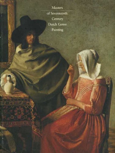
I found van Baburen’s The Procuress in this rather lovely book. It’s an old’un, but a good’un! My mum had a copy back when’s he did her degree. I think I’ve posted about this book here before? But I’ve not found that post, so can’t link to it yet!
16-18th, April, 2014.
Here they are individually, for a bit of a closer look. The pencil drawing is finished. But the oil stalled before completion. So I need to finish that off.
These two pieces are both for sale, should anyone want either. The pencil drawing for £89, and the oil painting for £239. That’s unframed. I can frame them as well, if required. Or a buyer could do it themselves.
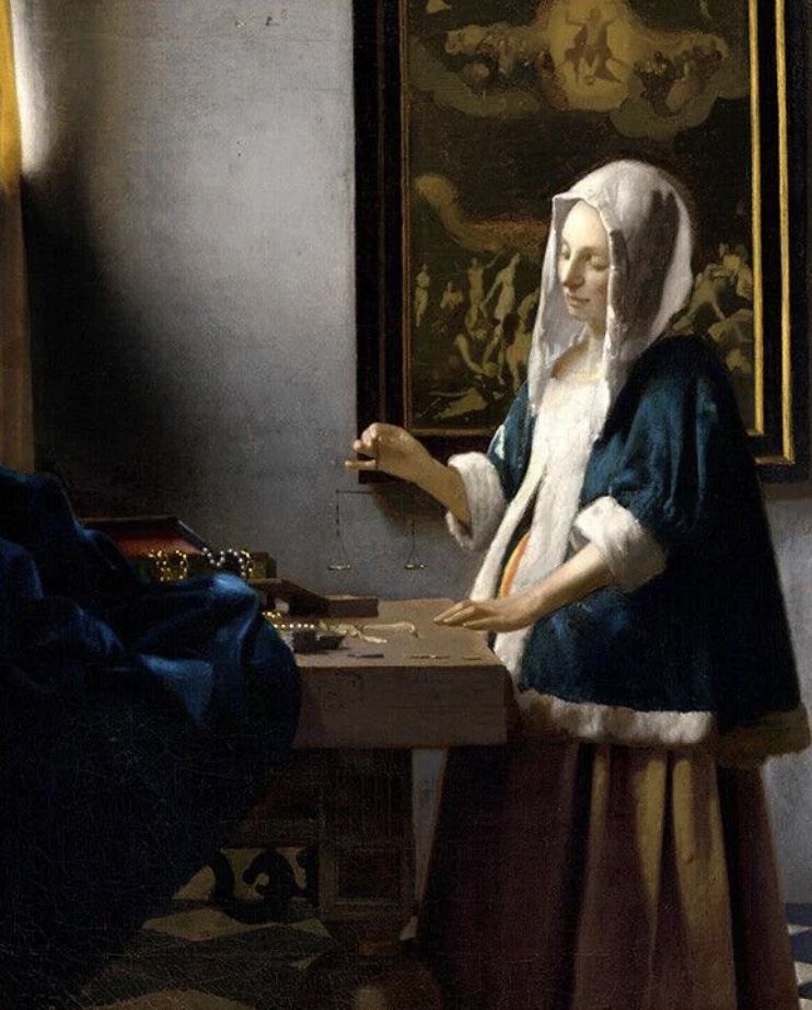
Woman Holding Scales, Vermeer, 1664.
I’m planning to do more in this line, as I enjoy it, and it teaches me a lot. I have a few favourite paintings I’ve long wanted to reproduce, such as Vermeer’s Woman Holding Balance, and Caravaggio’s very theatrical St Paul.
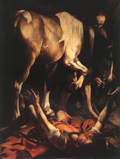
Caravaggio’s dramatic vision of St Paul.Together again. Indoors this time.
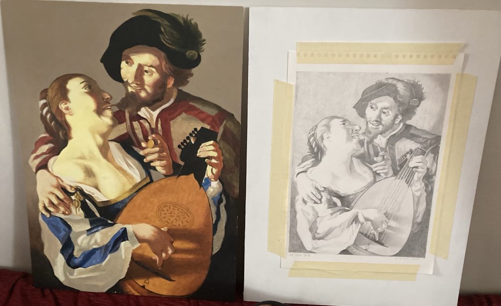
The first three pics of my efforts, further up this post, were taken outside in the sunshine. These last were shot indoors. But all the pics in this (and almost all my blog posts) are taken on my iPhone. So, hardly pro/ideal! But hopefully they get the idea across?
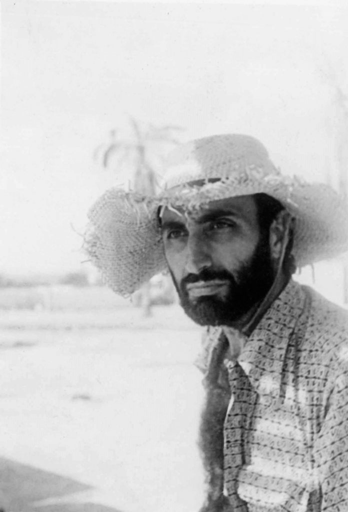
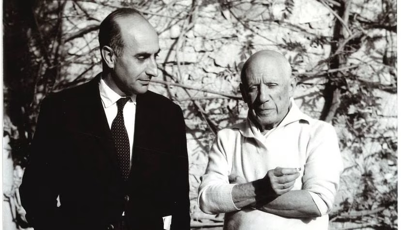
I posted about this dude and his passion for Picasso quite a while ago (read that here if interested). And I find myself wanting to post about this pairing again.
Here they are together.
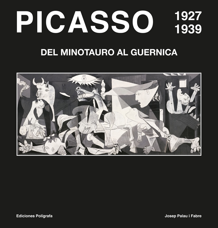
As per my previous post, I have three of the four ‘whoppers’ i Fabre published. And I really want to get hold of any more there might be. I’m aware of just one more, as things stand. Which, alas, seems both rarer, and consequently more expensive.
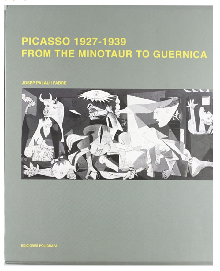
This is one version of the book I don’t yet have.
I’ve learned, thanks to my search for the cheapest way to buy this book, that it can be bought brand new, for €150! From Poligrafa, the Spanish publishers responsible for all these fabulous books. And in English (or Catalan!), as well as Spanish.
Here’s another edition.
Second-hand editions of this title are all more expensive. But sadly anything at all, let alone say £20-30 (roughly what I paid for the third volume in this series), is way too expensive for me right now.
I exchanged some emails with a chap called Carlos at Poligrafa today, thereby learning of the newer/cheaper buying option. But thanks to me not speaking Spanish, or quite following all his English, I’m none the wiser as to whether any more posthumous (to i Fabre’s passing, that is) volumes are in the pipeline.
Looking exceedingly cool!Nice wheels, Josep! What a dude.
Exciting news! I’ve located a decent looking copy of the 27-39 Minotaur to Guernica book, in the UK. It’s expensive, but affordable. Just. I might see if I can buy it today… (Feb, 17th, 2015)
Today I’m mostly confined to bed. By my own decree. Teresa’s at work. And I am on Easter break. Although it may be a bigger hiatus? That’s partly why I’m in bed!
I woke when Teresa got up, at 5.30am (mad!). But most of the time between about 9am and 3pm I’ve been in a 50/50 mix of resting/dozing, and outright sleeping. Snooker, with Kieran Wilson thrashing Ali Carter, on the Tour Championship, is helping on all fronts with rest and sleep!
An ornery mule, with an artist’s soul.
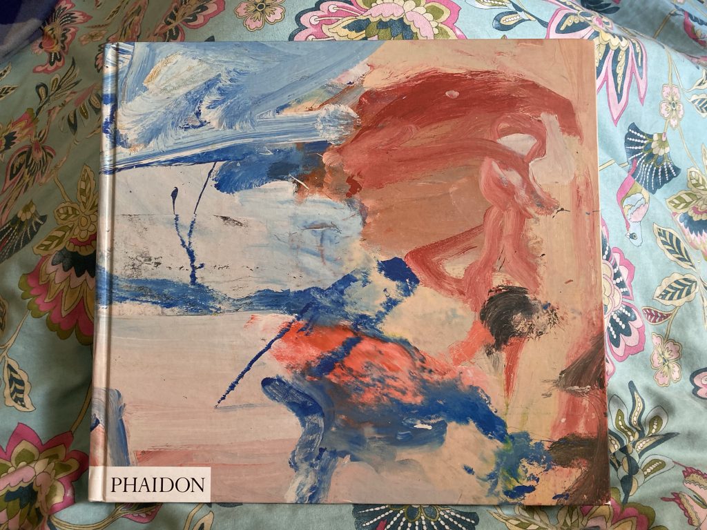
But around 2pm, after a second long chat with the alphabet soup brigade (the bouillabaisse of acronyms for mental-health organisations), I felt I needed an injection of culture and inspiration. So I hoyked a few art books off the shelves.
Angst meets beauty, in mixed media on canvas.
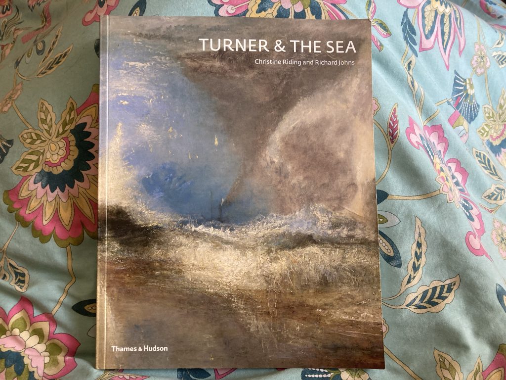
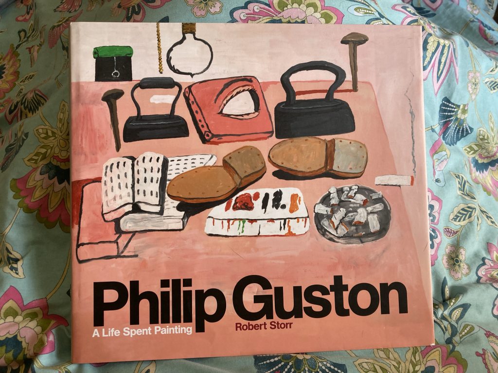
Having resumed a long derelict interest in making art, I thought I’d also resume the act of feeding on the soul food that art can be. Hence getting these tomes offa the shelves. Turner and The Sea, Guston, and de Kooning. Endless hours of fun and nourishment!
Not so eyebrow, n’est ce pas!?
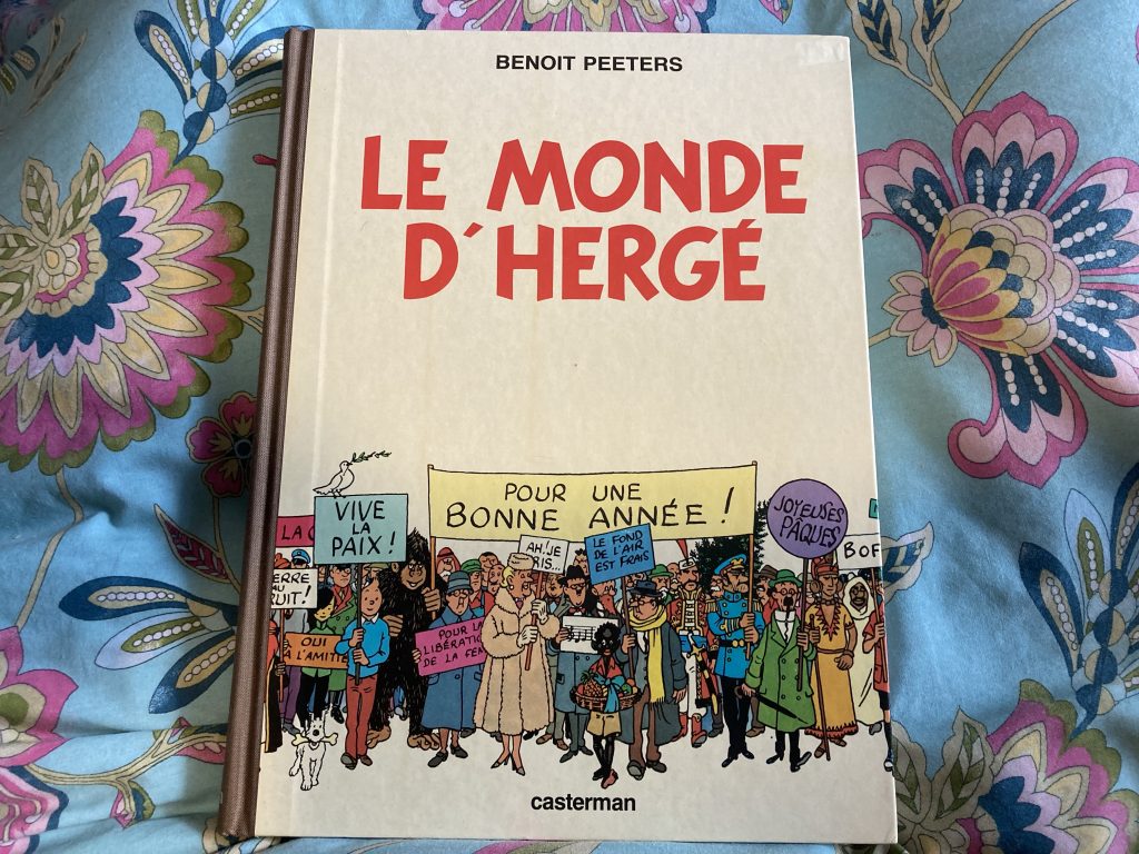
And to keep my furrowed brows at the correct elevation, something a bit ‘Felix’ lighter!
No-brow? Love the Tintin style cover!
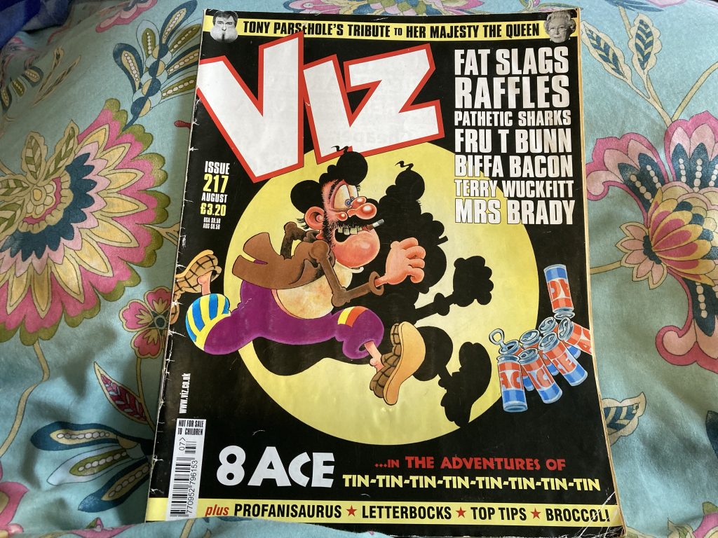
And of course, Viz. Thanks to the Viz Team I nearly died laughing last night.
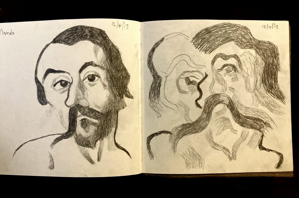
Without checking back, I think this little series of sketches, again from a decade ago, started with looking at an El Greco painting.
He distorted his subjects a fair bit, in a series of ever more stylised manners, as his style evolved. Taking his distortions as a starting point, I have, from the get go, been distorting further.
Manolo, Spread #2.
In the second spread, at left, I went back to the source again, but this time with a slightly more cartoonish feel. The one on the right is devoted solely to the background, in particular the cloudy sky; extrapolating shapes and colours. The yellow in this image is lost a bit in the photograph.
Manolo, Spread #3.
The third spread combines further abstraction of ‘Manolo’, at left, and an homage to (or poss’ even a straight copy of) either Picasso or Braque. Picasso’s my main man. Braque much less so. Though having said that, I do like the latter’s work. Just not as much as Picasso’s!
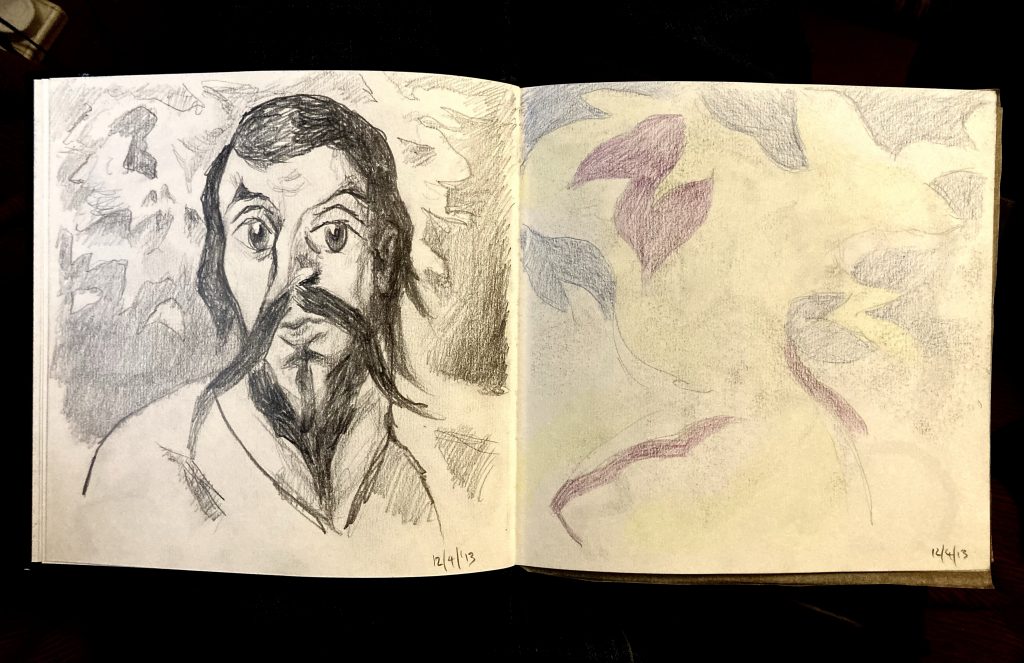
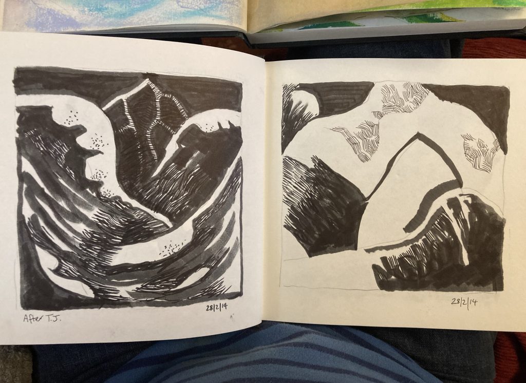
Whilst doing the initial sketches for this recent commission from Abbie and Dan, yesterday, I came across some black and white ink drawings, or sketches, that are, rather shockingly, now a decade old. That’s what this post is comprised of.
The first spread is two images that I think are actually derived from the same source. The left hand one is, I think, better/stronger, compositionally. And I’ll come back to it later in the series. The right hand one is further explored in the next spread.
2nd Spread.
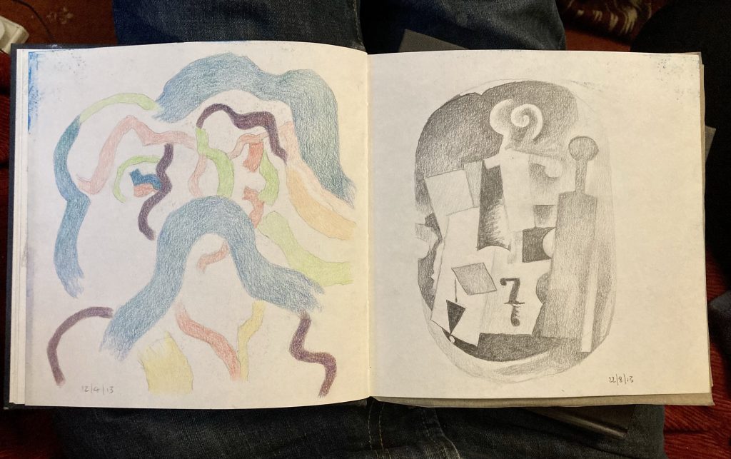
I’m not sure what’s going on with the left hand image, in this second spread I think it’s still derived from the same source, but possibly, flipped or rotated? Either way, it takes the whole thing in another direction.
Both of these belong to the more diffuse all over abstraction I’ve struggled with for years now. I somehow feel they have something. Something I like and don’t want to lose. But something I can’t quite put my finger on, and that’s all too easily lost amidst ‘too much information’.
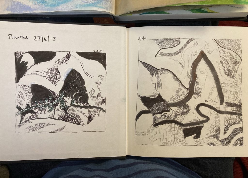
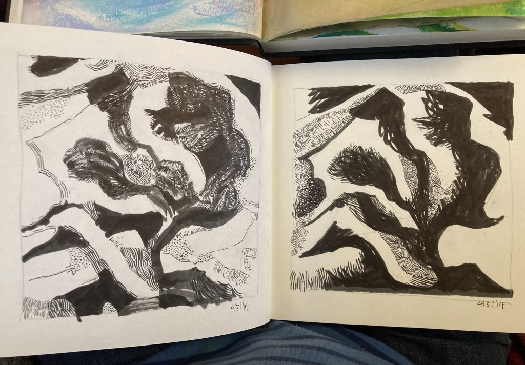
3rd Spread.
Spread three sees two ‘new’ things: the left is inspired by the drawings of Tove ‘Moomin’ Jansson, whose work I love. And it’s much more obviously representational. The right hand image, on the udder hand, sees me successfully distilling some of the preceding stuff into a stronger more succinct image/composition.
I love the sixth image of this series, and intend to do a series of prints, using it as a starting point. It’s the most reductive and simplified image to have come out of a number of related series of ideas, some of which are black and white, others (to feature in another post soon) are full colour ‘miniature’ paintings.
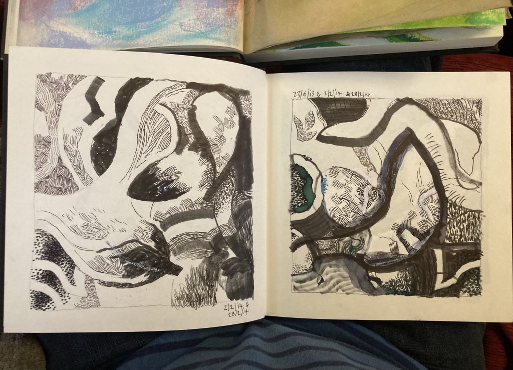
4th Spread.
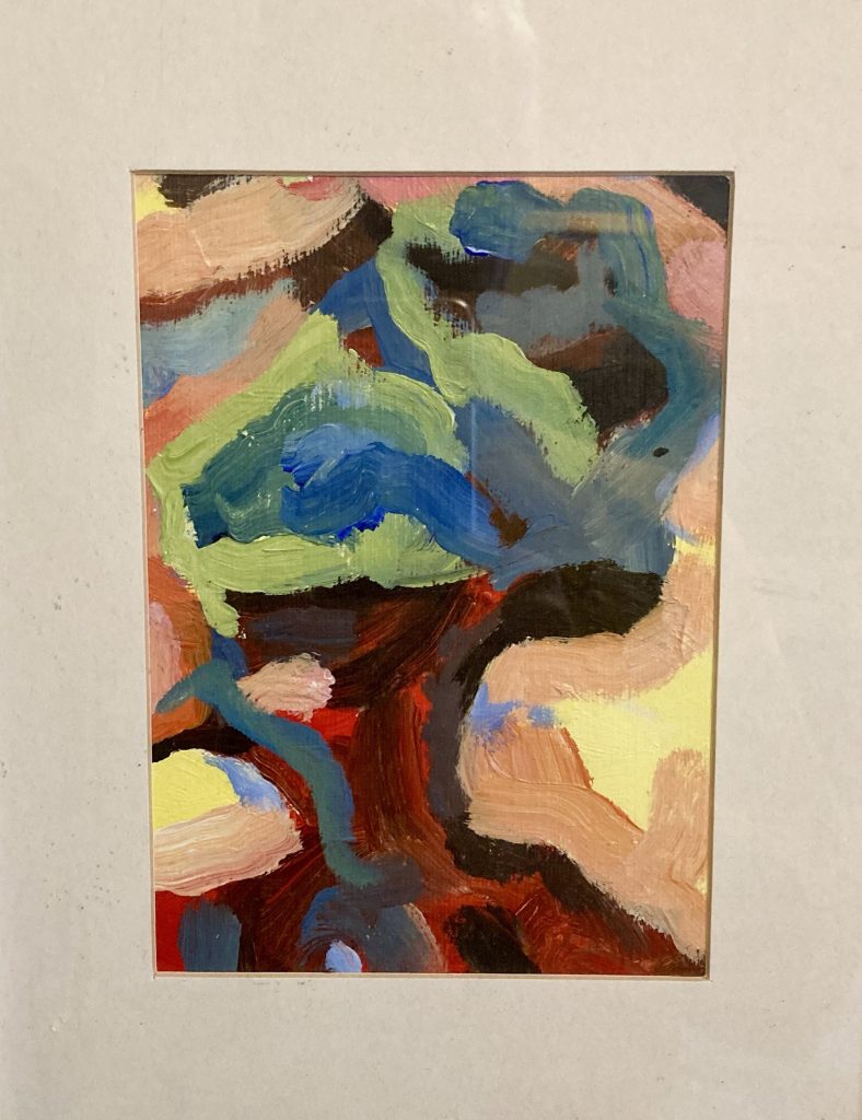
The fourth and final spread in this series is an exploration of a different source image. This one comes from the painting below, which belongs to but is also separate from the series alluded to above, that I’ll be posting about next.
These two share an imagery antecedent that is part head and shoulders ‘portrait’, part tree, part mountains, and simultaneously wholly abstract (pictured below). Once again, I think there might be grounds for or mileage in a print series coming out of this?
This one’s up on a wall at home.
For absolutely yonks – about ten years! – I’ve thought all this stuff was ok as ‘research’, but not good enough to share. Teresa has consistently said I ought to share it. I’m finally coming around to her way of thinking. So here it is!
Some of this stuff would up framed and on display, albeit only in our home(s). As of right now, only the image above is currently adorning our walls. Though I do plant I put up more original art around the house.
My sister Abbie and her husband Dan have commissioned me to paint an artwork for their home. That’s so lovely! Thanks, guys.
I’ve been given some photographic reference. I won’t say what that is, nor will I show it. For me the idea with the abstract side of my work is to work from the real world away, into something more dreamlike, and poetic; evocative yet imprecise, difficult to pin down.
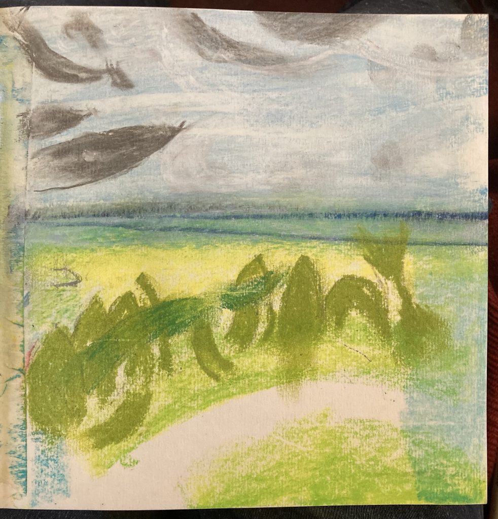
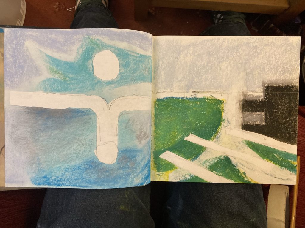
Sketch#2, 1/4/23.
Sketch#1 was a first overall reaction to the photographic image. Whilst a lot is left out, it’s still quite dense and busy. So the next three sketches unpack certain elements.
Sketch#2 catches some of the organic green growth, a very small but visually potent or significant element in the overall scene.
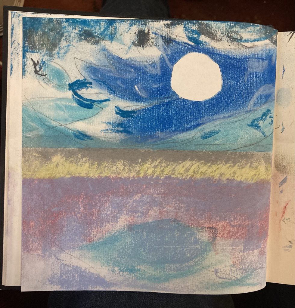
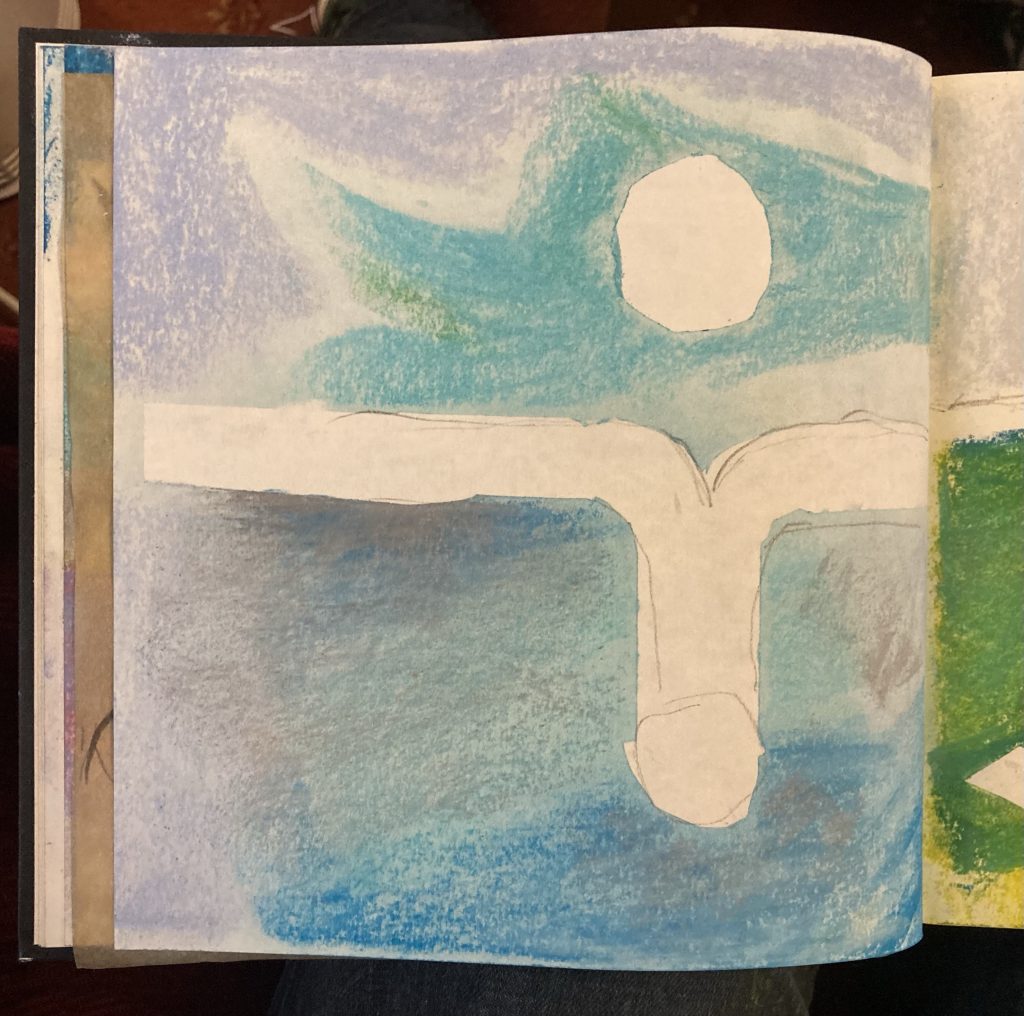
Sketch#3, 1/4/23.
Sketch#3 is the lighter stuff, the air and the water, the sun making strange reflections. This view is probably a second layer, to be rendered over Sketch#4.
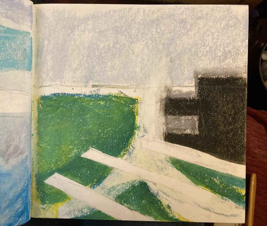
It seems odd in retrospect that I’m ending where one might have thought I should start, with the hard, solid architectural stuff; the landscape itself, and the straight lines of the man-made stuff.
So it is that Sketch#4 might well constitute the basal architecture of this painting? It might be the first layer?
Sketch#4, 1/4/23.
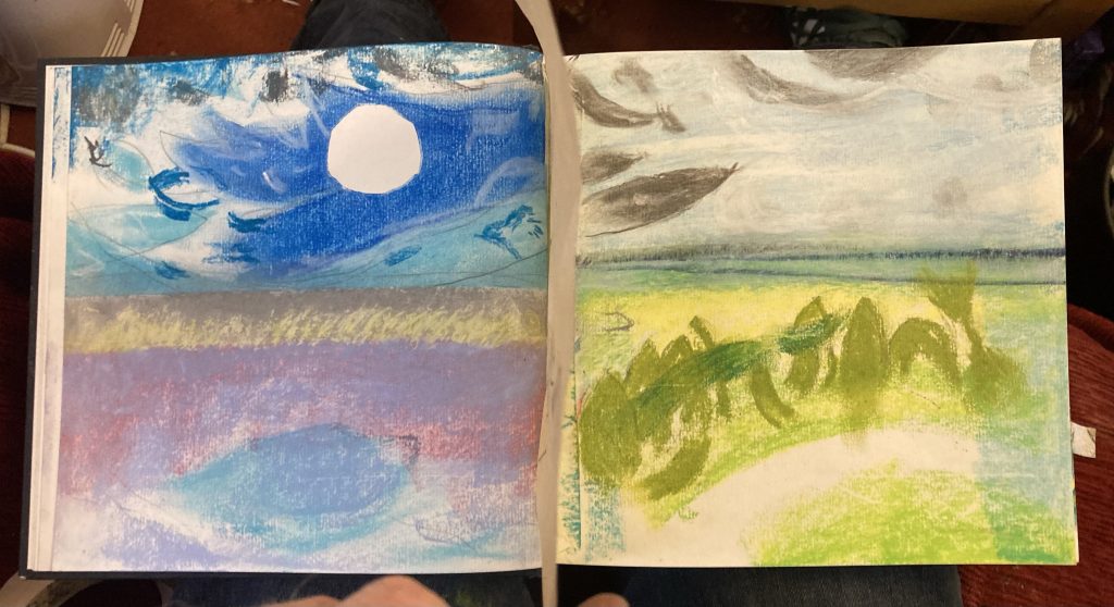
Here are the same four images as two double-spreads…
Sketches #1 and #2 …… and #t3 and #4!
I like seeing these four images together… or should I be saying juxtaposed, for the cognoscenti? They are, after all, derived from the same source.
What might prove tricky – and it ought to be, frankly – is amalgamating (what a word that is!) all these extractions. Can it be done? Should it be done?
Anyway, these sketches are a first draft response to a recent commission. I’m hoping that this process will bring my art practice back to life. It felt good to be sketching again today!
To my mind, the short answer to the question posed in the title of this post is a short and resounding yes!
However, apparently much of the science says otherwise: ‘Fundamentally, the idea of a general addictive personality is a myth. Research finds no universal character traits that are common to all addicted people.’ [1]
Anyway, I’ve suddenly collapsed into a near vegetative state of depression, over the last few months. Some of the reasons are perennial (lack of money), others more singular (least said, soonest mended).
Amidst all of this, I’ve relapsed into few behaviours (I’m sounding like an amateur naturist, er… naturalist, now) that seem, outwardly, very aulde. One of the common denominators to all these behaviours, is addiction.
And some of the things that characterise the kind of addiction I’m talking about: firstly they compel one to act in ways one knows are foolish and high risk, and two, there’s a kind of hollow joylessness to whatever the indulgence might me.
On that latter point, it has to be said that things aren’t really as cut and dried as that idea might imply. Pleasure can be and is taken in the addictive behaviours. But there’s an underlying sense, sometimes even when unquestionably enjoying the addictive behaviour, that one is acting foolishly.
Why should it be this way? And what makes certain things so compelling that they hijack one’s better judgement? This post isn’t an attempt to really answer such questions. In truth it’s more the sudden realisation that I’ve got some possible addiction ‘issues’ I need to acknowledge and work on.
Looking at all the textual images in this post, which I pulled from the Google image search results for ‘addictive personality’, they almost all apply. Perhaps unsurprisingly?
I’d say that for me there are two or three chief drivers when it comes to most of my addictions: pleasure, relaxation and escape. And the leaning into these behaviours is exacerbated in times of high stress – such as presently – by the desire to reduce or mitigate it.
I like to use my blog as a somewhat candid journal. But it’s neither an outright confessional, nor the best place to air dirty laundry that might best be addressed professionally.
On this last topic, however, I feel I’m being let down in a pretty big way, by the alphabet soup of acronym-heavy mental-health organisations I’ve been alerted to. It’s all pillar to post Groundhog Day assessments, and nary any actual support!
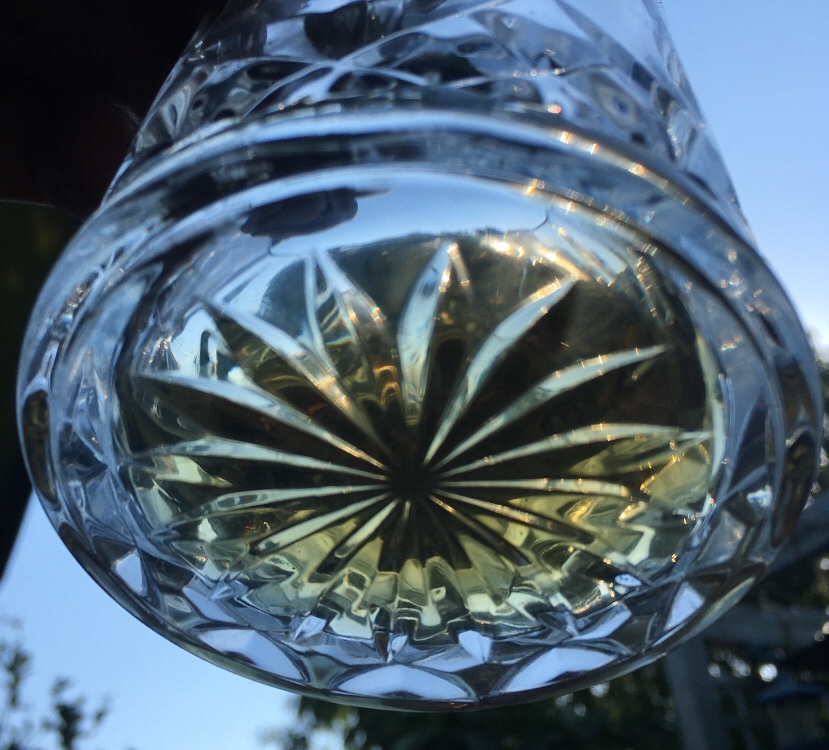
Whisky…
Having inferred above that here is not the place to go into the gory details of specific addictions, I will use one relatively innocuous seeming but actually very insidious example, namely spending.
My re-formulation of Descartes famous dictum, for our times, runs thus ‘I spend therefore I am’. One of histories’ greatest dictators, the unholy axis of capitalism and materialism, has marched into and annexed almost every conceivable aspect of modern life.
And I will often attempt to spend my way out of obscurity and depression with anything from a Gregg’s pizza slice to a book, CD, clothes or shoes.