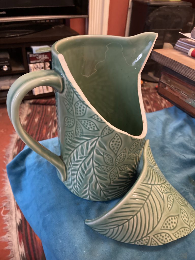
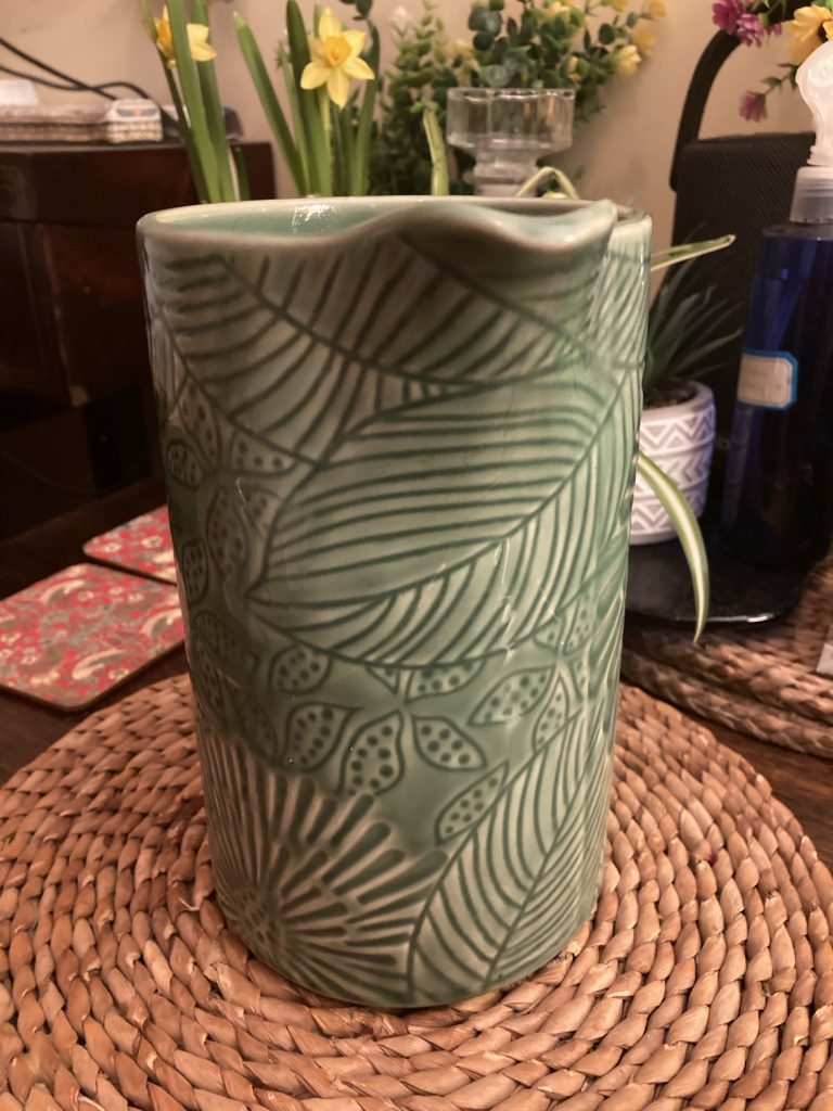
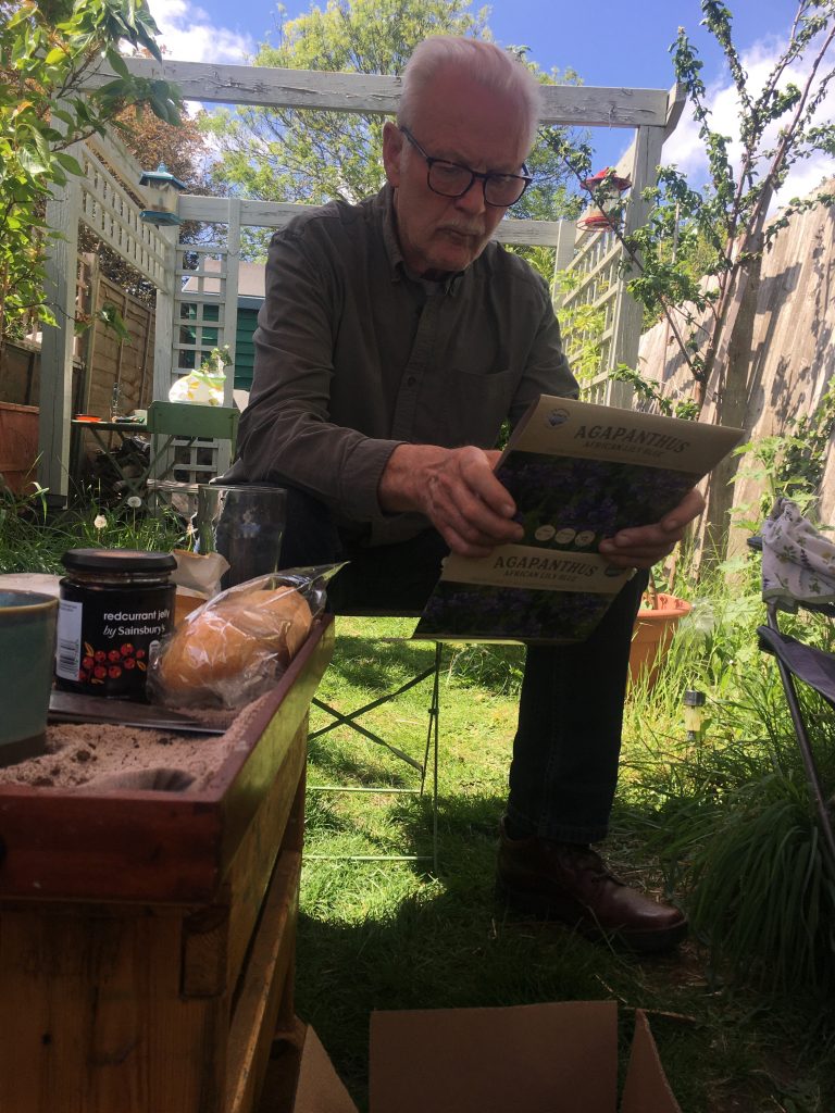
This rather nice jug was one of the many ‘free for review’ items we got under the Amazon Vine scheme, which I took part in for a number of years.
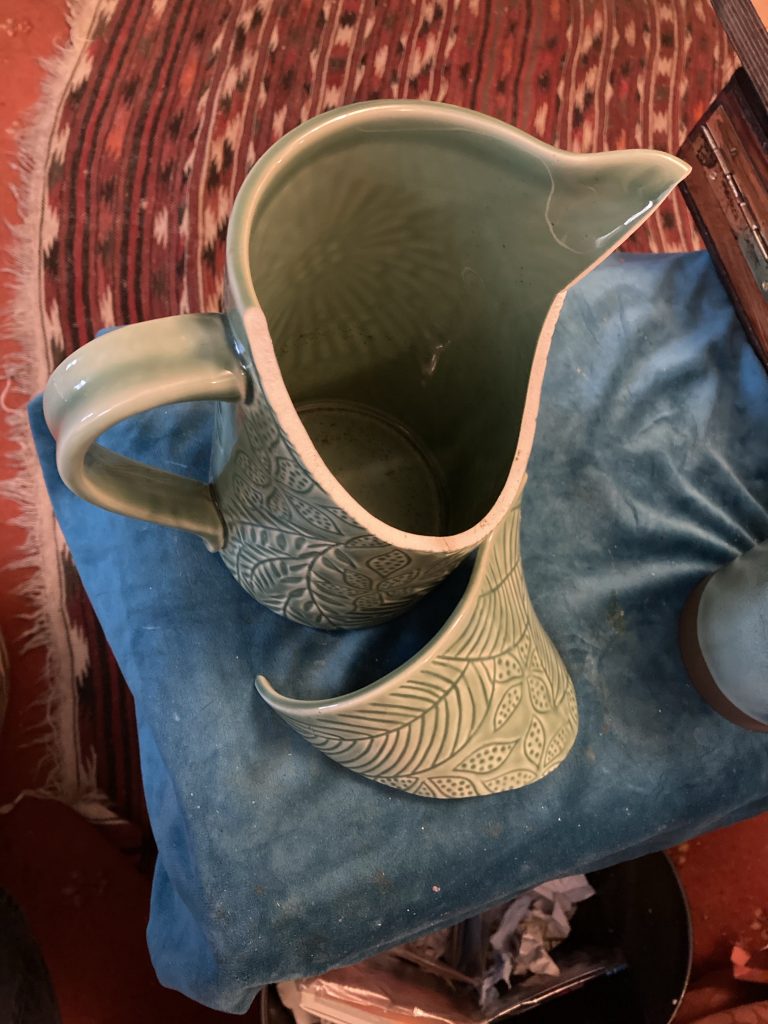
At least it’s a single and very clean break.
My time on Amazon Vine appears to have ended. And this jug also appears to have reached a demise of sorts. Fortunately it’s a single and very clean break. Quite a rare occurrence!
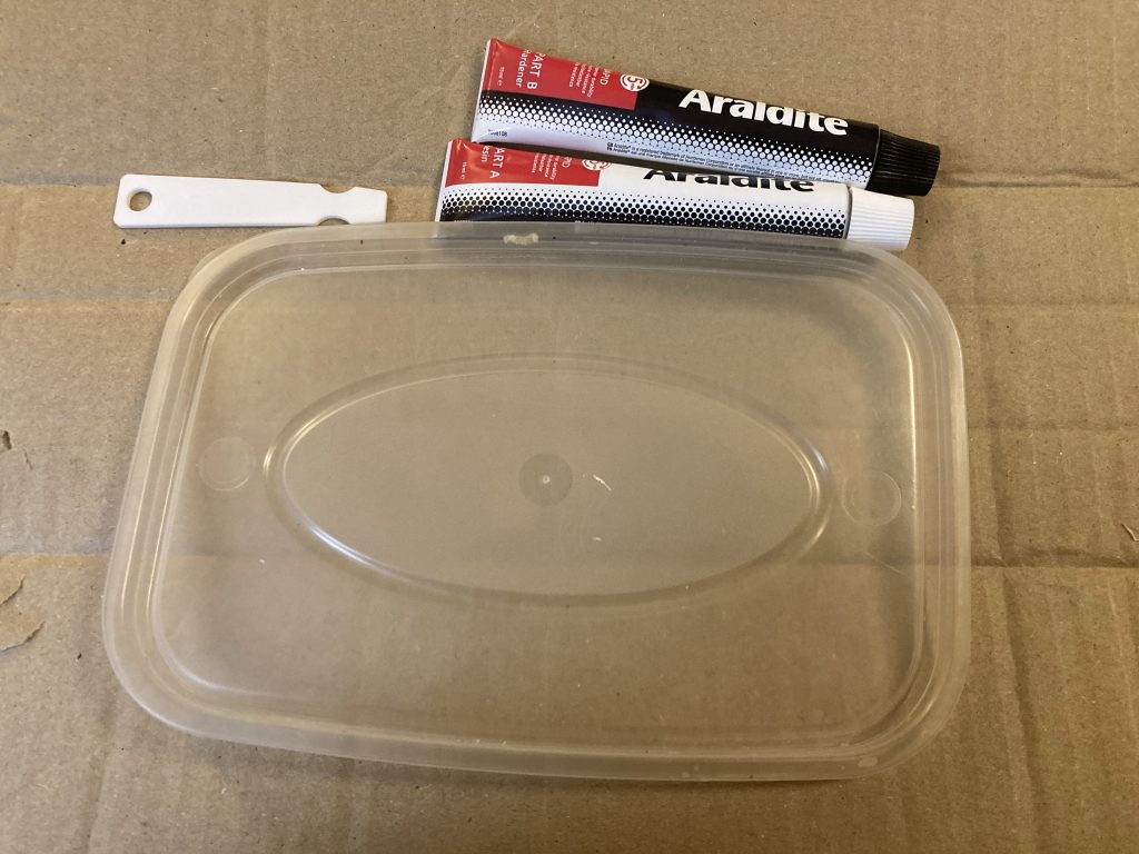
Really ought to have pictured the actual mix!
Teresa was insistent that I fix this. So a free jug is now costing me roughly £5, which is what the Araldite epoxy cost. I mixed a good amount of that up, applied it liberally to the break line, and – as they say on TV – ‘wallah’!
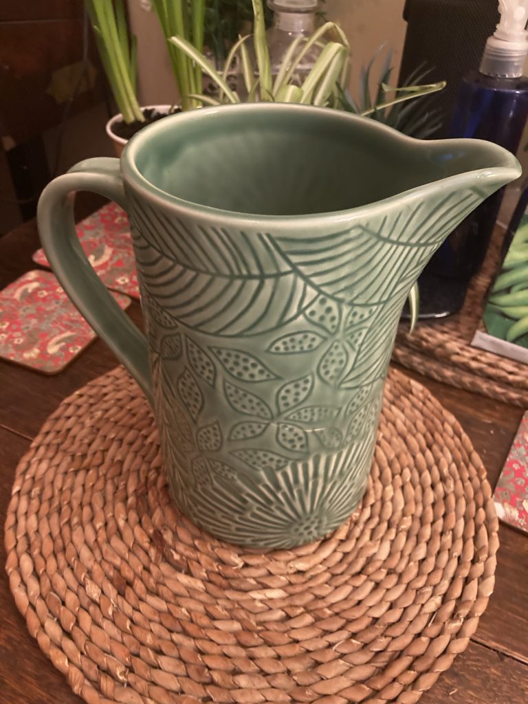
Not too bad.
The pieces went together again very nicely. My only issue was removing the excess epoxy which didst leaketh from the seam. I wound up trying warm soapy water, tissues, and plain ol’ fingers. It’s far from conservationist levels. But hopefully it’ll do the trick, repair wise. And if you don’t look too closely, the damage is nigh on invisible.
The crack is just discernible.
I ought to have worn gloves when mixing and using this epoxy. And I’d liked to have known what if anything would act as a solvent, for cleaning away the excess. I did look into it online. But in such a cursory way that I just ended winging it.
Still, all told, not too shabby. Another small but (hopefully?) relatively rewarding little home fix.
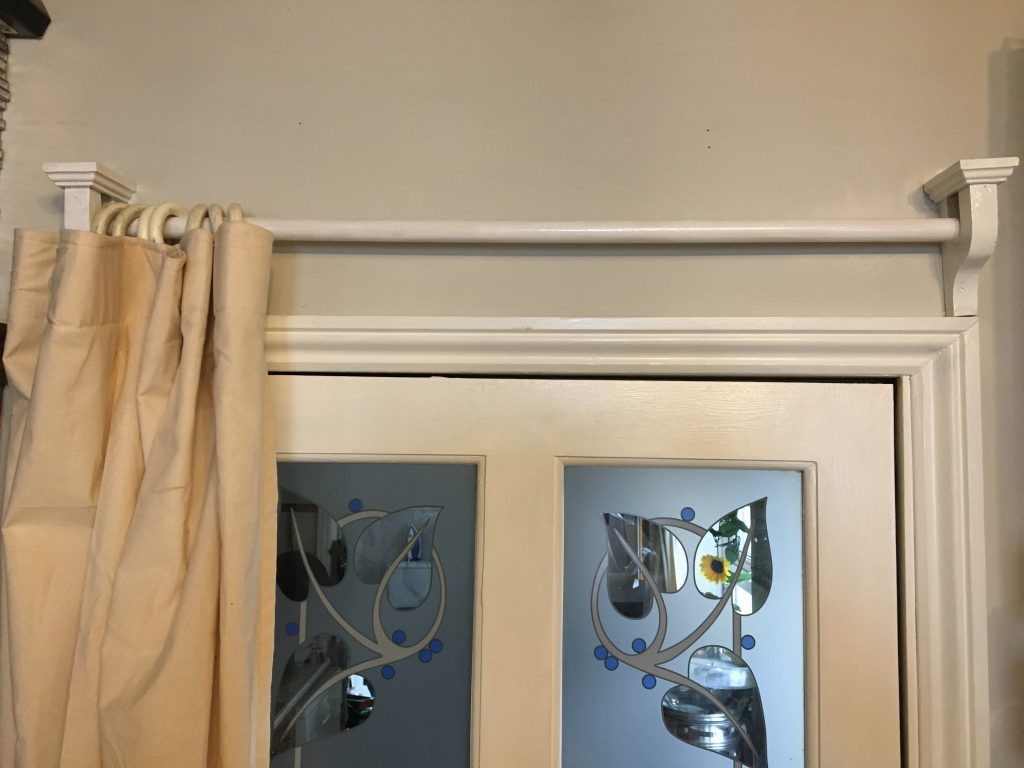
New draught-excluder curtain over the lounge to kitchen door.
Teresa’s been on at me for some time, asking that I put up more curtain poles and supports, mostly for doorway draught exclusion porpoises. Oh, and Teresa is making the curtains. So it’s a joint effort.
And we also have he added economic impetus of looking to rent a room, and needing to get the property as a whole up to snuff for sharing with a rent paying tenant. So we need, amongst a zillion other things, curtains in the bathroom.
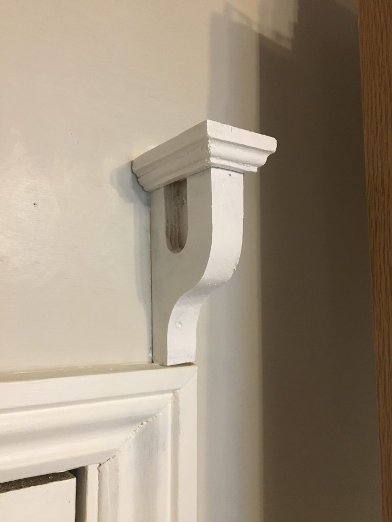
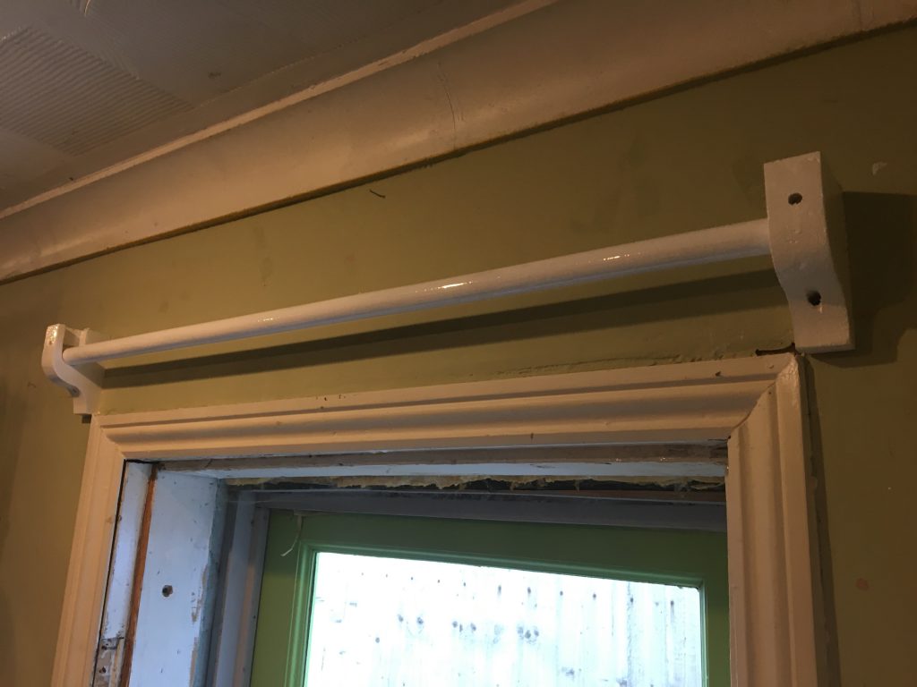
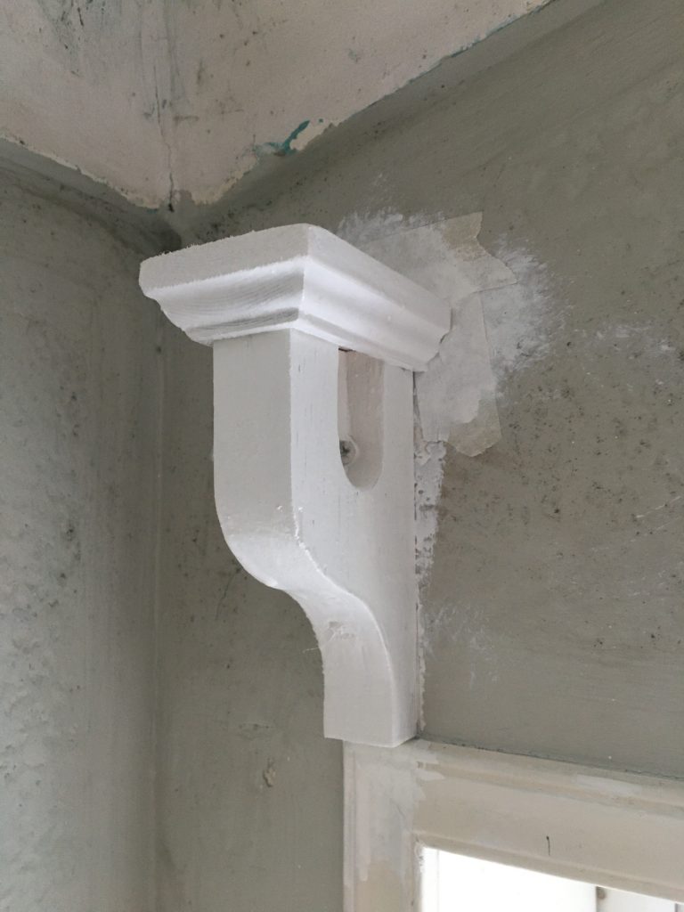
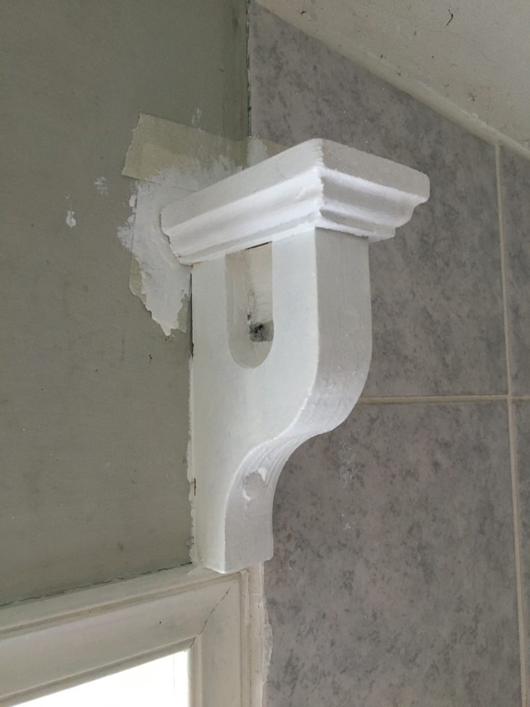
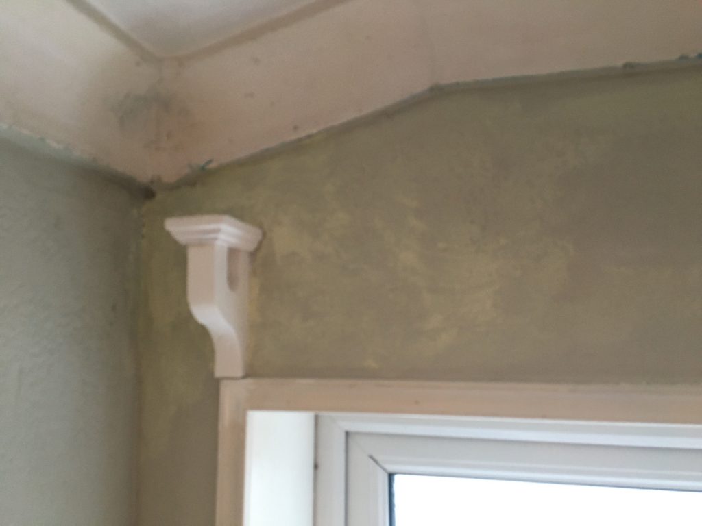
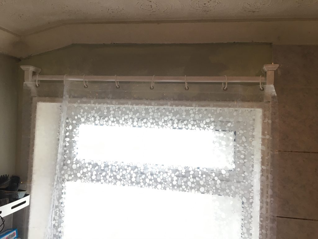
I already did a draught-excluding curtain pole thingy in the kitchen some while ago. And I want all the ones I make around our home to share a design, which is based, I guess, at least to some degree, on the classic ‘ogee’ profile. Incidentally, I’m talking about the two pole supporting doodads!
Making these in the workshop is fun. Although that said, my workshop is in such an awful mess it’s not that much fun! There’s another ongoing project; the new shed, finishing the damn thing, and getting stuff moved into it! Using the router to create the profiles ‘caps’ was especially gratifying.
I did want them all to have curved grooves (is that ‘fluting?’) in the ogee profiles, so you’d get that classic, er… classical look, of fluted verticals surmounted by profiled ‘pediment’ (?) tops. The result is, as Teresa put it, a bit pedestal-like.
I like to paint all the house woodwork in oil-based gloss white. I just feel it’s a classic timeless style, and that it works well in Victorian properties like ours. So I’m doing so with these, inc. the poles, which are 22mm hardwood dowels.
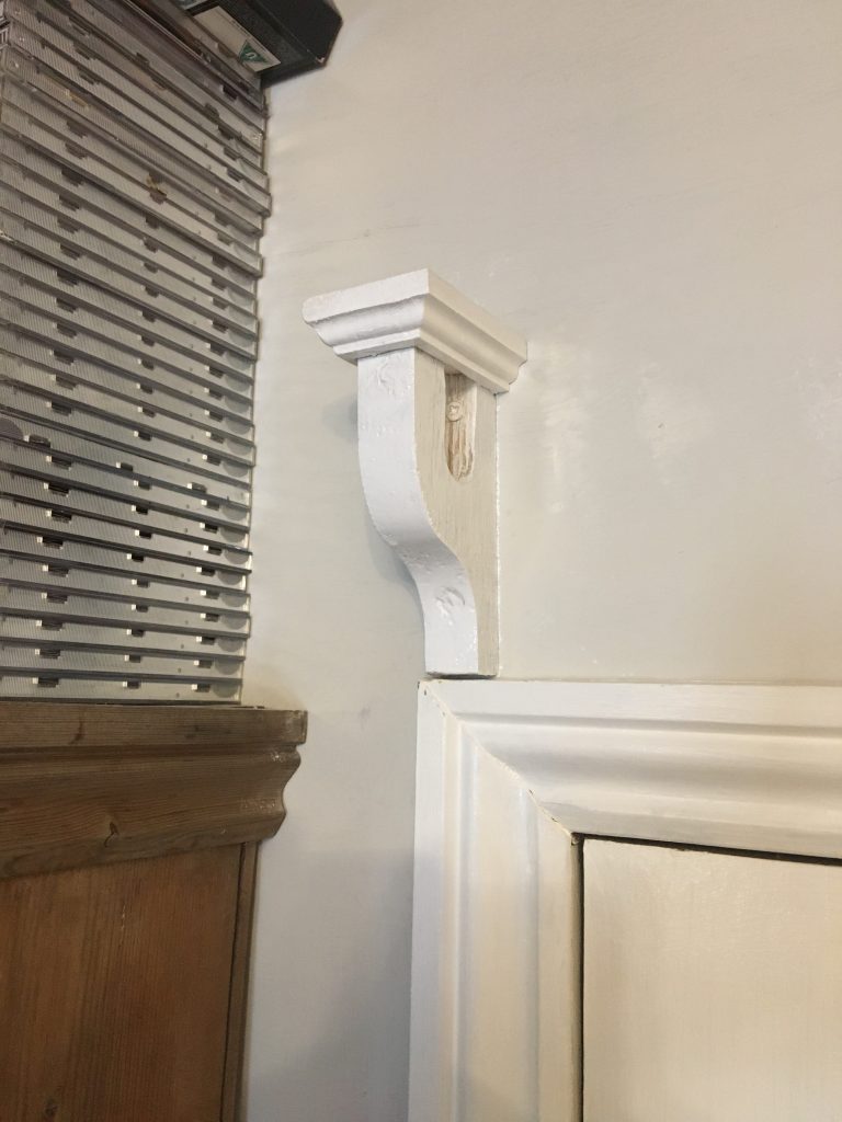
The older yet unfinished kitchen/back door one.
Attaching the ornamental pole supports can be tricky , as getting wall-plugs in to walls reliably in old (or is that any?) homes is a challenge. Then there’s the depth of wood to get through in the wider top part. I’ve developed a method I’m happy with. And so far it’s worked well enough.
You can see on these thicker and as yet unplugged and uncapped kitchen ones the holes for the screws. These get filled with dowels, or just some filler. These kitchen ones are ticker than the others. So the ornamental caps will need to be bigger. Not gotten around to making them as yet!
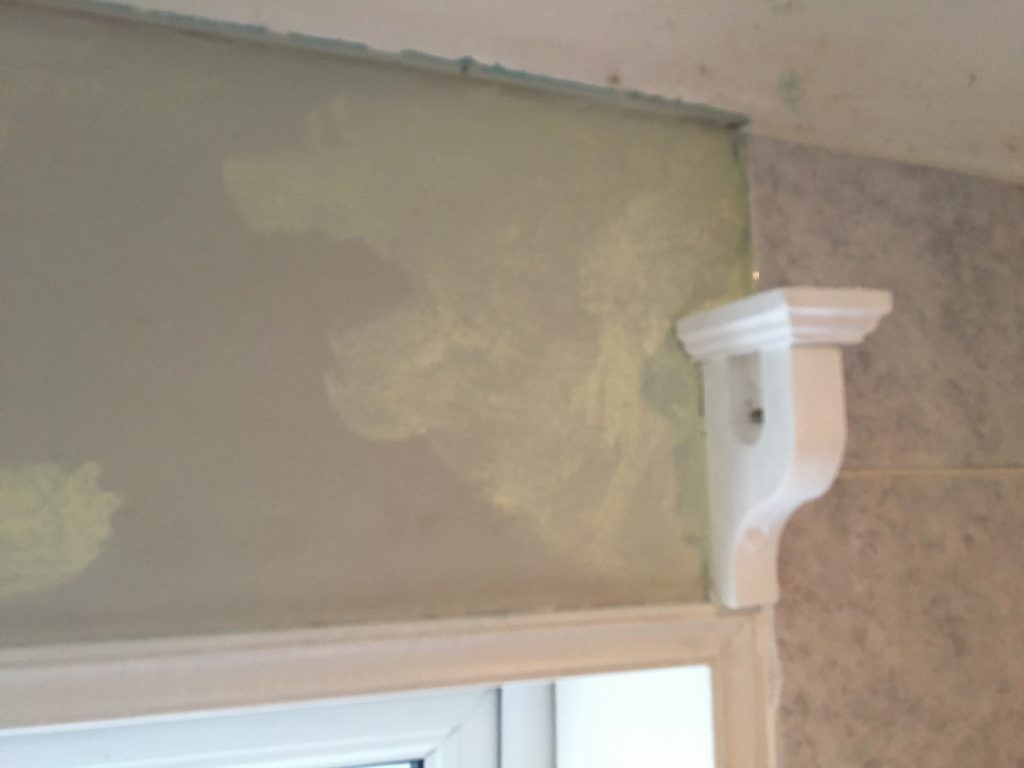
The next sequence of four pictures shows how, despite masking around these fixtures, I tend to get white paint on the walls. And in this instance (in the lounge the original paint colour – Egyptian Cotton – still matches), rather annoyingly, the paint colour, Asian Silk, which is literally from the same paint pot, doesn’t match! Gaaah!
Later the same day…
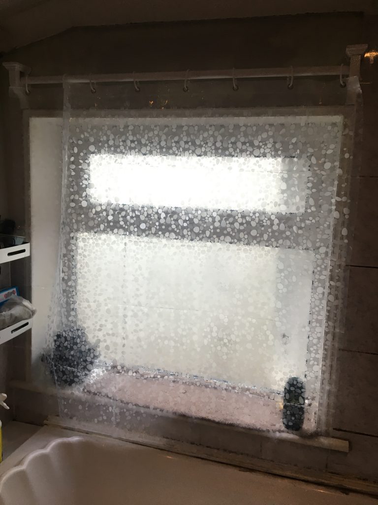
Not so easy to see, on account of the use of transparent shower curtain (fabric curtain eventually get mouldy and disgusting!), with all the daylight flooding in! At least the blotchiness of the touched up paint is less noticeable.
A double layer of transparency protects our modesty.*
Haven’t watched this yet. Might be dreadful!? But just before turning in for the night I discovered this, whilst randomly browsing stuff, stumbling upon it I know not how.
Sounded interesting, with a long and troubled production. Never actually really officially finished. Indeed, this video is the work of a fan, who’s attempted to ‘finish the job’ in the style intended by its creator.
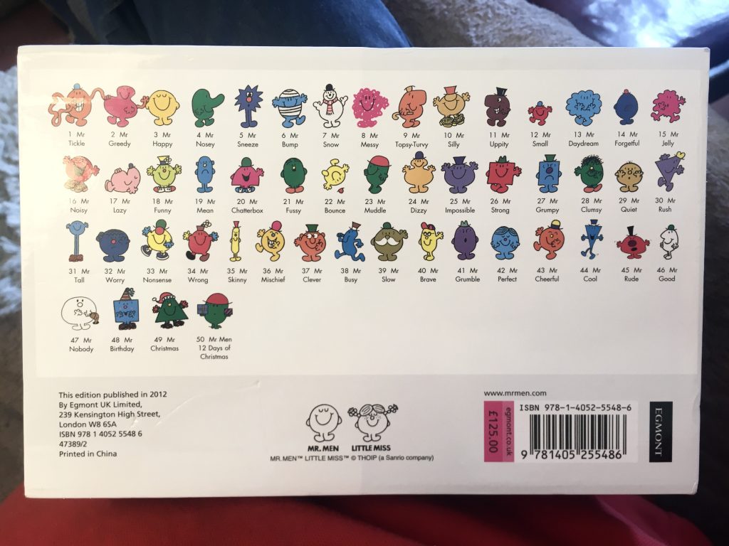
Yesterday I bought this handsome set from a Facebook seller locally. We were on our way to Anglesey Abbey, for a lunchtime picnic. That didn’t work out, for reasons I’ll cover in another separate post.
But en route we stopped over at an address in Chatteris, and I bought this delightful set of Mr Men books for a tenner. A tenner!!!
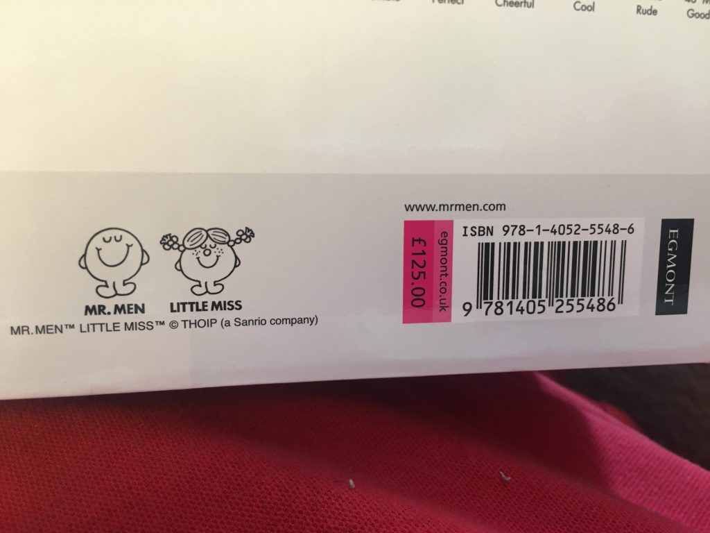
Each individual book is £2.50. Fifty at that price translates to £125 in total. I fully expected that the boxed set would – obviously, surely? – be somewhat cheaper. After all, you want to make the bulk buy attractive, don’t you?
The entire series.What? No bulk buy discount!?
So I was surprised to see that this set has, printed on the reverse of the hard-case, the full £125 asking price! This makes the tenner I paid even sweeter. And the condition of the set is immaculate. Brand new in all but name.
We don’t have kids. But these will not only potentially come in handy as and when kiddies are visiting us. But, truth be told, we adore them ourselves. They’re so sweetly innocent and charming. And most of them are a part of our own childhoods.
After the trauma of yesterday’s vehicular disaster (see this other post), reading a few of these today was a massively uplifting experience. The inner child lives on lustily in both Teresa and myself!
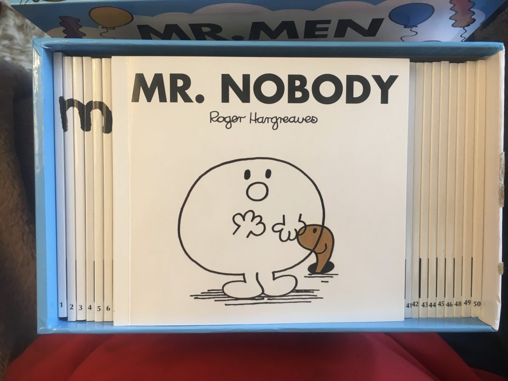
The (Mr) Man Who Wasn’t There!
I read Mr Nobody to myself. I find the theme here quite attractive. Almost Zen!? It’s not really intended that way. As Mr Nobody’s ‘nothingness’ – beautifully and so simply conveyed by his being see-through – is a bad thing, to be corrected.
I then read two to Teresa, putting on voices like a parent to a child. And it was wonderful. Not having children of our own, being, simple and childlike ourselves can be a real balm. A release from the unceasing cares of adulthood!
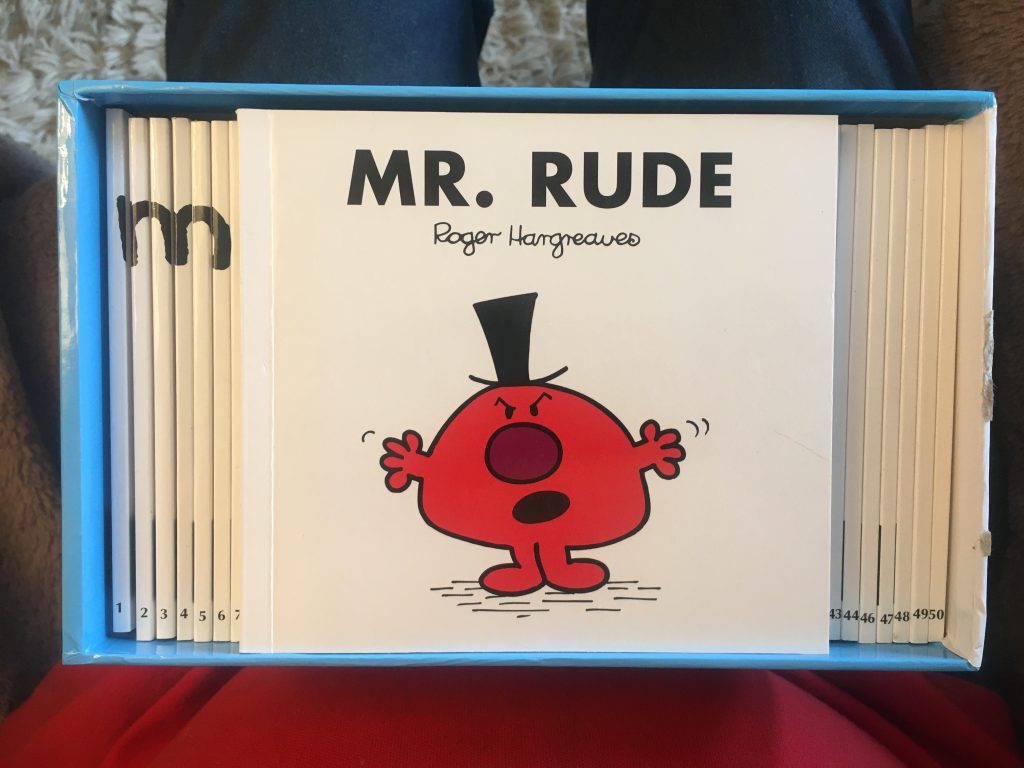
First I read Mr Rude, a later title (as was Mr Nobody), which I hadn’t had or read as a child, as it’s far more recent. Mr Happy forces himself on Mr Rude, as a house-guest, eventually helping Mr Rude find his better self. Lovely!
Delightful!
Teresa wanted me to read Mr Uppity. This is one I did encounter first many, many moons ago. Roger Hargreaves’ delightfully playful works occasionally use what Tolkien called ‘fairey’. And here we find Mr Uppity visiting the Goblin Kingdom, and thereby learning to be politer and nicer.
Utterly charming, and conveying simple homely morality, wonderfully illustrated in such a beguilingly naive and simple manner. Just lovely!
I told myself that, at least in part, I was getting these as illustration work type reference material. And so it is. But in truth I just love these books. And I’m very happy to own this set. Both as possible inspiration for my own work, and as little gems in their own right.
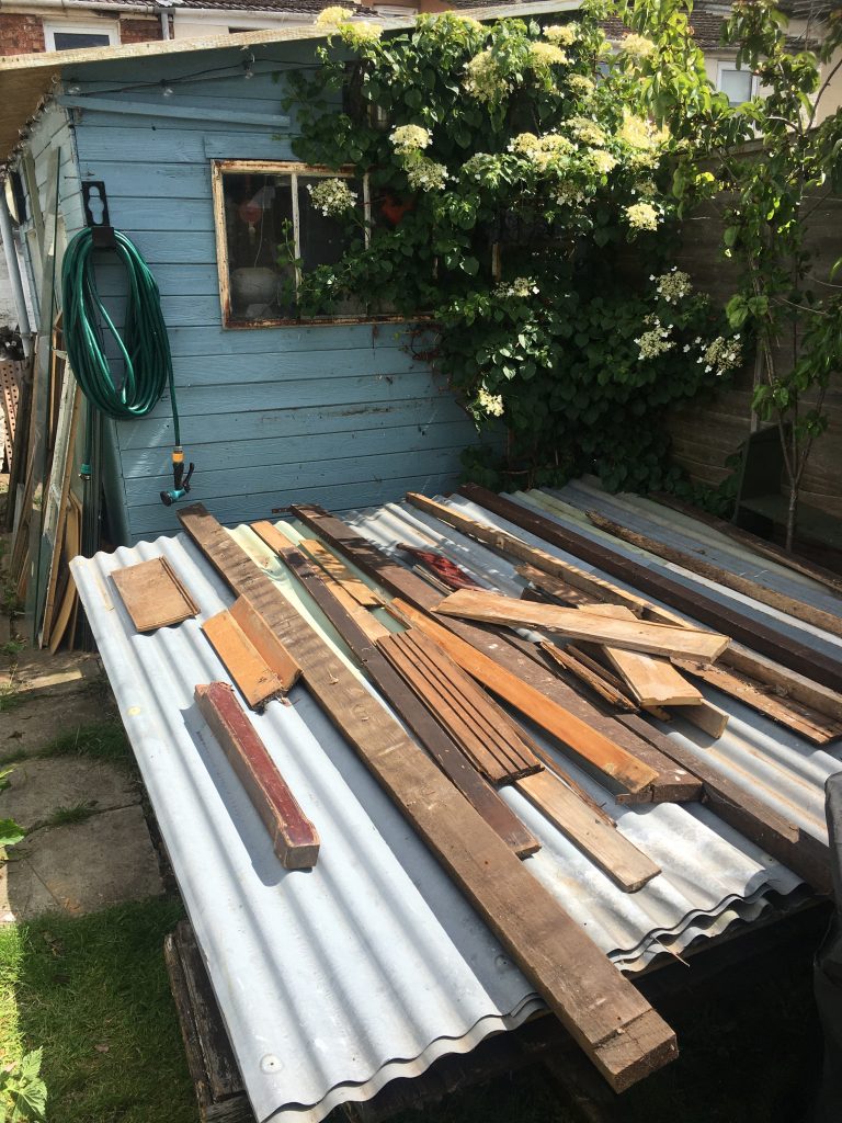
The blue building is my current/old shed. The pile of stuff on the ground is the new one!
Yesterday old school friend Trevor very kindly helped me move Ken’s old shed from his new place on Norwood Road to our home. Cheers, Trev’!
It doesn’t look too impressive (pictured above). But then you can’t actually see it, as it’s all under the roofing materials. The wooden crap on top is only there to stop stuff blowing away!
Ken, on a recent visit.
Thanks also to Ken, for the shed itself, and for very patiently storing it in his garden for a good long while! And also to Ruben, our neighbour, who helped us unload when he saw us shifting the panels.
Moving the ‘new’ shed highlighted the dodgy wiring to the current shed, which is overhead, and got in the way a bit! And access to the garden via the communal back passage-way (snigger) was always going to be hard work.
Next up I need to do the concrete base. And then it’ll be time to start restoring and re-assembling the shed itself.
Trevor, on his smallholding, just outside March.
Anyway, we’ve been very lucky. A free shed, and a free move of said shed. That’s really something. And Teresa and I are very grateful. We were also lucky with the weather. Amidst frequent rain showers, some very heavy, we enjoyed a sunny spell for the actual move. The heavens just opening as we finished. Result!
I wish I’d got some photos of the process of actually picking up and moving the shed. I should’ve had Teresa ride shotgun, with some form of camera, recording the happy event! But the activity of doing it all was quite demanding, and chased all thought of documenting it from my mind.
The garden, looking very ‘green and pleasant land’-ish.
The weather has been very changeable, and drowsily muggy, of late. When it’s not cloudy and raining, it’s warm and sunny. And the two states have been alternating rapidly. Just now we got back from a little lunch break in the sunshine, and boom, the rains cameth down.
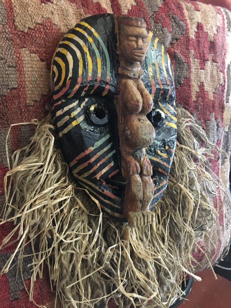
Up on the wall, finally. The (nearly) finished new look.
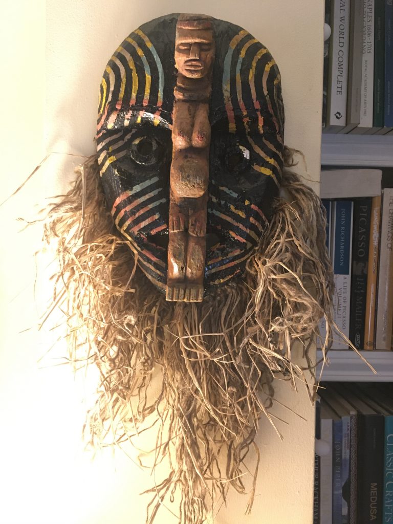
I thought I’d posted about this project before, here on my blog. But I can’t find any such entry! (I may have to go back and remedy that?) Anyhoo… here’s a ‘second’ instalment on the subject.
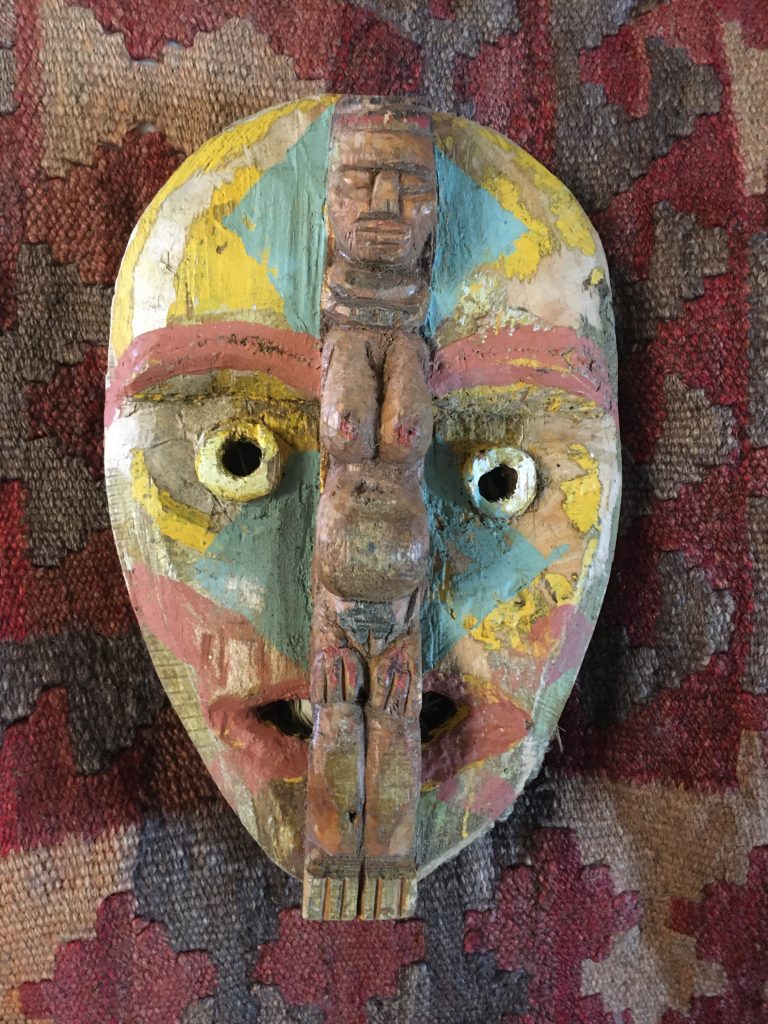
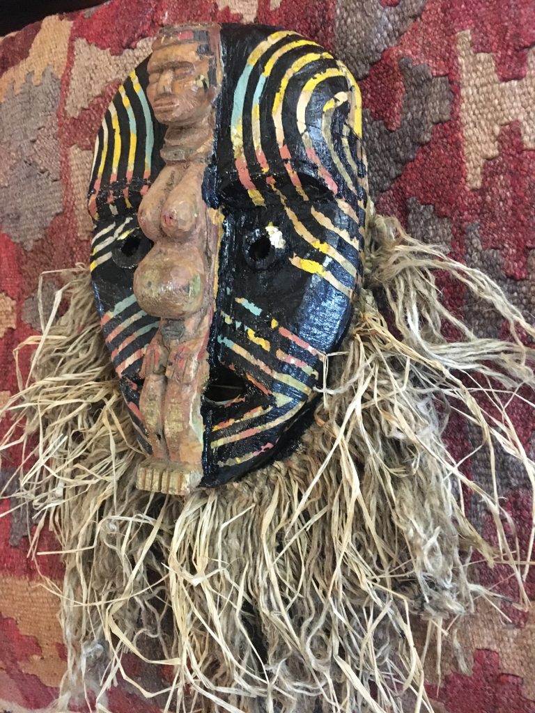
The original project was something I did several years ago, after buying a book in Heffers, Cambridge, on African masks. I bought that book even further back, a number of years earlier, with the intention of trying to replicate some tribal type African artefacts for decorating our home.
How the ‘face’ looked at start of play, with the ‘beard’ tucked away.
As as ever with my artistic projects, I’m not at all happy with my efforts. This is something that has generally stymied me in this department all my life! Indeed, lack of self-belief has grown to such an extent that I just really don’t do any art anymore. Same with the music.
Anyway, whatever. As folk say these days! For what it’s worth (or not?), this is my attempt to do something with this mask to make it such that I do like it. I’d like to say I don’t care. But the truth, as always, is more nuanced and complex than that.
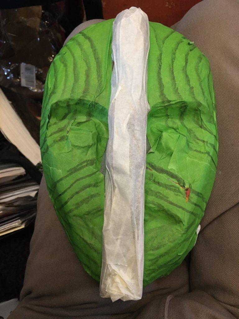
The mask, all ‘masked’ up, and marked up!
This is how it is at present. Or rather how it evolved today. Even in its first stage it went through several separate steps. As I searched for the elusive something. The basic design is a mish-mash of elements from various masks in the reference book.
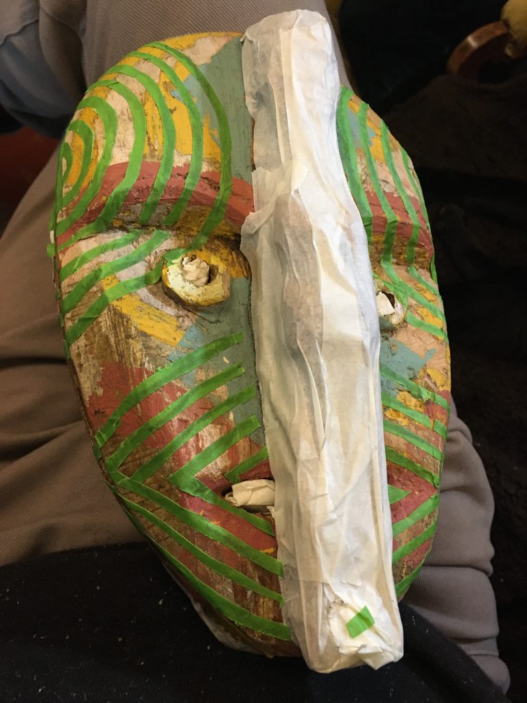
Today’s stages were first: masking off the ‘beard’/back of the mask; then masking some striped patterns on the front face; painting a black gloss coat over the front; and finally the tape is removed, and… ‘wallah!’, as many folk have it in Franglais.
Looking quite weird. But I quite like the green stripes.
I think it’ll need ‘knocking back’ or ‘weathering’, as it’s poss’ a bit too stark or pristine as is. Anyroad, I definitely do like it better now. I’m still not very happy with it. But an improvement is something. And it’s my first attempt. Maybe I ought to just move on to a second? We shall see…
From the right side.And the left.
I’ll let the latest layer dry overnight. And tomorrow I’ll work on weathering it a bit. Sanding, scraping, maybe some brown (strong tea?) washes? Then I need to work up some kind ageing or patina. Hmmm!?
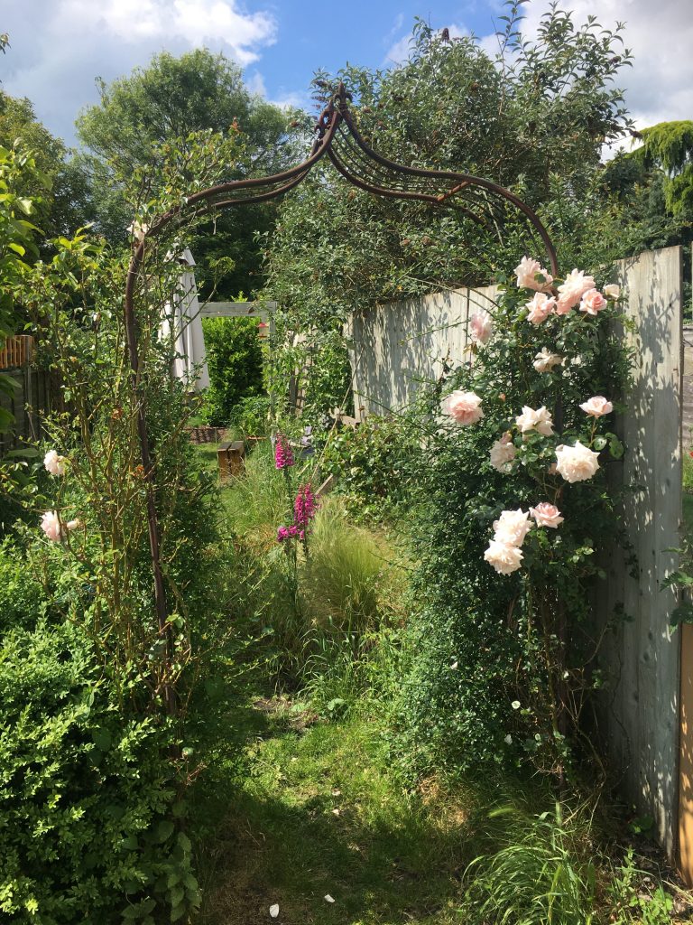
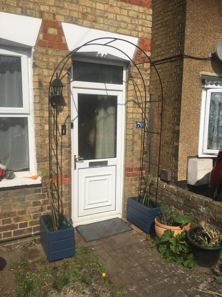
Teresa’s been on at me for a good while to make two planters for our two wisteria, and the front door arch she recently got for us.
I’ve been putting it off on account of not having the right timber to hand. We’ve been looking out for free pallets. But failing to find any. So I just went ahead anyway with what was at hand.
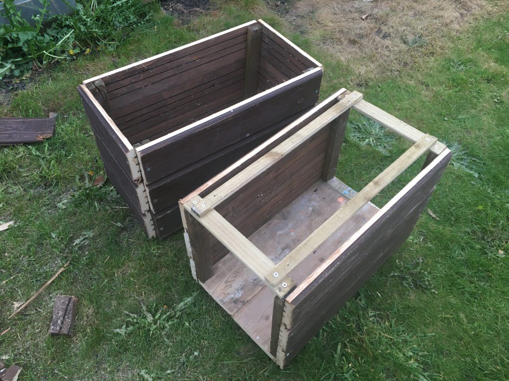
The building stage .
I used reclaimed Victorian floorboards we got free (Freecycle!) many years back, for the base. And the sides are made from cladding from one of our pal Ken’s outbuildings. I didn’t really want to use the latter wood. But needs must!
The cross-members over the top of the front planter, in the photo above, help keep things square whilst I add side panelling to the corner braces.
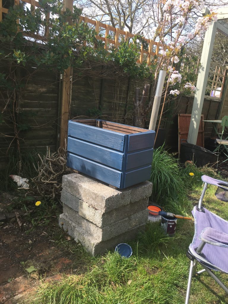
Painting the planters.
They’ve been given a double coat of outdoor paint, had drainage holes drilled (and painted, to hopefully stop or slow ingress of water!), and are lined with weed suppressing fabric, with a bit of gravel for drainage/ballast at the bottom.
We’re hoping the fabric will extend the life of the planters whilst allowing water to flow fairly freely. We’re also hoping that moving the wisteria from their pots into these planters won’t traumatise them. They appear to be growing very well!
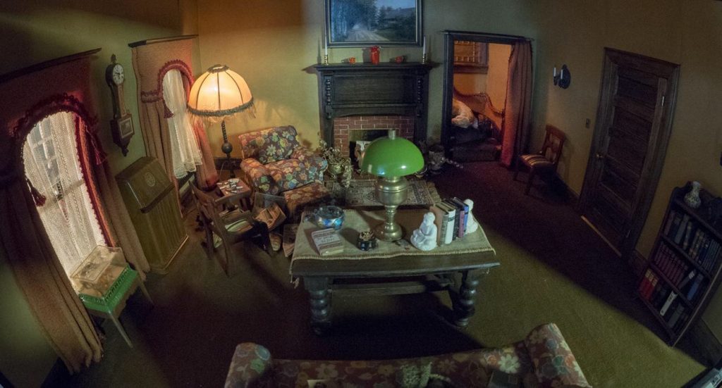
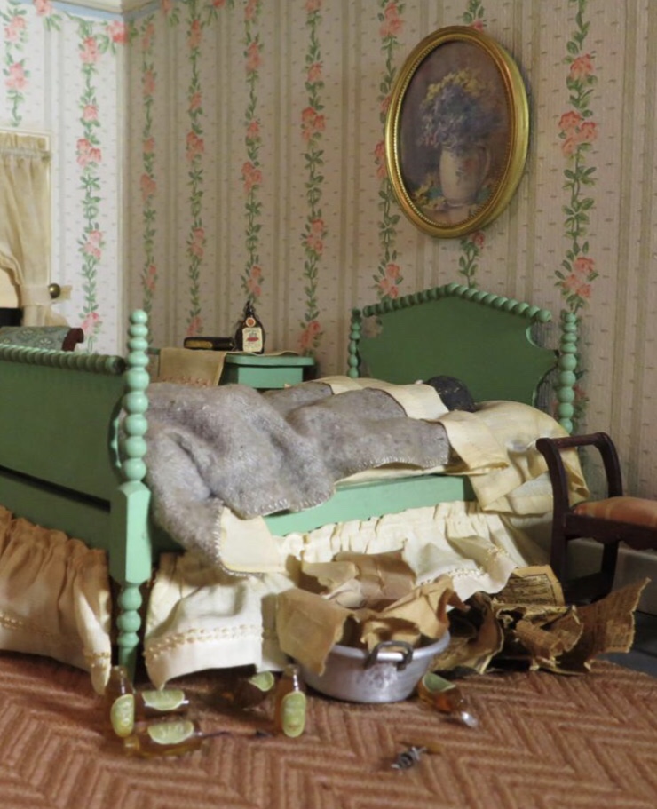
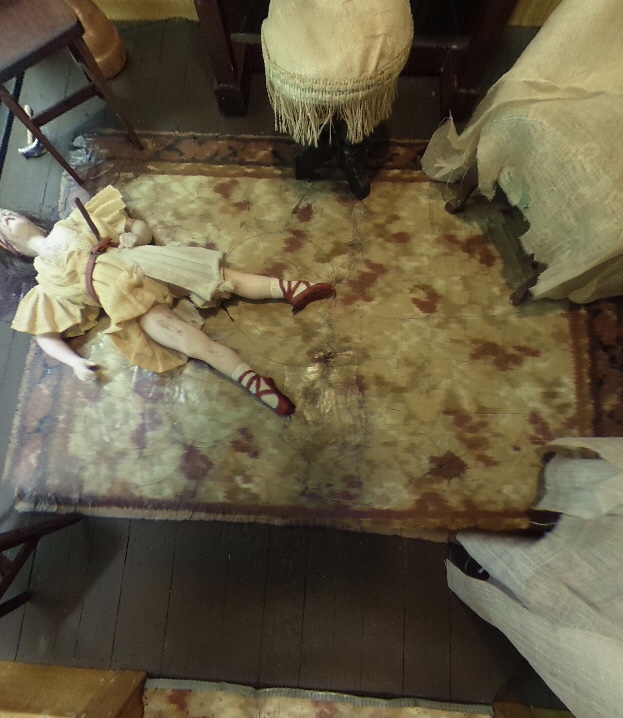
An innocent enough looking scene, at first glance.
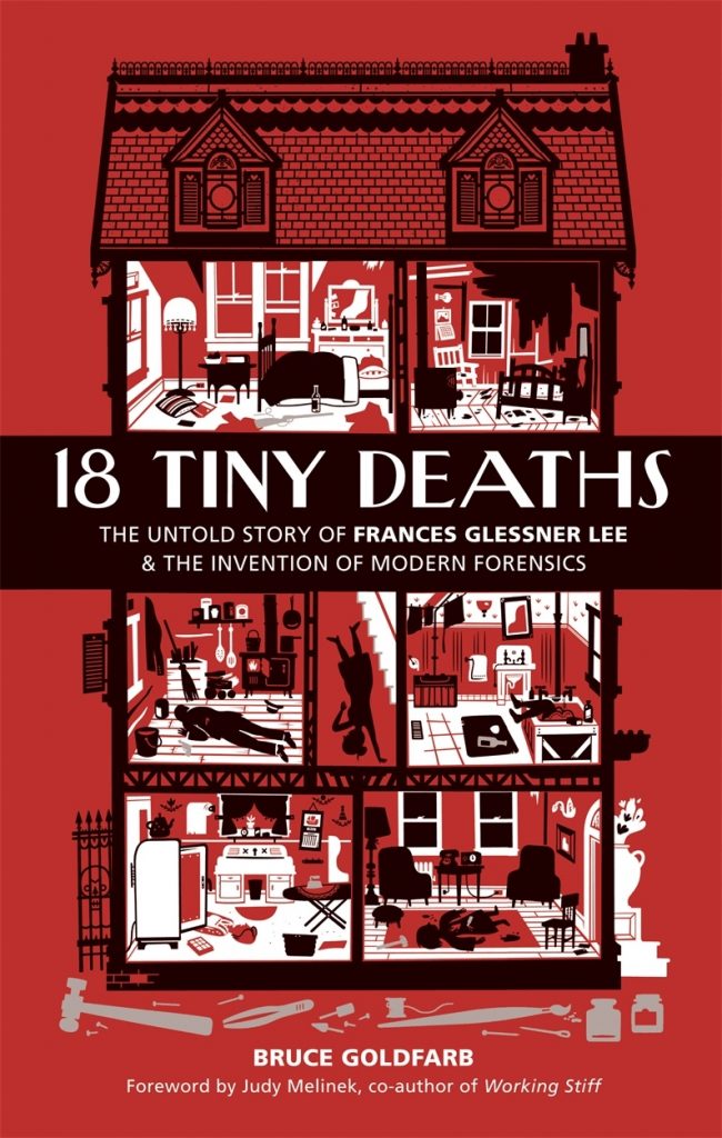
I stumbled upon Frances Glessner Lee yesterday. What an intriguing character!
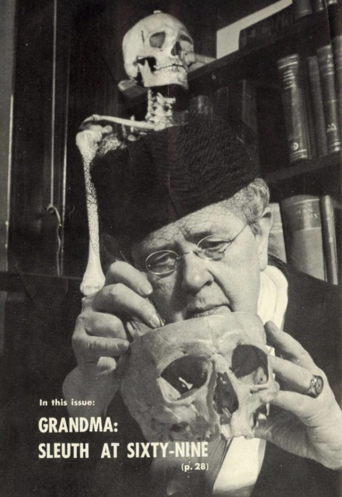
Not sure what the magazine is… great cover tho’!
Often called the ‘mother’ of American forensics, amongst her other accomplishments she created a series of 1:12 models, beautifully realised dioramas, but very unlike your typical dolls’ house.
The attention to detail is astonishing.
Most of the images in this post were harvested via a visit here. That link takes you to a Smithsonian Institute webpage about an exhibition of Lee’s ‘Nutshell Dioramas’, which includes a short film, some 360° panoramic photos you can explore (for five of the 20 extant ‘nutshells’), a little essay on Lee’s life and works, and a photo gallery of the dioramas.
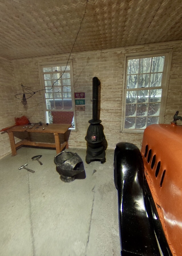
This scene is in a garage (alongside another room).
I won’t tell the stories that each of these scenarios depict. Some are murder scenes, some suicides, some ‘cause of death unknown’. You can visit other sites for that info.
I love these for how bizarre they are, combining a fascination with death/crime, and miniature modelling. They were, so the story goes, designed to help teach forensics, by giving the eye scenes to work over.
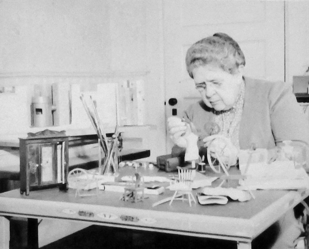
The rather dowdy creator at her amazing work.
As the photo of Lee at work shows, she built these herself. I believe she also had help from some others. For example her carpenter helped with the manufacture of certain wooden components.
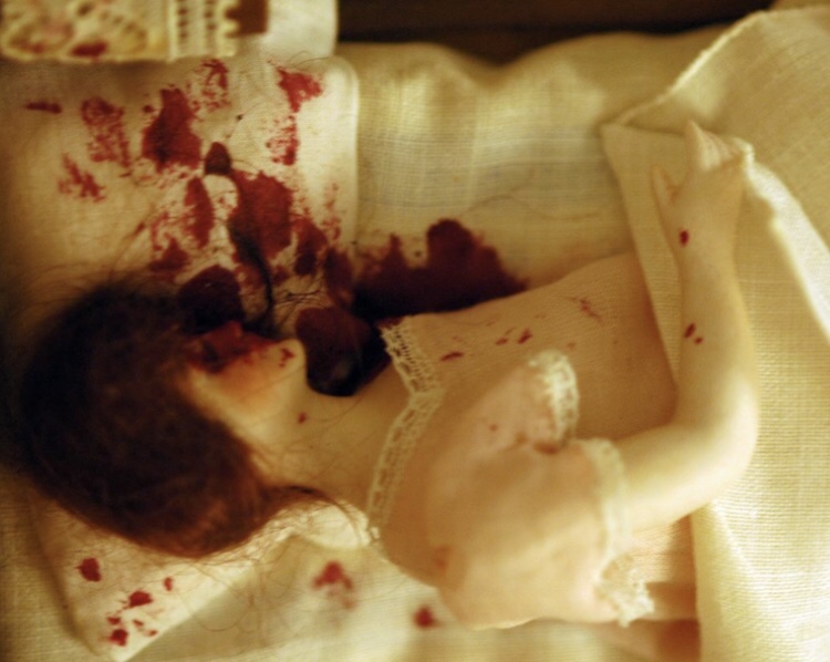
The detail is, as I hope my selection of images shows, pretty extraordinary. Once again, these recreations of actual historical scenarios differ from the chintzy fantasies of the more normal dolls’ house in that they depict real life, or rather death, in genuine domestic environments.
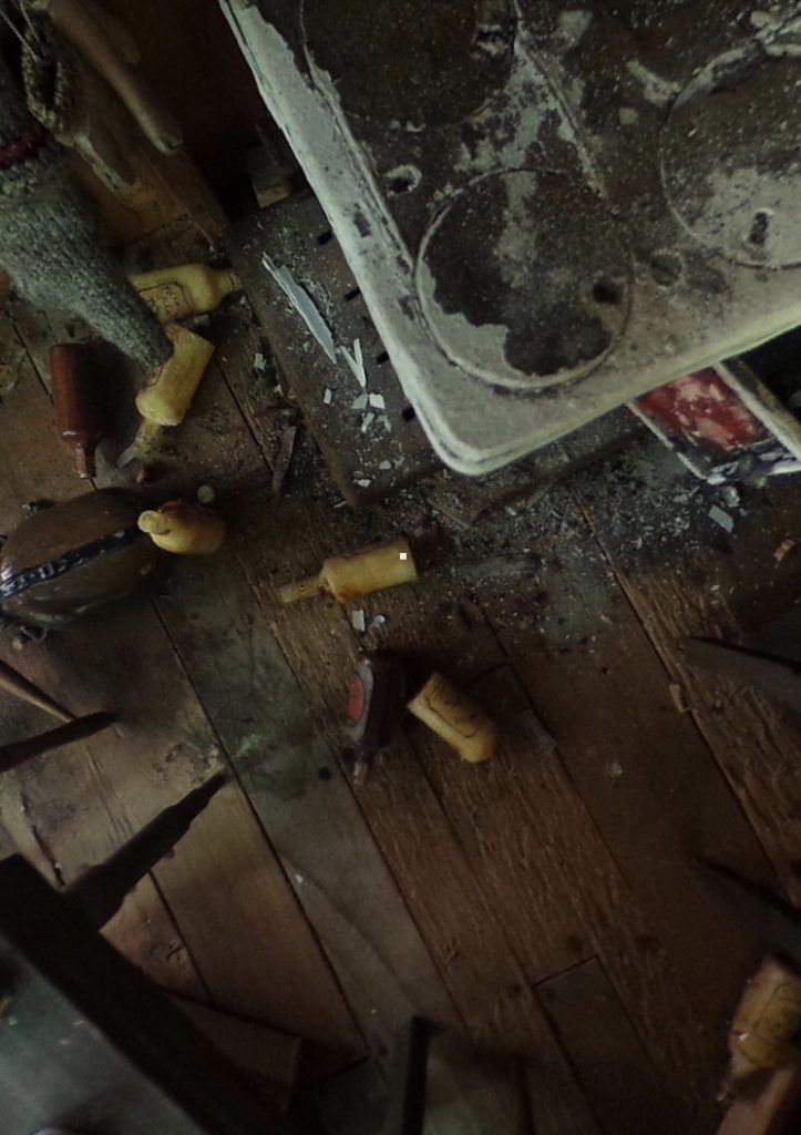
A messy scene in a shack.
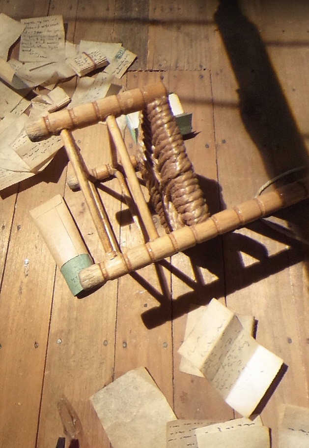
The detritus of everyday lives is often to be seen littering scenes: empty booze bottles, scattered paperwork, clothes and furnishings not curated for display, but in a more private disarray.
Note all the empty bottles by the bed.
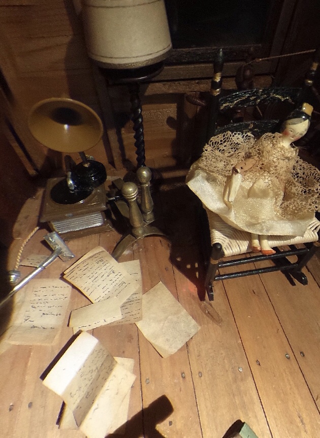
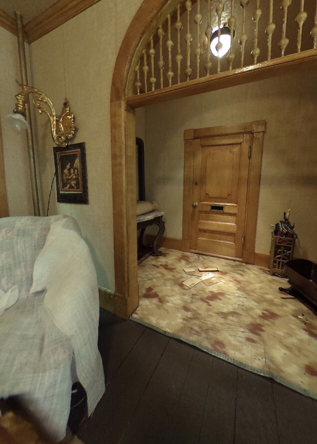
But even the stuff not associated with the demise of the bodies – and all these scenes include the dead, despite my focus on other aspects of the scenes – is lovingly rendered in terrific detail. We can see specific books, newspapers and magazines, and the interior scenes range from a rough ‘n’ ready log cabin, or a wooden shack, to a pretty large and swanky garage; from flophouses to middle class lounges.
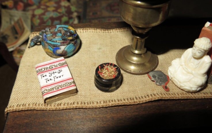
A Sherlock Holmes novel, matches, and a Buddha.
I love models and model making. I always have. And I have a definite soft spot for oddball or artsy takes on the making of miniature worlds. France Glessner Lee’s Nutshell’s definitely meet these criteria!
I’d like to get/read this, at some point.
There are one or two books on her, and these fascinating works of hers specifically, which, in the fullness of time and funds allowing, etc, I’d love to check out.
Here’s a full list of her mad little models:
• Attic (24 December 1946)
• Barn (15 July 1939)
Barn – Rather macabre!
• Blue Bedroom (3 November 1943)
• Burned Cabin (15 August 1943)
• Dark Bathroom (November 1896)
• Garage (7 January 1946)
• Kitchen (12 April 1944)
• Living Room (22 May 1941)
• Log Cabin (22 October 1942)
• Parsonage Parlor (23 August 1946)
Parsonage Parlor – the prim gentility of this lobby…… doesn’t quite prepare one for this scene!
• Pink Bathroom (31 March 1942)
• Red Bedroom (29 June 1944)
• Saloon & Jail (12 November 1944)
• Sitting Room & Woodshed (25 October 1947; thought lost and rediscovered in 2003[11])[6]
• Striped Bedroom (29 April 1940)
• Three-Room Dwelling (1 November 1937)
Three Room Dwelling – One of the bloodier scenes.
• Two Rooms (damaged or destroyed in the 1960s)[12]
Wow! I do love YouTube, for giving us all the chance to stumble across gems such as this. Thanks also to the NFB, or National Film Board of Canada.
Bill Mason, who made this film, and ‘stars’ in it, is Canadian. I have Canadian family and ancestry, on my dad’s side. So these facts set up something of a sympathetic resonance for me.
Then there’s Bill Mason himself, the man: he is, or rather was, an outdoorsman and artist, who made, I’ve subsequently discovered, numerous utterly gorgeous and fascinating films, of which this is one of the best.
The chief charms of this are simple yet kaleidoscopically rich, like the environment in which the film is set, on and around Lake Superior.
One of the things Bill addresses, a vexed issue for me, is spirituality. This was the only note struck in this otherwise perfect reverie of sound and vision, nature and culture, that – if not necessarily jarring – gave me pause for some (Indian!?) reservations.
But I’d like to take this post as an opportunity to consider a few things, and there are many, that this film either touches upon directly, or stirred in me by association.
First there are the ‘renaissance man’ and self-reliance aspects. Bill, who formerly worked as a ‘commercial artist’, was a conservationist, famed canoeist, artist, writer, family man, and all sorts. I love all of that! I have my own aspirations to living a multi-faceted life. Richer, one hopes -not fiscally perhaps, but in other better more important ways – than the monomaniac furrows our society drills us into pursuing.
So, there are many things Bill’s example encourages: to spend more time in, and pay more attention to, nature, and indeed all our environments. Art, get up, and out, and make some. Buy or build a canoe; get out and start messing about in the water!
It was also interesting to learn that Bill’s health wasn’t terrific. A sickly child, he has severe asthma all his life. And yet he didn’t allow this to stop him from adventuring. Maybe his derring-do contributed to his early demise? But then again, maybe not? And at least he lived a rich and inspiring life while he lived.
Some might laugh reading this next bit. And it may indeed sound facile. But I truly couldn’t care less! And that’s the fact that I like his style. And I’ve gone as far as to add elements of it – some were already there, others just a little tweak in already beloved themes – to my own sartorial repertoire.
I already had the neckerchiefs (though mine are too small!), and brown leather walking boots, and many a checked shirt. But the red outdoorsman socks are new! And so too is the very particular red and black check ‘lumberjack’ shirt!
Bill’s particular style of art – he favours palette knives over brushes, and cites J. M. W. Turner as his chief inspiration and influence – is terrific, albeit not entirely to my normal tastes. But that he does it all, is inspiration. It was interesting to see that he, like myself and several artists I’ve known personally, is highly self-critical bout his work, and often destroys what others. Might regard as decent work, because he’s unhappy with it.
Then there’s music. In other Mason films he strums guitar or plays harmonica. It amazingly, one might add. And his family aren’t exactly fulsome in their appreciation (does this remind any of us of our own domestic musical life? Or is it just me!?). But for Waterwalker, the music is supplied by (?) and (?). (?) is a star in his own right. And the music totally suits the subject!
Some of it, such as the actual ‘theme tune’, might induce cringing amongst some listeners. I’d understand why. It has a ‘new agey’ earnestness. But I love it.
Another facet of the whole thing that some might find they react to differently than I do, is the whole tenor of it all. It’s definitely dreamy, romantic, and perhaps even somewhat solipsistic? And it’s no surprise such movies helped created a cult of Bill Mason. But as a ‘fellow traveller’, and sympathetic romantic introvert soul-mate, I love it all. As did critics, numerous of his films, inc’ this one, winning a variety of awards and accolades.
Also interesting to me, is how stuff like this leaches into other areas. For example, I noticed, whilst watching a recent Jack Stratton ‘Holy Trinity’ episode, on YouTube, that he had created a logo and a whole invented Vulf Films thing suspiciously akin to the Canadian NFB (National Film Board) doodad.
Just as Bill Mason’s film is simultaneously about following one’s own individual and sometimes lonely paths, it’s also about connections. Be they to nature, or each other, immediate or indirect. Love it!
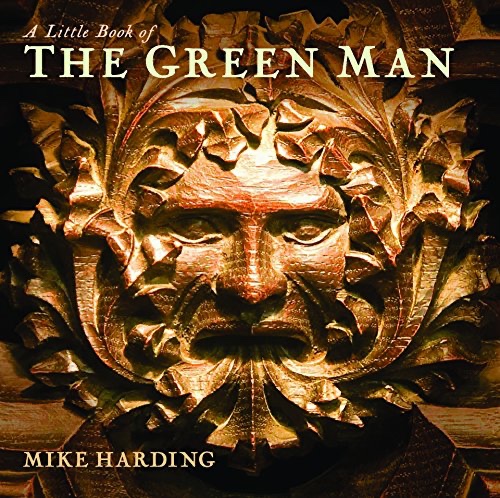
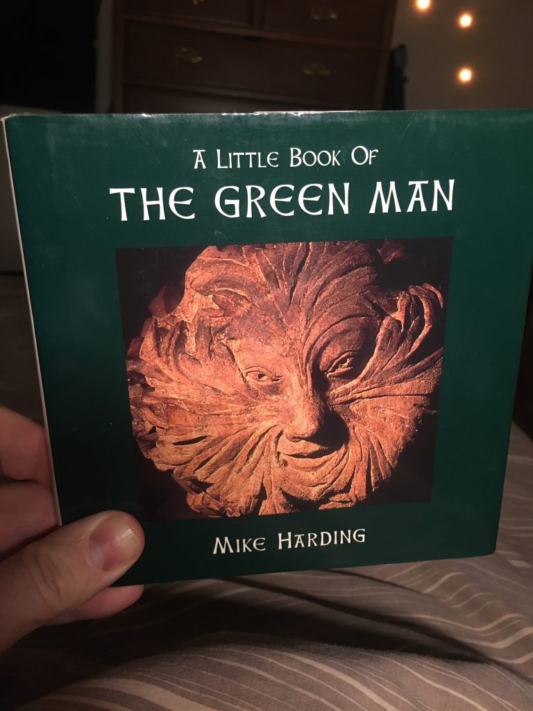
I arrived at the point of collecting a few A Little Book of this, that or the other titles, all by Mike Harding, in a roundabout way.
Having adored the Cosgrove Hall animated film of The Wind In The Willows, I was seeking out other similar stuff. This lead to Cosgrove Hall’s much harder to track down The Reluctant Dragon, another Kenneth Grahame adaptation.
It transpired that Mike Harding did the music for the latter. So I wound up checking him out a bit more. And so it was I found the series of Past Times titles from which series this comes.
An alternative edition.*
I got four – on green men, gargoyles, misericords and tombs and monuments – all of which are roughly six inches by six inches square. So far I’ve only looked at this Green Man entry. It has approx 60 colour images of its subject, along with a little explanatory text for them all.
I hope they’re all as good as this one. It’s delightful. Harding speculates on their origins, meanings, etc, and the ways in which green men can be found in many traditions and places. But his main focus is on how these so very pagan images populate so many Christian sites in the UK.
A rare full-bodied green man, St Leonard’s, Linley, Shropshire.
And he also draws some more secular and even up to the minute inferences from the study of his subject; ‘the Green man … has a story to tell – if only we knew how to listen.’ Amen to that, brother Harding, Amen!
A great little gem of a book. Highly recommended.
* A better and nicer cover image and design than the edition I wound up with, which is pictured at the top of this post.