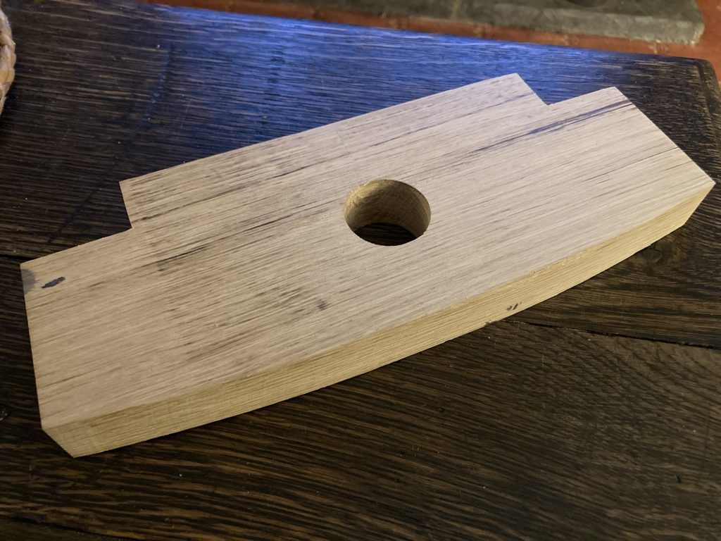
First thing I did today at Shedders & Fixers (hereafter S&F) was put my current project, a Paul Sellers style router plane – pics one and two below – through the drum sander. Thereby achieving a uniform thickness.
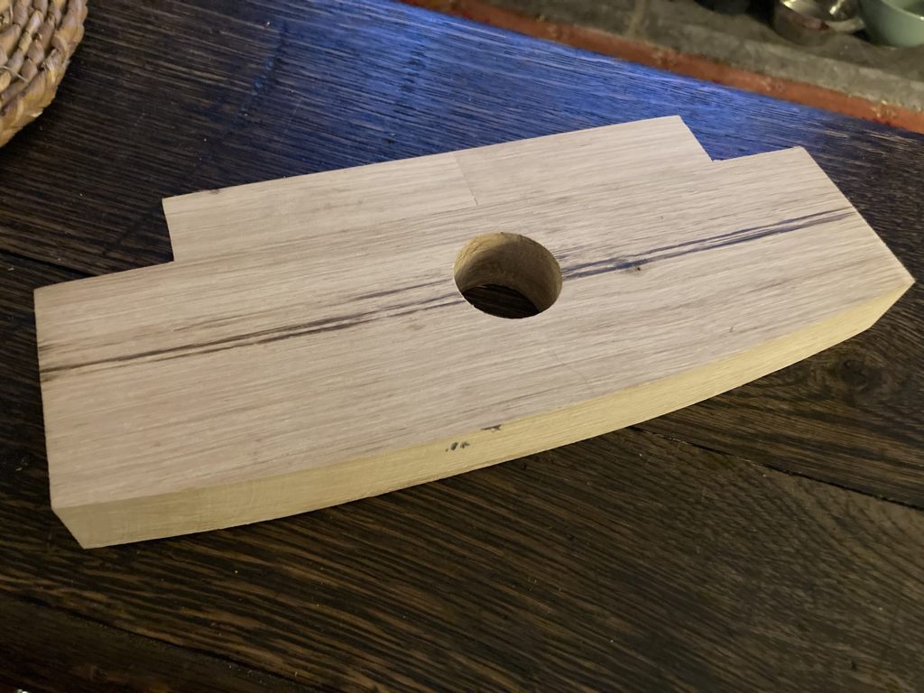
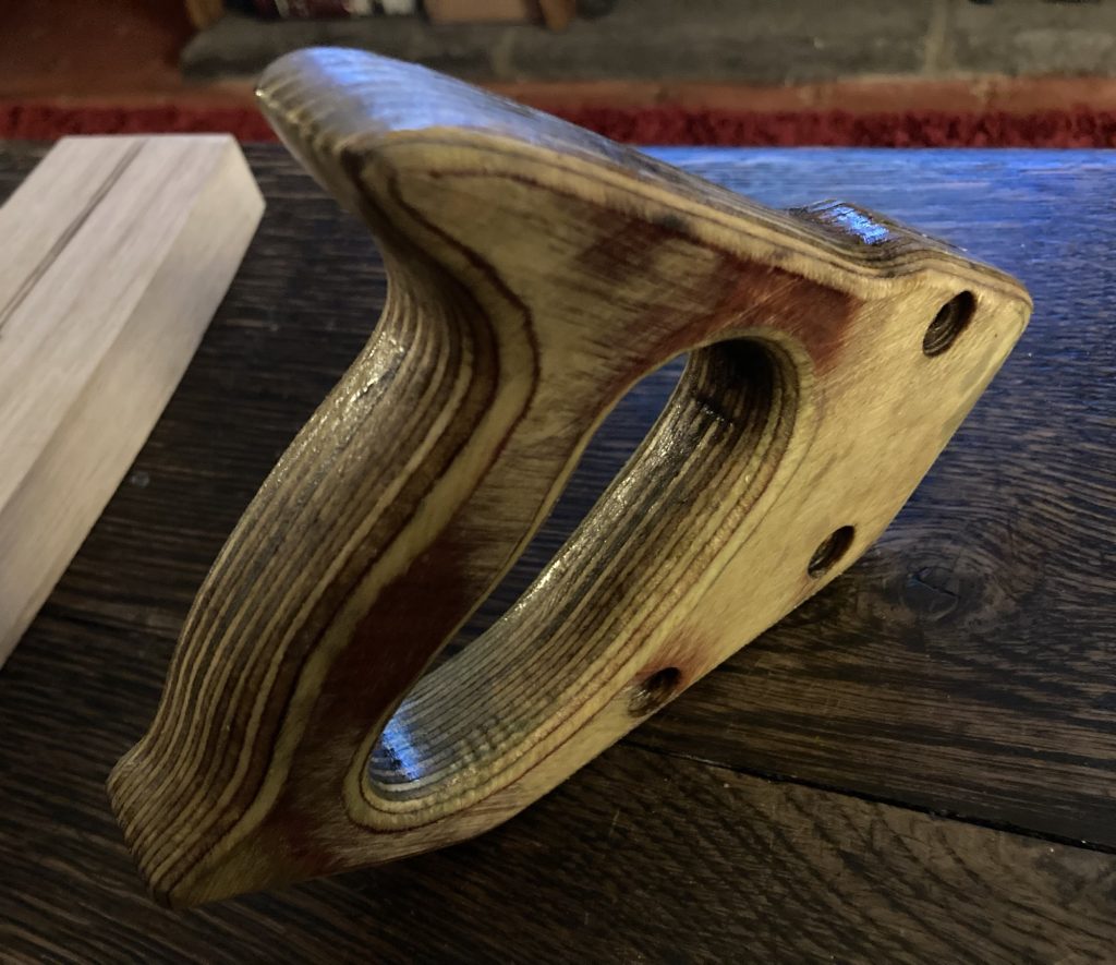
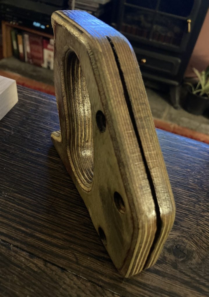
Second thing I did was take off and re-work a plywood saw handle, as shown in pics three to six, above. I made this some years ago, to replace a broken handle. But it was way too thick, and not terrifically well formed.
The drum sander once again did sterling service, bringing it down to a much better thickness. After thinning, I spent most of the rest of my time at S&F today shaping said handle; making it look and feel nicer.
I think I’ve put about five layers of shellac on it. But I’m not 100% sure? I really like how it looks; the way the shellac makes the plys ‘pop’!
The top four photos below show some rather nasty holes in the Keruing parts of this particular shell. Top row, as they were; below, after chisel clean up.
The bottom four photos, above, show other lesser bits of shell damage (pics five and six), and dowels that are no longer fully flush (seven and eight).
In the gallery below, pics one and two see me carve and fit a repair using the wrong wood (rosewood). Oops! Pics three and four I’m back using Keruing, aka the right wood.
Effecting repairs.
Somewhat to my own amazement, I think this drum may turn out ok. Despite all the traumas and setbacks it’s suffered.
Cheesecake and ice cream. Yum!
Leftover paella from yesterday’s family visit (Hannah and Tim), for dinner. Then a lovely pudding. And now I’m in bed. Could do a lot worse!
I’ve no idea where or when I acquired this particular saw! I’ve got quite a few saws. And I forget all the occasions on which I’ve found them. Mostly – this one included – they are freebies!
Above, the ‘before’ state.
Lightly sanding the handle.
I took it apart, to clean and restore it. The handle has some damage. Just about visible above. More obvious in the pair of ‘after’ pics, below.
Complete, left; damaged, right…
But I’m getting ahead of myself! Back to the restoration, in progress.
Blade and screws in a vinegar bath.
The metal bits went in a white vinegar bath, to get rid of the rust. I put a coat of pre-stain, and then a layer of shellac on the handle.
Above, the ‘after’ state.
I’ve tried to preserve some of the patina and character of the handle, whilst also improving it.
Interesting grip…Am I holding it right?
Having put it back together, I still want to do at least one more coat of shellac. Poss’ more? The blade needs oiling, to prevent re-rusting.
Blade and screws/nuts oiled.
After oiling the metal parts, or at least the blade, I put a second coat of shellac on the handle.
The final job – tomorrow, perhaps? – will be sharpening the teeth. I doubt I’ll bother ‘setting’ them…
Hannah and Tim visited today. Which was lovely. So cooked a hoooge paella. So massive it spilled all over the cooker. And for pud we had an apple tart Tim brought over, with ice cream. Very nice!
Later on we sat out in the garden, and had a wee fire. Before going back in and watching a Bilko episode. And then they were off…
I was at Shedders & Fixers today. I wanted to finish my new oak mallet. Which I’d worked on yesterday – cutting out the two channels for the handle – and laid out, for shaping today.
Let’s hope she holds this time!
I did the shaping at S&F. And all seemed well. But when I tried to drive the handle home, it split the mallet head along the glue line.
Top end.
Some mark-up lines are just visible. Even after sanding/shaping. At this point I was pleased as punch.
The above photo clearly shows the curve of the top, and the inward slopes of the sides. The latter disappear in the image below. A trick of the perspective.
Bottom end.
Note slight round-overs on the base of the mallet head.
Shaping and sanding the handle.
Once I’d split the head, I spent ages reworking the two channels, and the handle, as well. Until they all fitted together without glue. Hopefully after this second glue up, the handle will seat itself properly, wi’out rending the head in two.
Whilst working on the oak mallet, I took my glasses off, and – very dumbly – put them on the ground.
I them promptly forgot I’d done so, and stepped on them. I bent the left arm to almost 90° out of alignment, and cracked the frame, so the lense fell out.
I managed to more of less straighten out the bent arm. Super glue, so called – ha! – failed to bond the frame. As did hot glue. Third time around? Araldite epoxy.
That’s what’s currently holding the specs together. Along with some wound around masking tape… will the epoxy hold, once the tape comes off?
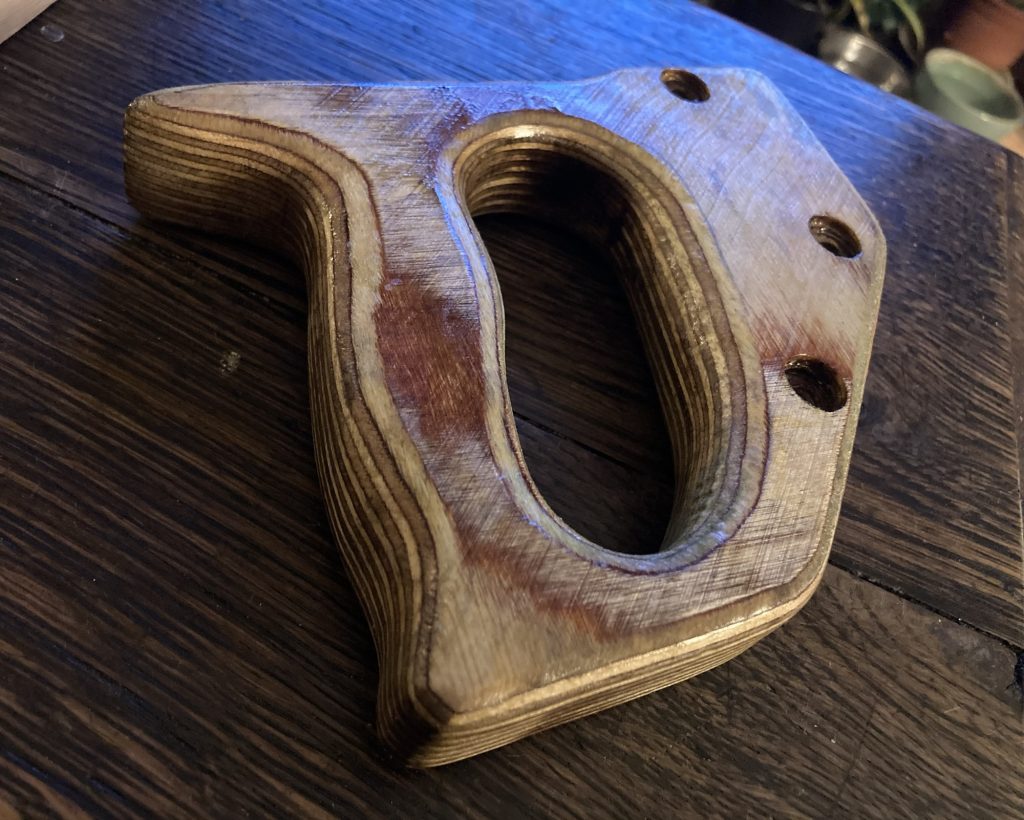
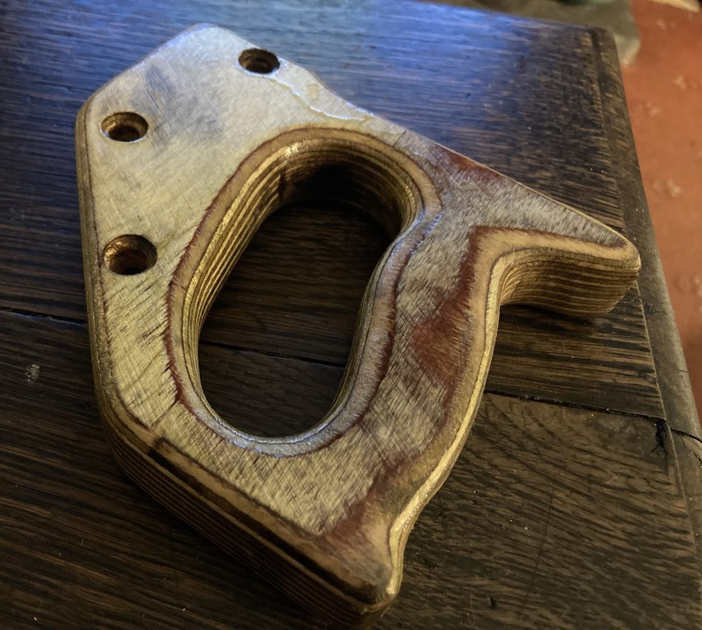
I’ve had a particular issue causing me problems for aeons. The screws holding the baseplate on my Titan TTB591ROU router are totally non-standard and weird. Neither I nor anyone in numerous hardware/engineering shops can find a match.
This means I’ve been unable to mount the router on any kind of alternate baseplate, workstation or jig. And I need to do so. I finally snapped, today, and decided – ‘cause it’s holding up my workflow with my current snare drum projects – this must be fixed.
Note swarf, produced by the tapping process.
The solution: enlarge the (approx’) 3.3mm threaded holes to a standard M4 thread, using a tap tool. To my amazement, this seems to have been both simple to do, and… successful.
The router is now fixed to the ‘underside’ of the jig I’m making, for routing inner bearing edges.
I first learned about Hermeto Pascoal thanks to his early ‘70s collaborations with Miles Davis. Two studio tracks (most of the album is live recordings) – ‘Selim’ and ‘Nem Um Talvez’ – both by Pascoal, are included on the 1971 Miles release, Live/Evil.
On an album of Miles’ post Bitches Brew stuff, that’s veering ever closer to ‘Free Jazz’, Pascoal’s influence brings a beautifully lyrical and gentle Brazilian vibe to proceedings.
Featuring Quarteto Novo’s ‘Misturada’.
My next encounter with him came via following up leads provided via the Blue Brazil series of releases, from Blue Note.
The track ‘Misturada’ enthralled me. And eventually I tracked down and bought the sole release by Quarteto Novo, from which it came. A terrific album.
50th anniversary CD reissue leaflet.
Along with bassist Theo, and guitarist Heraldo, this short lived group included two soon to become legendary Brazilian musicians: percussionist Airto Moreira, and flautist/multi-instrumentalist, Hermeto Pascoal.
Hermeto, Heraldo, Airto and Theo.So young! Before all the hair!
The series of images below show the later hirsute Hermeto most people are more familiar with. These images also remind us of his multi-instrumental prowess…
Pascoal’s music ranged far and wide. From minimal and mellow, to orgiastic free-improv’, and taking in a huge range of expression in many modes, often marked by a pronounced freedom to experiment.
I don’t always like the results. But I always admire the freedom, and the questing spirit that motivates and informs his music.
Pascoal is one of the many musicians to have passed before I got (or rather made/took) the opportunity to talk to them, for my long mooted book on music of the early ‘70s.
What a week it was, this last week. On Monday I had a… By Wednesday… And then, come Friday, well… Suffice to say, disaster struck repeatedly.
Gaaah!!!
This second breaking of the second snare drum – fool that I am I tried flattening it using the thicknessing machine (way too brutal!) – was the worst yet, because bits of shell, albeit only time fragments, vanished.
As the ratchet straps in some of the above pics show, I glued the shell back together, again.
The four pics above are from after the latest shell glue-up. There are small bits of both the inner and outer farces that have chipped off. Less disastrous in the inside, perhaps? The larger chunk missing on the outer face might be more of a problem?
Several dowels popped out, as well. I had to gently tap them back into position. One or two are still not 100% flush.
These were stuck in the nut… jammed fast!
Today I finally got the over-tightened nut on my router loose. It took literally days of effort. But dogged perseverance eventually triumphed.
These arrived today.
A couple of days ago a collet adapter – 12” to 8mm – arrived, via Amazon. And then today the above set of six router bits dropped thru’ the letterbox.
But of course I had to get the stuck bit out, and the nut loosened off, before I could cut out the plate attachment area on