ART: Caravaggio

Wow! Such a powerfully beautiful composition!

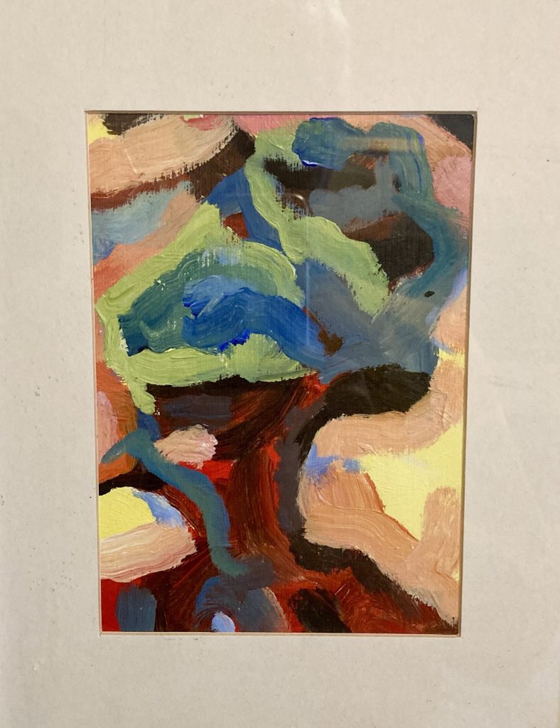
Mention of Caravaggio in a recent post set me to poring over a couple of art books we have on this incredible artist. I recently mentioned in another post having sketched a pencil version of The Conversion of St Paul years ago. But I’d like to try and paint it, as well.

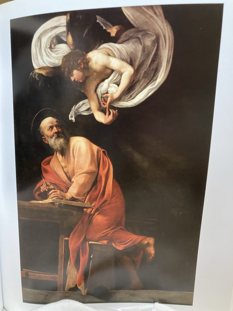
But whilst perusing Gilles Lambert’s Taschen 25th title on Caravaggio just now, it was Saint Matthew and The Angel that really clocked me one upside the head. What an incredible composition! Flat and empty to the point of being almost frieze like. Yet rich with light, shade, colour and volume.

The rendering has the strength of sculpture. And yet is richly vibrantly colourfully alive. Caravaggio’s eye and aesthetic sensibility imbue his art with an intensity that I can only reach for poetically: chestnuts, leather, velvet, red wine, red meat, incense, lace or muslin, the scent of candle wax and smoke.

Incredibly dramatic!

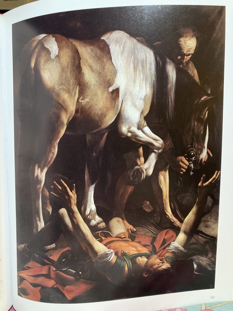
In both St Matt and The Conversion the pictorial space, whilst rendered with surreal photo-realist clarity, remains so shallow as to be effectively flat. I love that! It’s simultaneously modern, and timeless. It lives in the present.

As many have said, including my hero, Picasso, the best art of any era is most potently alive in whatever ‘present’ the viewer sees it. Great art loosens the shackles of short-lived fads, or era-specific parochialism/opacity, and rises above time!

Details of Victorious Cupid, 1602.

Some of Caravaggio’s stuff looks, to my eyes, very blatantly homo-erotic. Check St Paul’s torso in the painter’s two versions of The Conversion. When the subjects are young male nudes of a childlike appearance, that can sit rather awkwardly with current social mores, and indeed laws.

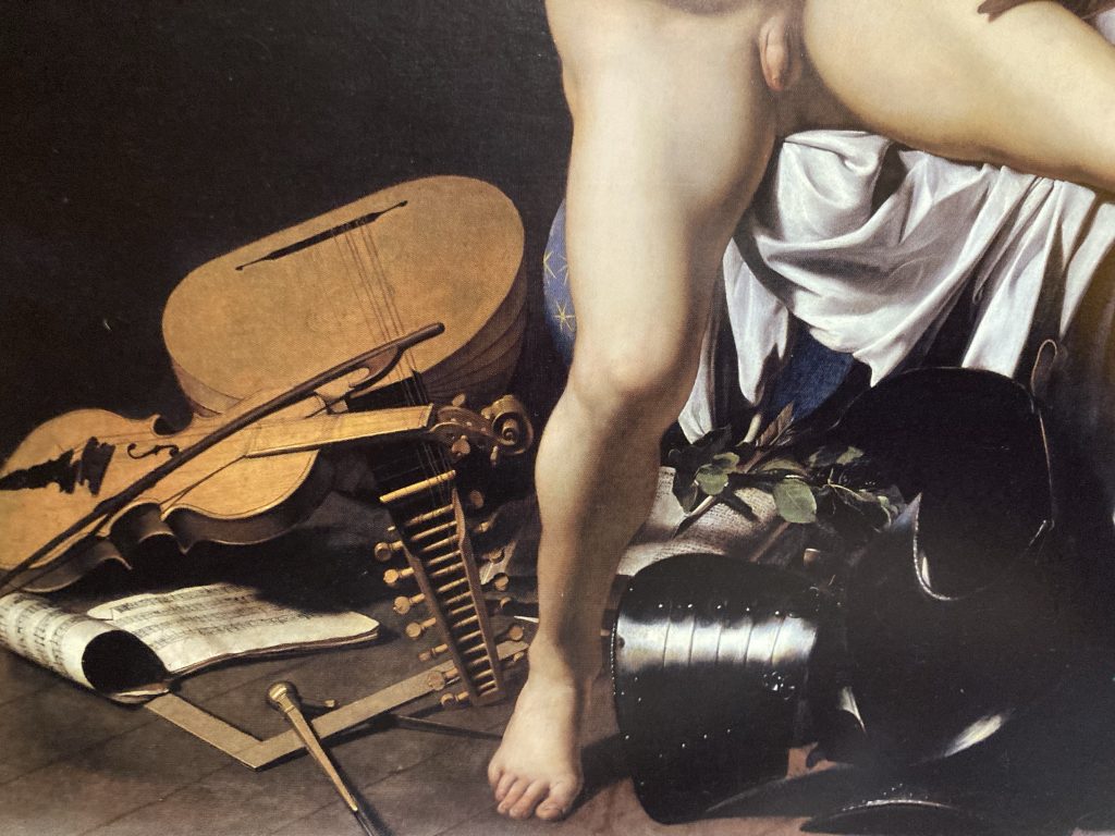
Victorious Cupid is a bit icky, to me. I call it Cupid Scratching His Arse! But it’s still an amazing artwork. And just look at the detail in the lower part of the painting. The musical instruments, armour, and textiles, are like a somber symphony in paint!

Anyway, it’s great to be nourished by fabulous art. I am very grateful for the luxury of being able to indulge in such a hedonistic yet refined pursuit!

ART: More Aulde Stuffe

Manolo, Spread #1.

Without checking back, I think this little series of sketches, again from a decade ago, started with looking at an El Greco painting.

He distorted his subjects a fair bit, in a series of ever more stylised manners, as his style evolved. Taking his distortions as a starting point, I have, from the get go, been distorting further.

Manolo, Spread #2.

In the second spread, at left, I went back to the source again, but this time with a slightly more cartoonish feel. The one on the right is devoted solely to the background, in particular the cloudy sky; extrapolating shapes and colours. The yellow in this image is lost a bit in the photograph.

Manolo, Spread #3.

The third spread combines further abstraction of ‘Manolo’, at left, and an homage to (or poss’ even a straight copy of) either Picasso or Braque. Picasso’s my main man. Braque much less so. Though having said that, I do like the latter’s work. Just not as much as Picasso’s!

ART: Another Old Series…

This series, in one pic.

This little series of miniature abstracts was born of spell of mental ill health. I hate that phrase, and I don’t think it really accurately captures what I was going through. But anyway, whatevs, as they say these days!

I was, rather amazingly, prescribed a short series of therapeutic art classes. As is so often the way with me, ornery curmudgeon that I am, I didn’t play by the rules – adopts Saxondale manner – this lone wolf rides to the tune of a different drummer (face-slap!).

My raison-ing was that, given I’m already a trained, even professional (occasionally!) artist, I didn’t need to do the ABC type stuff my group was doing. I just needed a quiet corner in which to pursue already established trajectories. Fortunately I was allowed to do just that.

The net results were this little serious of four mini-abstractions. They began life as an evolution from sketches of a stained glass window. In fact somewhere I’ve got an image I really like, showing how these little artworks evolved. I’ll stick that up here if I can find it!

To those with a bit of art or art history knowledge, some of my influences might be discernible? Perhaps ironically the single greatest influence on my own art isn’t really obvious in these series. That’d be Picasso. More on his influence to follow!

Some of the major influences on this approach, however, are Willem de Kooning, Philip Guston, and to a much lesser extent, some of Brice Marden’s linear stuff. There’s even a bit of Georg Baselitz in there (thanks to the influence of an old – and much missed – pal, Ben Carter). And then there are less obvious folk, like Turner, and even Caspar David Friedrich.

These aren’t the best photos. You can see the shadow of my head on them! It’d be nice to have much better lit and positioned photographs, but these’ll have to do for now!

ART: Some Old Designs

1st Spread.

Whilst doing the initial sketches for this recent commission from Abbie and Dan, yesterday, I came across some black and white ink drawings, or sketches, that are, rather shockingly, now a decade old. That’s what this post is comprised of.

The first spread is two images that I think are actually derived from the same source. The left hand one is, I think, better/stronger, compositionally. And I’ll come back to it later in the series. The right hand one is further explored in the next spread.

2nd Spread.

I’m not sure what’s going on with the left hand image, in this second spread I think it’s still derived from the same source, but possibly, flipped or rotated? Either way, it takes the whole thing in another direction.

Both of these belong to the more diffuse all over abstraction I’ve struggled with for years now. I somehow feel they have something. Something I like and don’t want to lose. But something I can’t quite put my finger on, and that’s all too easily lost amidst ‘too much information’.

3rd Spread.

Spread three sees two ‘new’ things: the left is inspired by the drawings of Tove ‘Moomin’ Jansson, whose work I love. And it’s much more obviously representational. The right hand image, on the udder hand, sees me successfully distilling some of the preceding stuff into a stronger more succinct image/composition.

I love the sixth image of this series, and intend to do a series of prints, using it as a starting point. It’s the most reductive and simplified image to have come out of a number of related series of ideas, some of which are black and white, others (to feature in another post soon) are full colour ‘miniature’ paintings.

4th Spread.

The fourth and final spread in this series is an exploration of a different source image. This one comes from the painting below, which belongs to but is also separate from the series alluded to above, that I’ll be posting about next.

These two share an imagery antecedent that is part head and shoulders ‘portrait’, part tree, part mountains, and simultaneously wholly abstract (pictured below). Once again, I think there might be grounds for or mileage in a print series coming out of this?

This one’s up on a wall at home.

For absolutely yonks – about ten years! – I’ve thought all this stuff was ok as ‘research’, but not good enough to share. Teresa has consistently said I ought to share it. I’m finally coming around to her way of thinking. So here it is!

Some of this stuff would up framed and on display, albeit only in our home(s). As of right now, only the image above is currently adorning our walls. Though I do plant I put up more original art around the house.

MUSiC: Closing Time 50!

Very tempting!

Closing Time, 50th Anniversary limited edition double vinyl release, 2 June, 2023.

Oh how I love this album! It captures Tom in a uniquely youthful and innocent mood, less gravelly, a bit more country, and utterly wonderful.

The closing title track would, on its own, make this album essential. But there are plenty of other great tunes; from the cosy bar-room sentimentality of I Hope That I Don’t Fall In Love With You, via the Tin Pan Alley balladry of Grapefruit Moon, to the ol’ timey vibes of Ol’ 55 and Rosie.

It’s an astonishingly mature and assured debut recording. And the musical team that made it help evoke a timeless beauty drawing on a whole smorgasbord of American popular music, to craft a classic recording that’s both gently obscure and disarmingly immediate and charming.

A contemporary advert for Waits’ debut.

An essential album, reissued for über fans (like me!), in a couple of deluxe twin disc vinyl formats. I can’t justify the extravagance (although it’s not actually out for a bit!), but I’m very sorely tempted.

Overall I prefer the Tom of the ‘first phase’, ie the boho-beatnik barfly romantic and philosopher, of Closing Time through to Swordfishtrombones (and maybe even Frank’s Wild Years?) to the art house carnival freak he evolved into after that.

On Closing Time, whose moody cover art is be Zappa’s buddy Cal Schenkel, we have a sweeter, softer and smoother sounding Tom. He’s already the folksy troubadour, with a big dose of jazz and blues in the pockets of his rumpled yet earnest thrift store suit.

Waits, circa ‘72.

This album is unique in that after this awaits would produce a run of amazing recordings working with Bones Howe, a former jazz drummer turned producer, who helped craft the classic early Tom sound-world I so adore, by surrounding Waits with stellar jazz sidemen (like Jacky Sheldon, Jim Hughart and the incomparable Shelly Manne).

On Closing Time Jerry Yester produced, and the band – who are brilliantly sympathetic to awaits’ material – are less familiar names, gathered together from Yester’s musical orbit. Yester also did some superb string arrangements for Tom, on this and a few of his subsequent albums.

MUSiC: Iron Maiden Go Postal!

Steve Harris must be super-chuffed!

Iron Maiden didn’t trouble my recent top five post. But back in my mid-teens I was listening to them a lot. And I still do, occasionally. Power Slave was my favourite album back then, with Piece of Mind coming next. I’m not so keen on their pre Nicko/Dickinson stuff, and I haven’t followed their later releases. By which I mean everything after Live After Death!

Still, though I’m not their biggest fan, it’s nice to see them being honoured by the Royal Mail. They have their beers as well. So they’ve really gotten into the bloodstream of the nation, and now the postal service as well!

Well done fellas! You’ve earned it. Read more about this here.

PS – Not that I give a sh*t for anything to do with royalty/monarchy. Butt… shouldn’t it be Charles’ head in profile on stamps now?

MUSiC: My All Time Top 5 Albums?

For sheer innocent sentimental sweet beauty, this is a corker!

Wow!? How hard is this!? It’s easier to pick my top few artists, Joni Mitchell and Tom Waits are no brainers. After that it gets tricky.

This one is etched into my being; melancholy beauty, at its most powerfully maudlin.
But I love For The Roses as well!

This all came about when I wanted to pick a ‘top five albums’ list, to illustrate a private posting on cataloguing my CD collection. it rapidly became clear that it was not going to easy!

J-Fusion at its slick funky glossy and melodic best.

If it were my current top five that’d be different. My most listened to CD right now, for example, is Casiopea’s debut. But I’m also listening to a lot of Sons of Champlin right now, and I’m not as sold on them as the other artists that I’m featuring in this post.

Intense, colourful, surreal, poetic, earthy. Amazing!

I know it might seem weird, but as a historic top five disc, Trout Mask Replica is definitely up there (with Lick My Decals Off in hot pursuit!). Not music I’d listen to all the time. And my honeymoons with these discs were many many moons ago. But I have an abiding love for them.

Slabs of sound, wafting through space and time, all floating atop Leibezeit’s incredible grooves.

Can’s Future Days also has a special place in my musical heart, closely pursued by Tago Mago!).

Memories of this on constant rotation are bittersweet.

And whilst I’m thinking in the longer term, like this, then I suppose Steely Dan and Donald Fagen figure large. Aja, Katy Lied and The Nightfly all being rave faves.

Ah, The Don. An almost perfect record!
Mad cover! Great album.

Apart from the Casiopea one, so far these are all song-based albums, of a broadly speaking Pop nature. If I were to pick some Rock albums, Thin Lizzy, Zep and Van Halen would be right up there (even Slayer, perhaps?).

It’s close with Lizzy, ‘twixt this…
… and this. Still In Love With You is Divine!!!

Likewise with Zep, is it this one…
… or this one?

With Zep I was equally taken with all of I, II and III. I only got into IV later, and – as brilliant as it is – (Stairway alone is priceless, it didn’t have the same visceral impact the first three had.

And then there’s Jazz…

This was massive for me in my mid-teens. Still love it.

I could go on like this. Should I go with Caravanserai, or Welcome, for Santana? With Herbie, is it Fat Albert, Headhunters or… Coltrane’s Love Supreme is up there, as is Davis’ Kind Of Blue (or back in my late teens, ESP).

And what about Brazil? Jobim, Joyce, Marcos Valle… and on it goes!

I got lost in the deserts with this one!
This ought to be a guilty pleasure. But I have no shame!

I’m finishing with one that really isn’t anywhere near the top. But to be fair to Slayer and the album, I’ve listened to it tons. Rather like true crime and serial killers – the kind of dark subjects with which Slayer themselves were obsessed – I find it hypnotically compelling. If Van Halen’s 1984 is a ‘guilty pleasure’, this is a ‘dirty secret’!

A dirty little secret…

Anyway, I can only conclude that picking a top five favourite albums is pretty near impossible! I mean, The Beatles Rubber Soul, a biggie for me around 16-18, did t even get a mention til right here at the very end!

ArT: More Gene Deitch…

The Cat… Gene’s buff, a speccy nerd obsessed with jazz!

How I feel sometimes when transcribing drum parts!
The neighbours disapprove of The Cat’s listening habits.

Non Jazz stuff…

Not sure what he’s up to here. But look at all that fab gear!

Myeah… back to his primary love, good ol’ Jazz Music!

I love this pic; bassist looks after his bull fiddle in the rain.
Ok, so I’m featuring this one again… but I just love it!
Ditto this one!

If anyone’s interested, I found this, a page with an interesting selection of record changer magazines for sale, featuring the cover art of Deitch and others.

This is one from the above linked page.
The man!

MEDiA: Gene Deitch, RIP

Gene, with sons Kim and Simon.
Fantastic!
We’ve all been here, right?
What has come to be known more recently as ‘crate digging’.

Oh no! I just posted about cataloguing my CD collection on FB. I thought I’d illustrate that post with an image by Gene Deitch, whose character The Cat was an avid record collecting jazz buff.

Deitch did some amusingly prophetic cartoons.
Haha… love this!

In finding an apt image, I discovered that Gene passed, aged 95, in 2020. I have a nice book, Cat On A Hot Thin Groove, about his illustrations for Record Changer magazine.

I bought this book about him years ago.

He also created characters like Nudnik, as well as animating such famous cartoons as Tom and Jerry and Popeye, and doing all sorts of other artistic/illustrative work. I’ve peppered this post with a few images by him I either love for their visual artistry, or their comic wit, or, frequently, both.

I got the image at the top of this post from an excellent obit’ from the NY Times, which you can read in full here.

Deitch in his Prague home/studio, in later life.
I pinched this for an Xmas card one year.
Bold abstraction meets jazzy figuration.
His Record Changer covers alone would be a great legacy.

I’ve not watched Munro (1960) – see below – yet, but as soon as time allows, I’ll be doing so (tomorrow, perhaps?*) * aka later today!

I find Deitch’s art, by which I’m mainly referring to his Record Changer and jazz related cartoons, design and illustration work, really inspiring. His mainstream animation stuff I’m much less familiar with or aware of.

But, rather madly, I’ve discovered that Deitch was also involved with one of the earliest screen adaptations of Tolkien’s writings. I love Tolkien, and I was really quite surprised to find yet another point of connection here with Gene Deitch!

As with Munro, I’ve yet to watch this Hobbit based animation. I glanced at a minute or so of it, whilst drafting this post. It seems quite a loose adaptation! But I look forward to watching it in full.

CLOTHES, etc: Green! Part 1

I’ve got a thing for green clothing right now! My 51st birthday is looming. And I really want some new clothes, to put a little cut in my strut, a bit of glide in my stride!

I love the T-shirt/vest/top, whatever the thing above is! Need to get my bloated belly in shape though, to really enjoy sartorial splendour!

I love these khaki green Converse trainers. Over recent years I’ve developed something of a sneaker fetish!

Oh, man… I sooo dig this green shirt! I’m thinking that a short shift I do delivering for Amazon can net me me one of these items a pop. Five or six extra shifts, and I can have all of these… if I so choose! The temptation is too strong!!!

I love both colour, shape and pattern of this shirt sleeves top. Is this what Los Yanquis would call a vest?

I’m really not one for ‘trackies’, to be honest. But I do love this stylish zip-top. Although I’m not gigging at present, I’m intending to start making drum videos. Partly purely for pleasure. Partly as a means to improve my playing, and partly to make more teaching resources available to pupils. And some snappy togs for drum videos is a definite must!

Okay, so these aren’t green. But, hot damn! They are super sexy. I jes’ gots to get me some of these!

Back to the green theme. Above, some really nice Adidas Hamburgs! And below, a ladies sweater that I doth covet!

Fannily emuff I am actually getting a ladies jumper for my Xmas or birthday, quite soon. In yellow:

Looking for’ard to wearing this baby!