I r thing I’ve learned going this is that the simpler the shape the better and more uniform the shrinkage.
Large complex shapes, with thin sections and appendages, tend to get very warped and misshapen. And in this instance, there are cracks as well.
After shrinking.
Bummer!
I also left some ‘connecting tissue’, which looks a bit shite after shrinkage. If I do any more of this – and it is great fun! – I’ll keep the shapes much much much simpler.
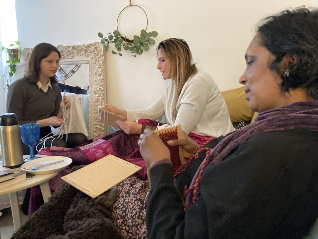
I made some very primitive weaving looms for the girls. Four A5 pieces of hardboard, with 18 holes drilled in a straight line at each end. One each for Teresa, Hannah, Ali and Sofi.
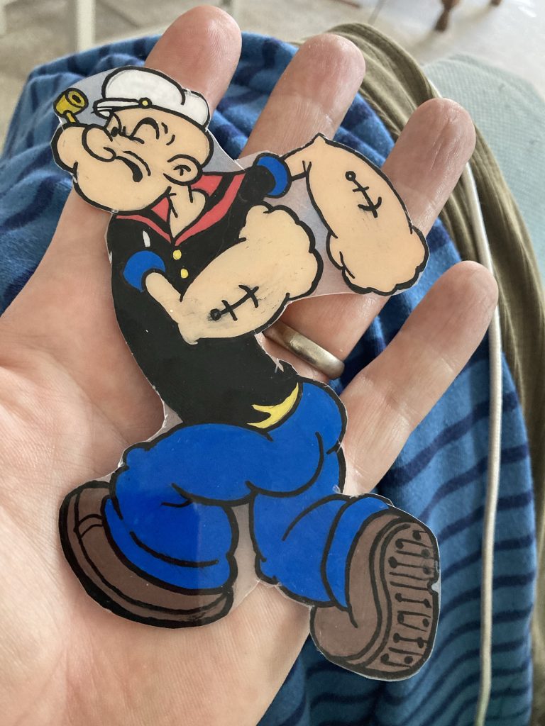
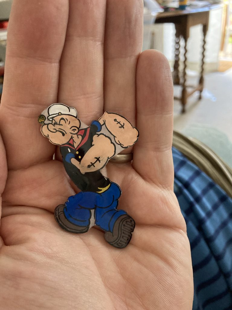
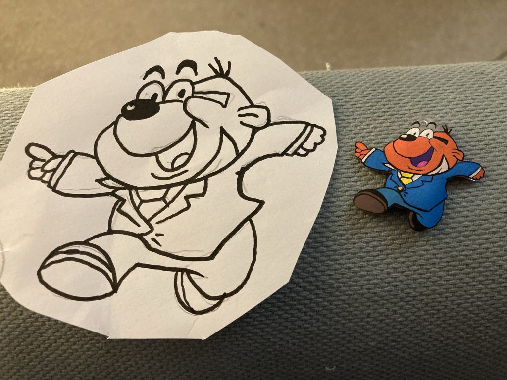
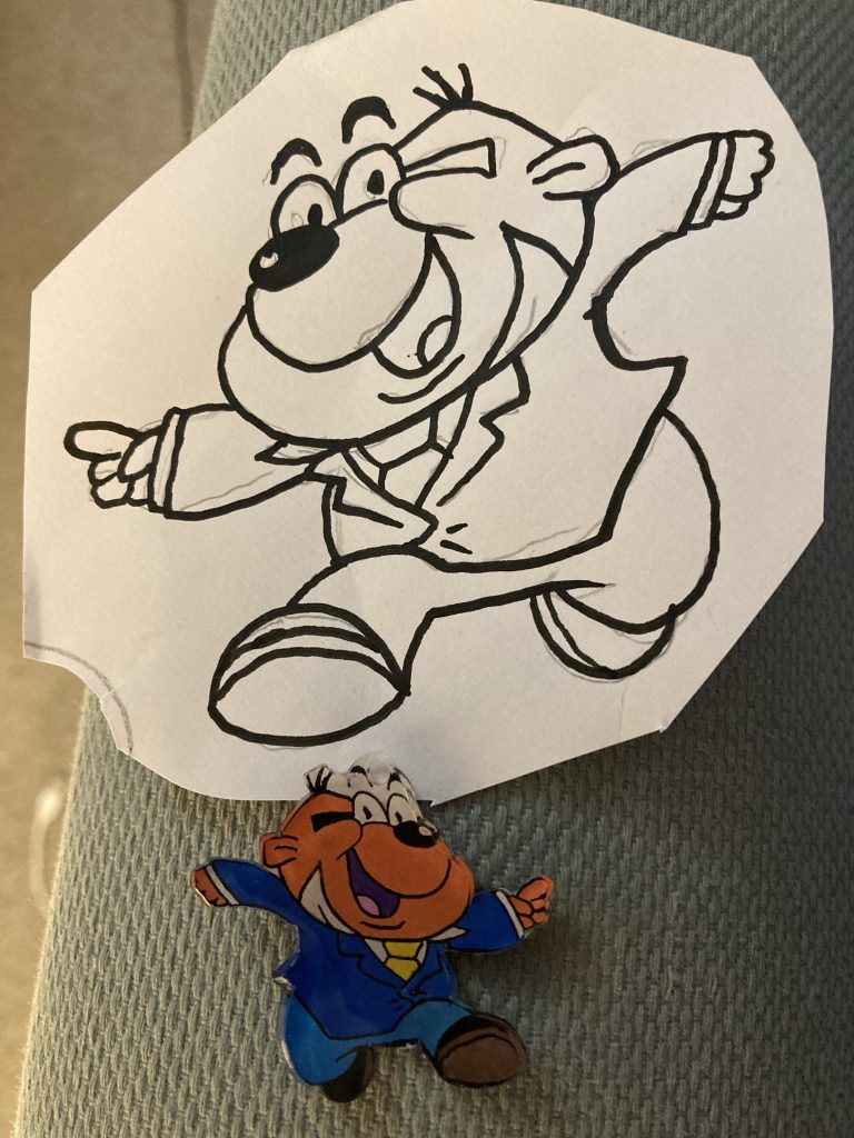
Ali and Sofi showed me this pretty cool ‘keychain’ stuff they have. You make a picture, on this plastic sheet, using acrylic paint pens. This is then cut out and heated in the oven at 150° C for a couple of minutes, which causes it to shrink (and thicken up).
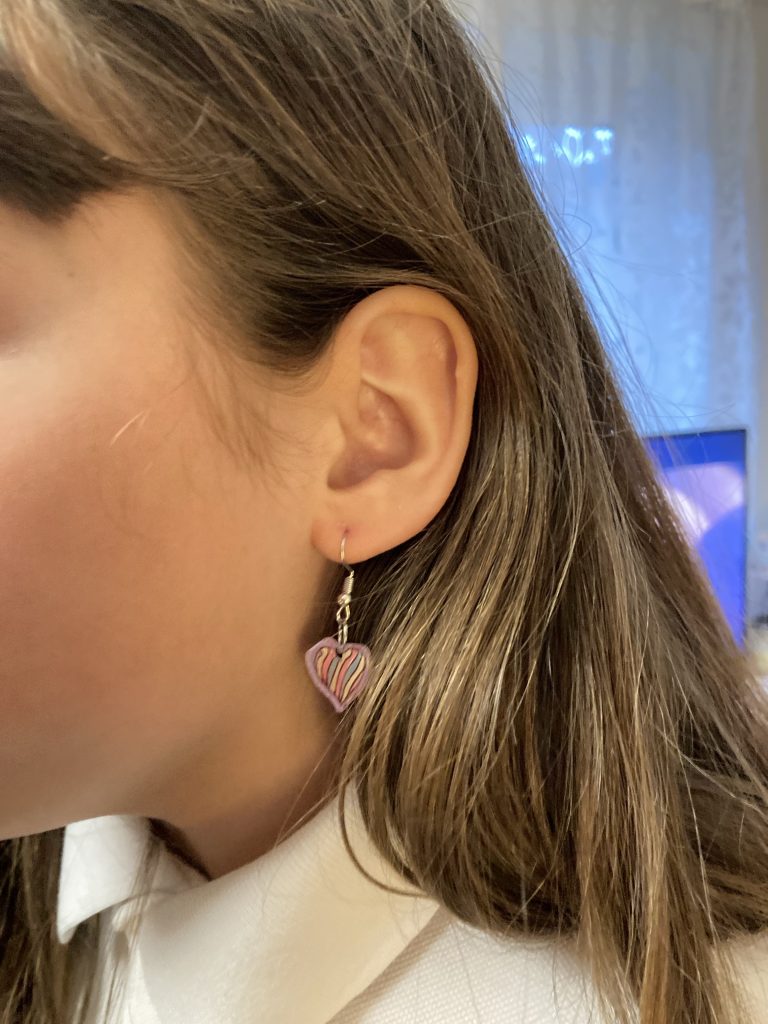
Here’s a little rainbow heart ear-ring Sofi made:
And here’s one I made, Penfold, from Danger Mouse:
The ‘keychain’ started out the same size as the sketch!I need to varnish the acrylic layer.
I’d quite like to make a Popeye!
I yam wodeye yam!
The plastic side of these doodads is probably the display side. But I prefer the ‘back-side’! Can you see why?
The shiny plastic side. A bit distorted.
We also had homemade pizza. Which was lovely! We’re stopping over the night. I’m doing a shift for Amazon Flex tomorrow, out of Cambourne.
I had a shockingly disturbing chat with my dad earlier tonight. I won’t go into detail. Least said, soonest mended, eh!? Anyway, I suppose some aspects of what that was about will be clear from the themes in this post.
I start with an image that sums up a form of modern hyper-masculinity that would no doubt be described by some nowadays as ‘toxic’. And yet it remains a fantasy that is both persistent and ubiquitous. The lone ‘maverick’ male, short on words, long of gun-barrel. He’ll make a shitty world conform to his will!
And, as silly as they might seem in popular entertainment form – think of Al Pacino at the end of Scarface – the real world is very much affected by such ideas. Boris Johnson thinking he’s Churchill. Churchill thinking he’s St George. St George butchering some rare and endangered winged lizard… and so the cycles of violence roll ever on.
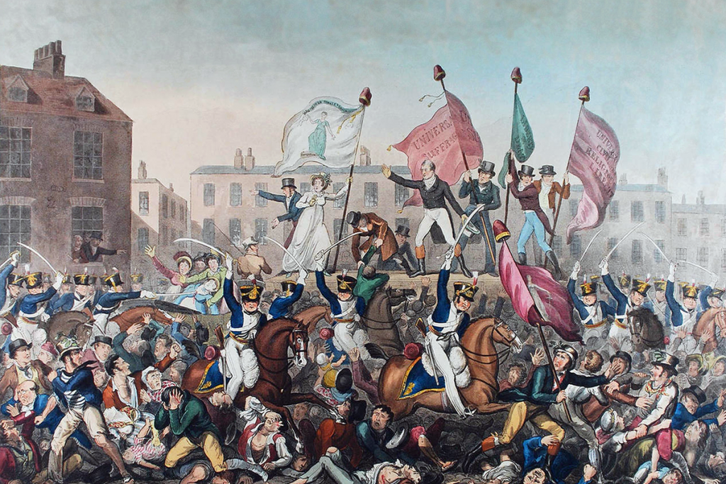
The Peterloo Massacre, 1819.
Anyway, I’m going to try and collate some stuff, here on my blog, around the issue of socio-political change, and the role of violence within that.
I don’t think it can be denied that violence has long been a key ingredient (as, on the other hand, is co-operation) in leading to our species ‘enjoying’ the unique niche it has on Planet Earth.
Generalised conflict or all out war have been more or less constant features of our history: whether against our environment, or against each other. Driving change and innovation – from the stirrup to computers – it could be argued that violence has been hugely beneficial to humanity overall, if not admittedly for those unlucky ones who’ve suffered by it.
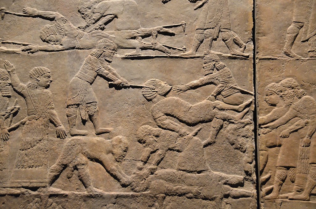
The violence of war and conquest. Nothing new
Ok, it’s stating the bleeding obvious, but violence is, unsurprisingly, pretty much always beneficial to the victor, and pretty much always correspondingly awful for the vanquished.
Once again, it’s pretty clear for all to see that violence builds power structures, and very often helps maintain them. But once those structures have been around long enough, does violence, rather like religion, eventually become counter-productive?
I suppose there can be no blanket coverall answers. But I’d like to try and engage my mind (and body) with such issues. It feels like the UK is drifting towards a form of Capitalo-Fascism similar to that which is very alive and (un)well ‘across’ the pond’.
Kim Phuc Phan Thi and other victims of napalm attack, 1972
And America as she is today, powerhouse of Capitalo-Fascism, is very much a product of violence. Many of the Europeans that colonised the Americas were fleeing religious persecution in their homelands.
And then a virtual genocide was perpetrated by those European escapees, on the hapless indigenous peoples of that huge landmass, ultimately turning it into the nation it is now.
This Colonial bastard child then had to free itself by war and Revolution from its oppressive unloving ‘fatherland’. And all of that’s before they got to the point of Civil War, whether you believe that was fought over States’ rights to self-determination, or the issue of slavery.
America is a nation – just like all nations are, in truth – born and bathed in blood. It’s the human condition.
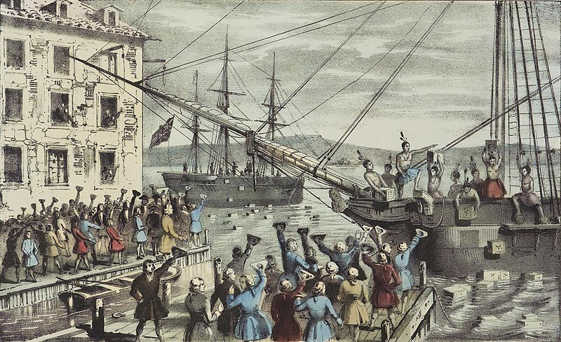
The Boston Tea Party.
Or is it? Many contemporary thinkers believe (or is it just hope?) that there comes a time when violence is, or rather should, no longer be the go to prime mover for human destiny. Such a view is put forward here.
One of the biggest issues in current societies, and again we see it particularly strongly in that fairly young nation, the US, is all about who has the right to ‘own’ violence. America is, to a very great degree, founded on both the idea and the brute reality of an armed self-determining populace.
And yet, when some of the ‘folk’ who feel themselves heirs to such gun-toting ‘founding fathers’ recently stormed The Capitol, it looked very much like a pretty appalling red-neck revolution.
Lynch-mob-rule; an attempted right wing coup.
I have to confess I’ve found myself thinking that those who govern us – or oppress and exploit us – may not understand any language other than violence. And those in power have long been thinking similarly. The future enemy may not be other States or Nations (although they remain a useful threat), but ‘the enemy within’.
If ruling elites are too distanced from the suffering they inflict, or allow to happen, they may well wind up in cloud-cuckoo land; blissfully unaware of the appalling realities that they perpetuate, and whose conditions might even be essential to maintaining their own privileged positions.
That’s taking a very generous view. Probably beyond the point of naivety. Another harsher and perhaps more realistic viewpoint would be that the oppressors know all too well what they are up to.
I suppose it is possible that whilst aware, cognitive dissonances can be overcome through the ‘magical’ effects of religious style thinking. Steven Trivers makes a powerful case for fooling ourselves being far more prevalent than we might want to think, in his excellent book, Deceit.
Steve Bell’s reworking of an old ‘we rule you we fool you’ idea.
Humans have an appallingly strong tendency to believe in their own own infallible righteousness (even whilst being equally riddled with self-doubt and self-loathing!). Up to a point it’s an essential strength, as it allows us to function more readily, by oversimplifying what might otherwise prove to be insoluble riddles.
The downside is it leads to belligerently partisan tendencies, with all the differing factions believing their particular take on things must be right. This is one of the many reasons I’ve always disliked certainty in people. It just seems too glib. And it’s the first step in dominating others: my truth is so obviously the only truth, how dare you disagree!
And if you’re cowed by this, your adversary or oppressor has won a battle without even having to fight.
I guess right there is where it becomes very interesting. If you’re the oppressed party, you’re immediately cast in a bad and troublesome light, because in order to carve out your own space, you will have to challenge the assumptions (and the consequences that flow from those assumptions) that are being presented to you as ‘just so’.
Timothy McVeigh’s Oklahoma bombing.
And of course, returning to a theme alluded to above, but not explored here, it all depends on who perpetrates the violence – state vs individual, left or right wing leanings, racially or religiously motivated, etc. – and what their goals are.
State sanctioned violence to defeat Hitler might conceivably be somewhat different – it’s certainly generally held to be (but is it really?) – from Timothy McVeigh or Ted Kaczynski waging war on a modern society they didn’t like. It’s stuff like this I want to explore in this and other posts here, over time.
But to end on a less gloomily sanguine note, here’s a link to the AEI’s * ‘Liberation Toolkit’. I’ve not read it yet. It might be shite! But I thought it might make a nice counterweight to the foregoing cogitations on violence.
I’m having a pretty difficult time at present. I’ve called The Samaritans quite a number of times. I’ve had periods of doing so before. But in the past I used to hang up in disgust after just a few minutes.
Maybe I’m a different person now? Or maybe I’m just more desperate? Whatever, I’ve certainly found some of my conversations with The Samaritans to be helpful. So I’m grateful the service exists.
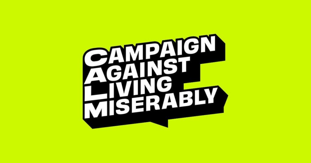
I thought I’d try CALM, as their title ‘Campaign Against Living Miserably’, and their specific remit, re males and suicide, sounds tailor made for me, esp’ right now. But the two times I’ve called, it was shit.
The first time it was a technical issue. The line was so appalling I couldn’t hear the guy the other end. Mind, the little I did hear left me feeling ‘what’s the point?’ That was a few days ago. I just called them again, today, and, although the line was better, the quality of support wasn’t.
So after 5-10 minutes of chat, I said thanks and goodbye, and hung up. Not impressed with CALM! It seems the quality of staff on the end of The Samaritans lines is a lot higher.
I wonder what training, if any, is required? There must be some? And it’s not going to be a job, one would’ve thought, that just anyone could do, straight off the street. But that’s what I felt I was getting with CALM.
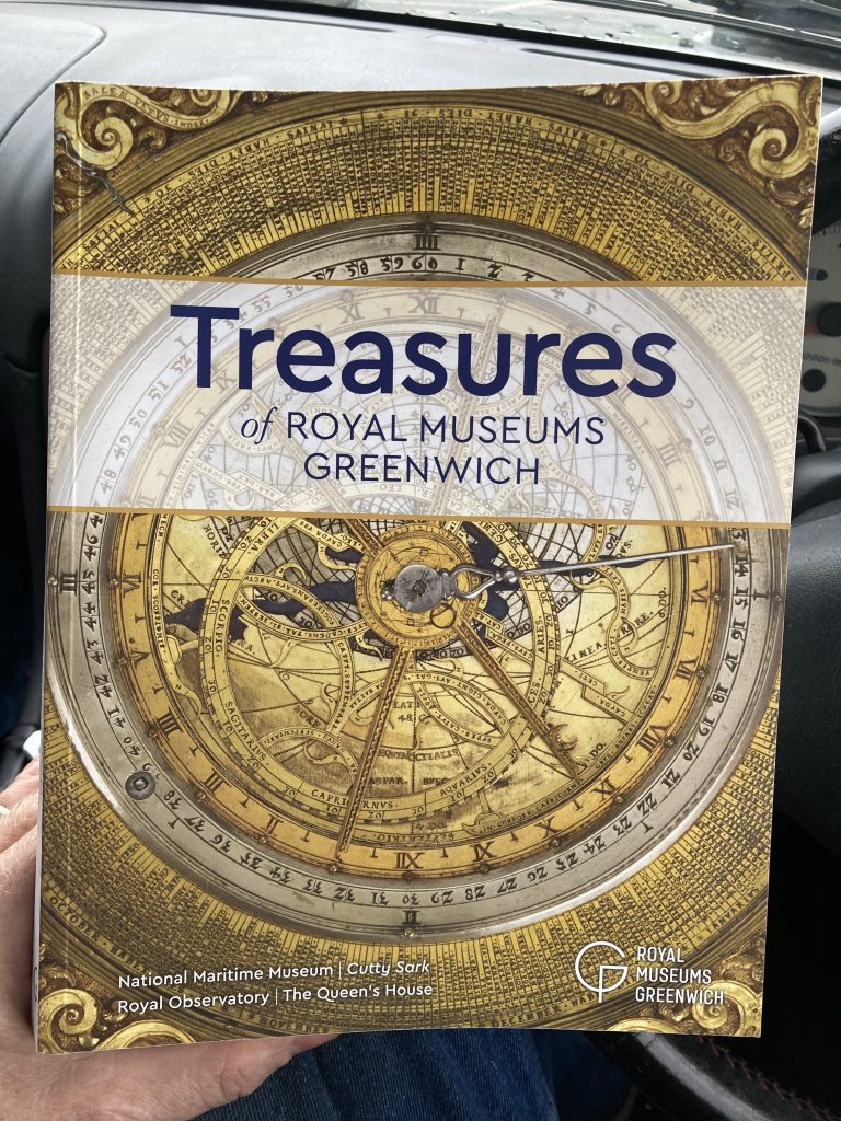
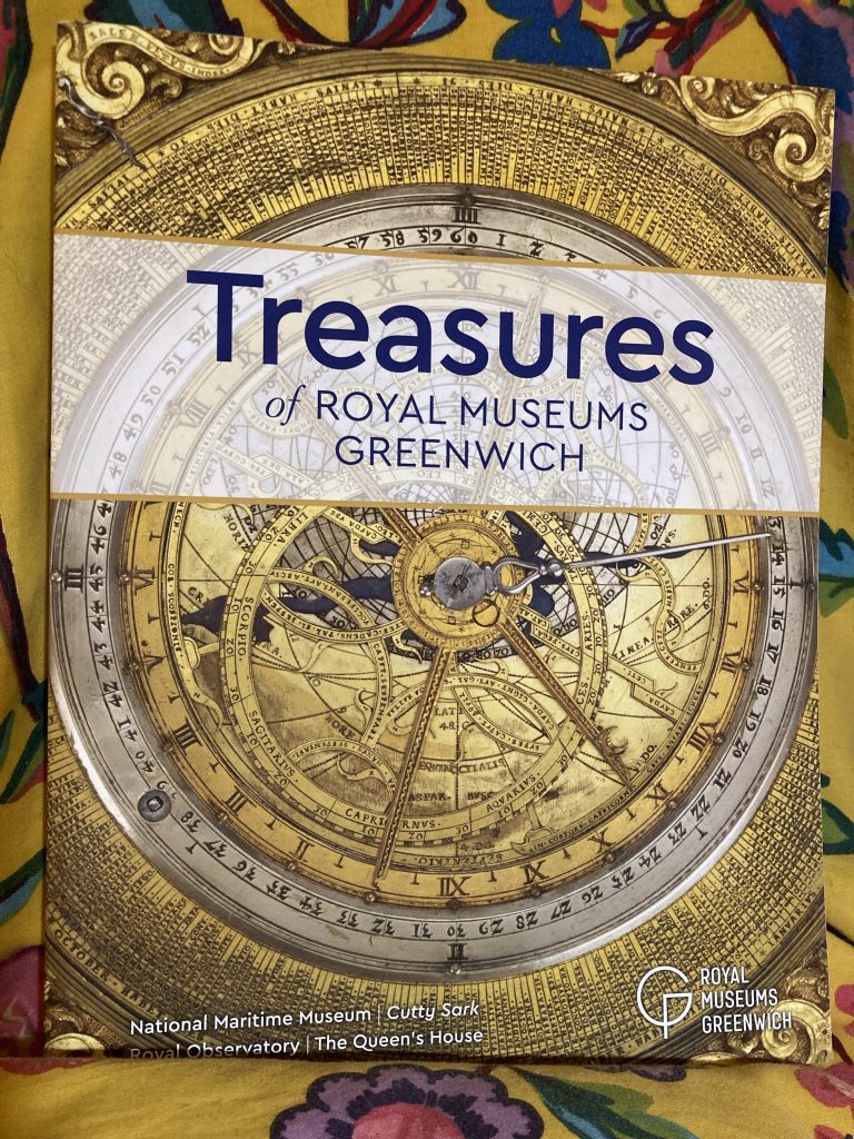
Well, I’m parked outside Tesco, whilst Teresa does our weekly shop. I stayed in the car, as I wanted to finish reading Treasures of Royal Museums Greenwich.
And literally just now, before I started typing this, I did just that. It’s the kind of easy reading smorgasbord one could potentially read in a single day. Although that might feel rather too much like cramming!
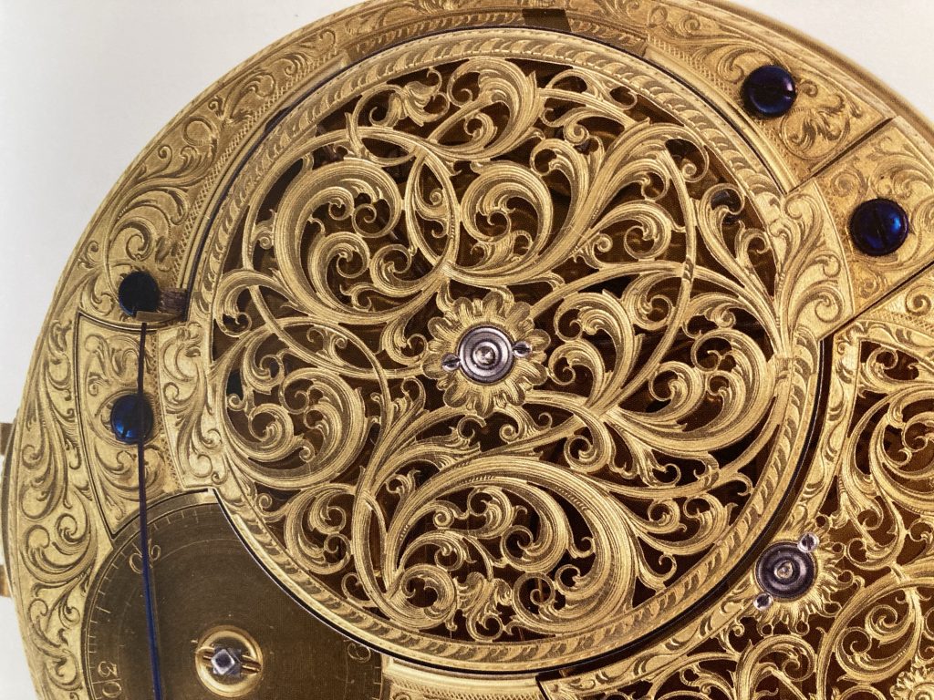
Marine Timekeeper, H4, John Harrison.
As it is I’ve spent a very pleasant three or four days reading tranches of the 100 numbered entries. The book starts with the Caird Astrolabe, and finishes with a new ‘fresco’, adorning The Queen’s House, by contemporary artist Richard Wright.
I reviewed this book once already. And gave it five stars. I’ve upgraded that to the rarely bestowed but coveted six stars. It’s just fantastic. A compendium of mostly exquisitely beautiful – and a few apparently mundane – artefacts, all of which have interesting tales to tell.
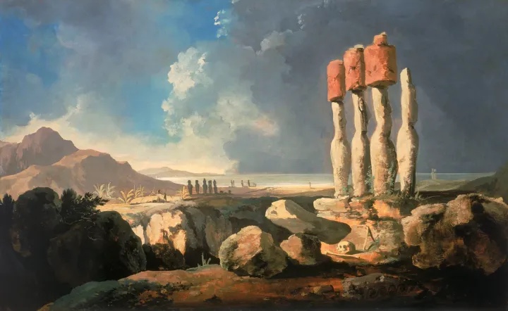
A superb Hodges painting of Easter Island. (1)This one adorned a Melville book I read years ago! (2)
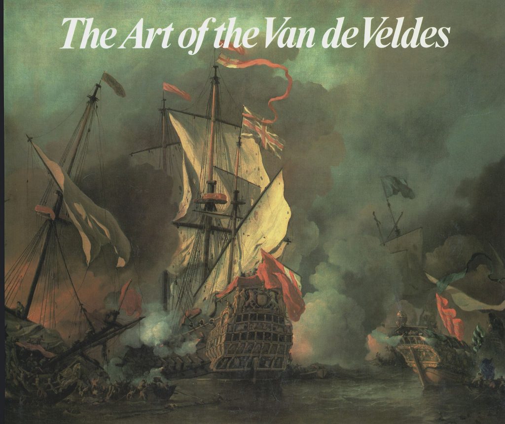
A sure-fire sign of an excellent book is when it promotes further exploration, be that purely literary, or in some other form. I’m now very keen to explore ship models further; to study the works of numerous marine artists more deeply (the Van de Veldes, William Hodges, W L Wyllie, and many more*); and perhaps to expand my modelling/wargaming interests to include the Anglo-Dutch naval conflicts?
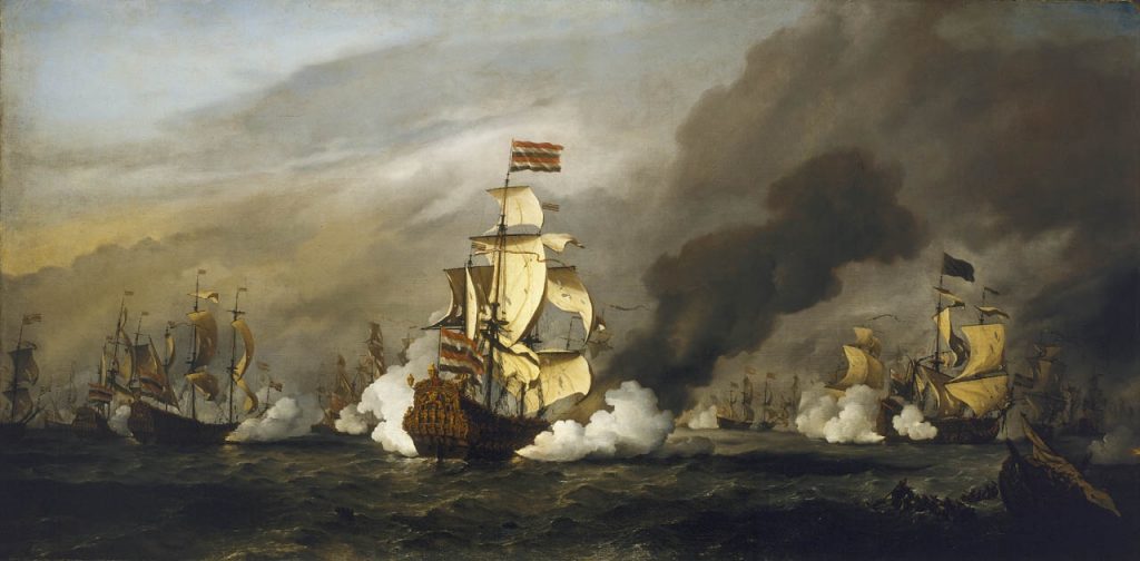
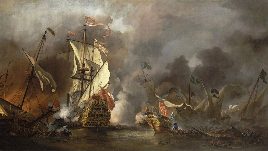
The Golden Leeuw, at Texel, Willem Van de Velde the younger.
The cornucopia of artistic and crafts or engineering brilliance is also very, very humbling and awe-inspiring. Oh, and inspirational, as well. I want to incorporate aspects of things I see here – from intricately worked brass, to art or wall paintings – into our home life.
So I’ve found studying this book – gazing in awe at the objects, and reading with great interest the pithily short accompanying texts – a hugely pleasurable and massively enriching experience.
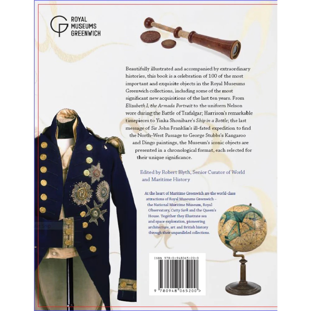
The back cover.
And at the current asking price of £10? It’s a no-brainer! This was a real bargain, and is a wonderful addition to our library.
* Some I already knew, some are new to me.
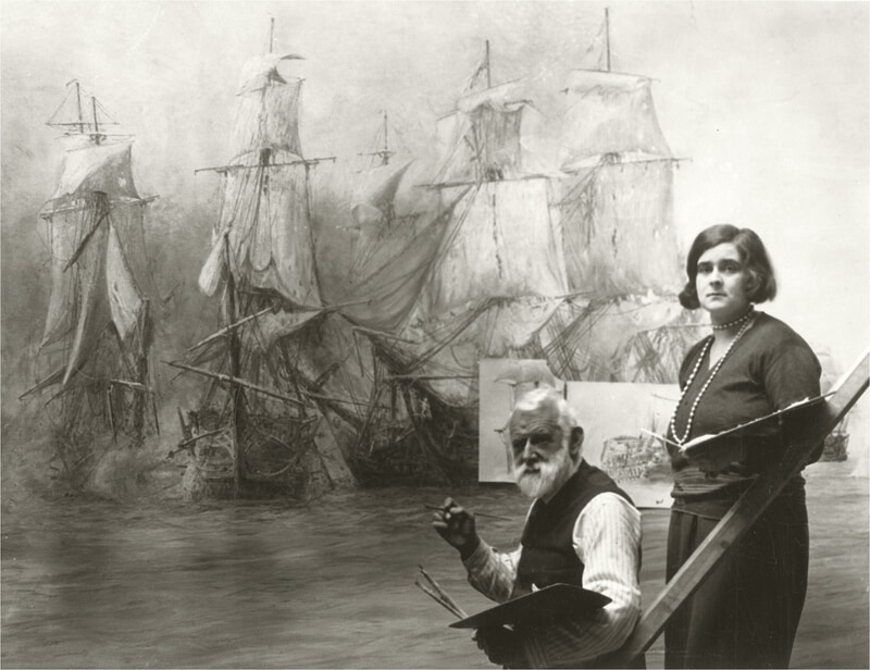
Wyllie at work, with his daughter.
One of the artists I’d not really know about before – I may have encountered him, by name, but I wasn’t truly aware of either him or his work – was W L Wyllie. That’s him, pictured above (this image is not in the book I’m reviewing), working on an enormous panorama of Trafalgar, in Portsmouth. With his daughter as assistant. In the book he’s represented by a fabulous underwater scene, titled Davy Jones’ Locker!
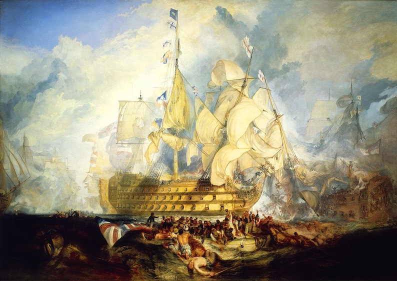
There are also works by lots of familiar names, such Canaletto, Hogarth, Reynolds, Stubbs, Ravilious, and even Heath Robinson! And of course there’s Turner’s humongous Trafalgar. An amazing work. Not my favourite Turner painting – although I do love it – but a must see.
Monumental!
NOTES
(1) (2) Neither of these Hodges paintings appear in the book. Their selection is the fantastically dramatic A View Of Cape Stephens. I include these two because they illustrate how reading this book inspired me to explore Hodges’ work further.
Hell, or Purgatory, is in fact Toryland, in which the seven levels are accessible only via automated call-centres, staffed entirely by AI-bots; one is condemned to remain On Hold for eternity, whilst being told how much you are valued, all the while being tortured by muzak, and shown – in real terms – how you’re actually held in total and utter contempt.
Teresa and I visited the Royal Museums, Greenwich, on Friday, 21st April. That was billed as the secondary attraction, with the main event being Salute’s 50th, on the Saturday. But we actually far preferred the museum visits in the end!
I’m pretty much totally broke right now. To go away at all was pushing the boat out. Buying this book, even though it was only £10 (orig. RRP £20), felt extremely extravagant. But I’m sure glad I did. It was a bargain, frankly.
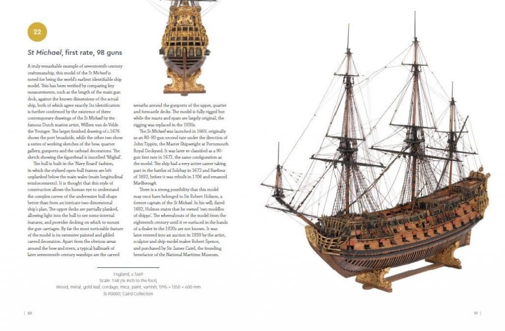
Pp. 50-51, 1:48 model of the first rate, St Michael.
The contents really are, very literally, an embarrassment of riches. I’m currently reading it entry by entry, and I’m only one-tenth of the way in at the time of posting this. The objects are from the RMG’s collections across the National Maritime Museum, Cutty Sark, Royal Observatory and The Queen’s House.
We didn’t visit either the Cutty Sark or the Observatory, on this occasion. The Queen’s House had a temporary exhibition; paintings and drawings by the Van de Veldes. That was a fantastic exhibition in a fabulous setting.
An incredible example of the naval art of the Van de Veldes.*
* Couldn’t find the title, or even which Van de Velde this is!? Prob’ the Younger…
The bulk of what’s in this book is to be seen at the National Maritime Museum, and, as the introductory stuff makes clear, a lot of that – such as the astronomical table clock pictured on the cover – comes from the famous (and enormous) Caird collection.
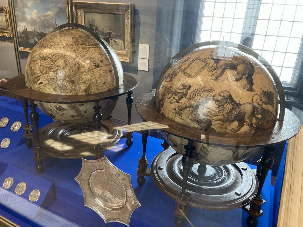
I had originally wanted to focus any such visit on ship models. And there are lots of unbelievable ship models in the collections. But the truth is that almost everything in these collections is really interesting. And the range, from instruments to baubles, paintings to ship models, books to weapons, clothing to globes… well, it’s astonishingly rich.
Mercator’s terrestrial and celestial globes.
Some of the most ostensibly mundane things, a pair of breeches and stockings, for example, are revealed to be those worn by Nelson at Trafalgar. His blood still visible in them. Whilst Horatio’s iconic status almost inevitably turns such run of the mill ephemera into totemic relics, the depth of historical interest such things can convey is gradually extending to the ordinary ‘Jack tar’, and even the ladies he loved and left behind.
I think we have Neil McGregor, The British Museum and BBC Radio 4 to thank for the whole slew of The History of [whatever] in 100 Objects type books and shows that have followed in the wake of that epochal exhibition and series of radio and podcasts.
Whilst this book doesn’t title itself in that vein, there are in fact 100 ‘objects’, and it acknowledges that antecedent. And it keeps up that very richly informative and inspiring tradition, with its good old-fashioned Reithian aspirations to educate and inspire. Terrific!
The Golden Leeuw at Texel, 1673, W. Van de Velde the Younger.
I could rave about this entry by entry. And I find it very salutory that things I might’ve initially cocked a snook at, for example the Royalist propaganda of Elizabeth I, The Armada Portrait, can be rendered fascinating by their broader context. My anti-Royalist desire to gloss over what I regard as a very ugly bit of nationalist chest-thumping is made more interesting when I read about how the ‘calm’ and ‘storm’ naval scenes can be regarded as ‘key moments in the development of European Maritime painting… particularly the focus on and eventual dominance of battle painting from 1600 onwards.’
I’m so keen on the latter genre (perusing the terrific Turner & The Sea helped galvanise an already incipient interest!), I’ll be looking for a cheap copy of the same museum’s book on the Van de Veldes:
Just gave up on a truly Hellish call to Citizen’s Advice. I waited in the ‘virtual queue’ for over 10 minutes, listening to appallingly inane muzak. The volume on my phone was turned way down, because the torture-muzak was so loud it was distorting. Despite this, the volume would occasionally swell. Is this some new and deliberate kind of cruel and (not so) unusual black-ops Guantanamo Bay shit?
Seriously, this system is designed to induce despair and stop users even contemplating using the alleged ‘resource’. And we encounter this every day, in so many areas of our lives. Anywhere they can put AI (which in this case stands for Artificial Idiocy) between you and help, corporate bodies will do so. One day I hope the human cost will be recognised, and such systems will be outlawed.
Nowadays we’re building towards a situation where we have terms for just about everything one can think of. That can be both good and bad. It’s good inasmuch as it gives us a handle on stuff, but it can be bad if inaccurately or lazily applied.
I was recently pondering on the phrase ‘addictive personality’, and how, despite it being a term or phrase that medical science largely rejects, nevertheless, practically speaking, it can be used to understand one’s own behaviour.
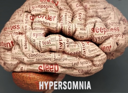
Perhaps in a similar vein, I am now thinking about hypersomnia? On and off throughout my life I’ve definitely struggled with the more common or garden insomnia. I still do at times. But just recently – since a bout of taking zopiclone sleeping pills, funnily enough – I’ve seemingly transitioned from insomnia to some form of hypersomnia.
Am I medically hypersomniac? I don’t know!?
Personally I think my own current personal brand of hypersomnia – excessive sleep as well as excessive tiredness – is (unless there’s an underlying medical cause I’m unaware of?) almost completely down to depression.
My most recent bout of depression was kicked off by being summarily fired from a music peri’ teaching position I’d been in for four years, by a new music head not yet in his job even four months.
Maybe I was heading depression-ward already? I must admit I can’t really unpack it all at present. As my mind is not in the fittest state it’s ever been in.
Other stuff – most of which I’m keeping resolutely private for the time being – has deepened the depression. So much so I’ve had a few crises. Some of these have been akin to episodes in my past. One or two are unprecedented. And scarily so.
I think mind and body are reacting to these stresses by a desire to shut down. Mind especially so, with body following, in the form of total and perpetual exhaustion. I’m also experiencing neck and headaches that are both very frequent and pretty intense.
One way out?
All of this combines to make me want nothing more than oblivion. This has manifested in, most upsettingly, what nowadays is sometimes called suicidal ideation. And in more mundane terms, the desire to stay in the warm cosy cocoon that is bed, and not venture out to face the world and all it’s depressing drudgery.
Anyway, speaking of which… it’s 2.05 pm. And I’m still a-bed. Shocking, eh? But increasingly normal for me. I guess I’d better haul my sorry carcass out of the sack, and attend to some depressing drudgery… here goes nuttin’…
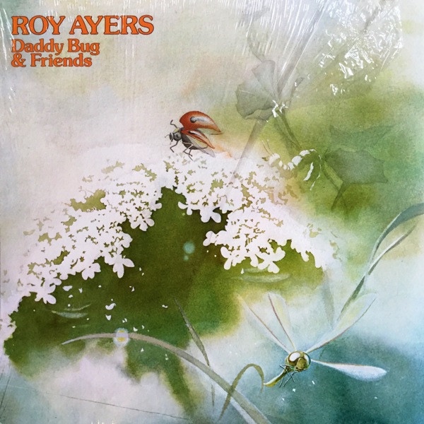
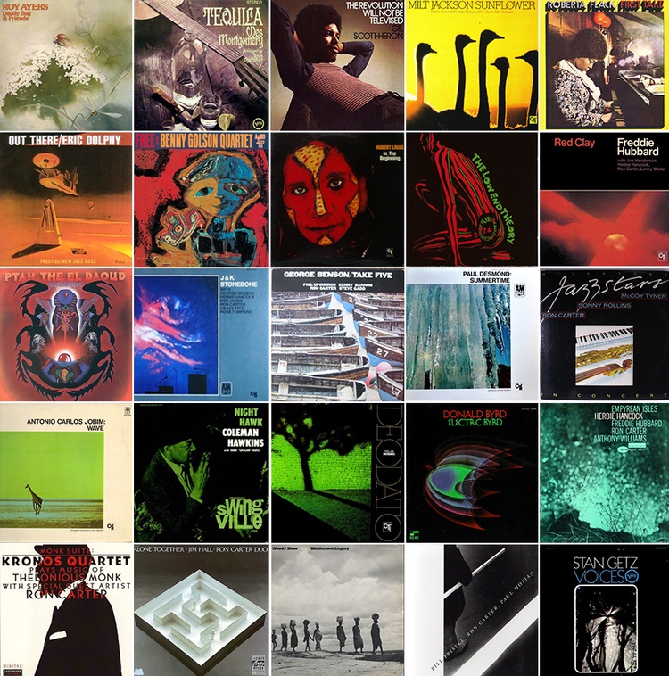
In a recent post about being friends with the illustrious (and elegant!) Ron Carter, via Facebook, I discovered a Roy Ayers album he appears on that I’d not seen before. Daddy Bug & Friends (1976), pictured above.
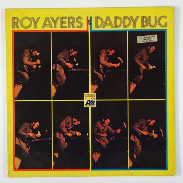
I initially confused it with this, plain ol’ Daddy Bug (1969):
I only learned of it via an album cover photo montage on another website (see below). It piqued my interest. It appears to be an odd rag-tag selection of numbers, drawn from several diverse sessions, and released on Atlantic, with some of the music edited, and a couple of tracks (Slow Motion and Bonita?) that were hitherto unreleased.
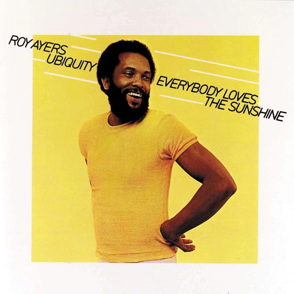
Released in 1976, it bears all the hallmarks of a speedy cash-in, by a former label, designed to capitalise on Ayers growing mid-‘70s popularity. 1976 was, after all, the year Ayers’ Ubiquity group released their breakthrough and now evergreen classic, Everybody Loves The Sunshine.
I found a nice piece on the latter here. And as that article points out, this was the track/album that catapulted Ayers to what was then referred to as ‘crossover’ fame. Something very few jazz artists achieve. Herbie Hancock, George Benson and The Crusaders are some of the rare big name exceptions.
When I first saw the Daddy Bug And Friends image, in the montage of album covers pictured below, it had an immediate allure. That has been rather tempered by finding out it’s an unofficial cash-in. Also, at the smaller scale in which I first encountered it, I even felt I preferred the artwork to the genuine and ‘original’ Daddy Bug album.
Top left … I was intrigued!*
Now, seeing it more clearly, visually and within the Ayers canon, I’m rather less sold on it. I had thought it was a photo, a bit like the weird Katy Lied cover, by Steely Dan. But it turns out it’s a rather dated looking piece of airbrush style artwork. Never mind! It’s all interesting to a fan of Ayers’ work like me.
* I have over half – at least fourteen – of the 25 albums pictured. Carter’s discography is mind blowing!