
As a kid I had a few T-shirts – only a very few, mind – that proclaimed something.
One such was a Blackfoot one. They were a US ‘Native American’ rock group, most famous (I think?) for a track called Morning Dew (‘Mourning Jew!?’ says my inner Woody Allen!).
A bit weird, that one. Acquired primarily for the colourful design, at a time when being a rocker/hippy, of sorts, was my intent! I did like the group, or at least the few songs of theirs I’d heard. But in truth, a Thin Lizzy T-shirt, something I now have, but didn’t back then, would’ve been a better representation of my tastes and listening preferences!
I then went through a very long and, retrospectively, rather bleak ‘no logo/label’ phase. A combo of anti-advertising sentiment and a semi (pseudo?) political stance.
Nowadays I’ve relaxed back into a childish glee in using my chest as a communications platform. And I’ve slowly but surely been amassing a collection of T-shirts whose sole porpoise – aside from temperature regulation and public decency – is to let the world know a little about me, without I have to open my yap.
There are still a number of things the puritanical politico-moralist in me eschews; I don’t like brand labels, nor am I fan of slogans. Maybe it’s a legacy of the artist-illustrator-designer part of me? But I prefer T-shirts that are primarily visual. Sometimes, as in the Moog or Lizzy tees, this design is textual. But mostly I prefer pictures or ‘designs’.
Some of these purchases have been happier than others. I’m quite disappointed with how my Mr Natural Robert Crumb T-shirt is fading with each wash. And a couple of Herbie Hancock designs I got (from China, most likely?) are kind of great, design/image wise, but are made from hideous synthetic material (the sort often used for football shirts). I definitely prefer good ol’ plain cotton!
Pics: Herbie tees…
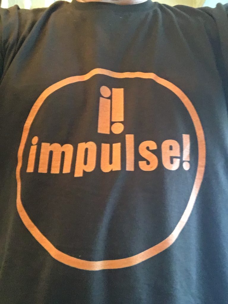
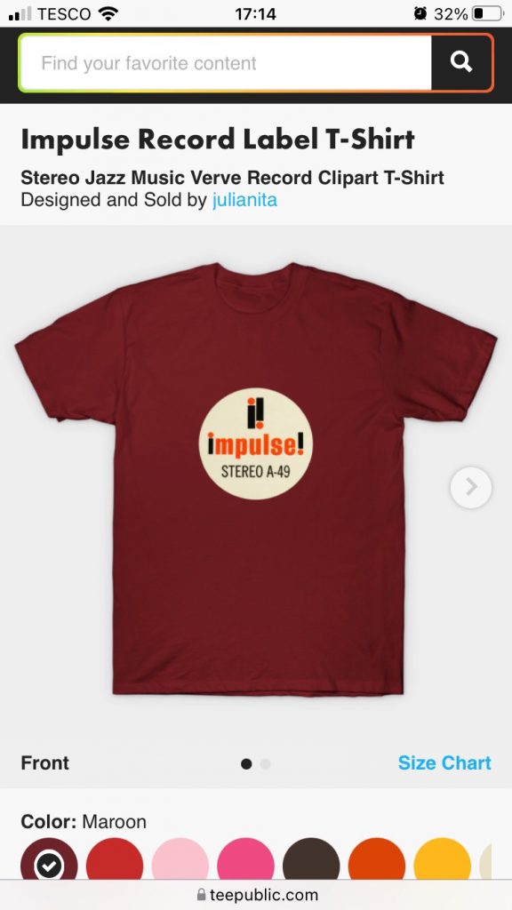
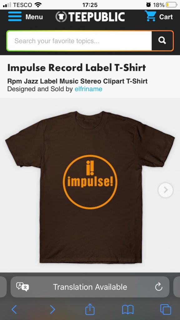
My most recent acquisition – whilst pictured at the top of this post, it hadn’t actually arrived when I started drafting it – is an Impulse record label logo job. I really wanted the maroon variant, with cream disc, etc, the above of the two pictured below. But that wasn’t available. So I went instead for the brown and orange variant below that. Still nice!
This whole trend towards forlornly broadcasting one’s interests, perhaps esp’ so since I turned 50 (Jan’ this year… gulps!), might seem a bit pathetic. But I reckon I’m past caring!
Here’s a mini gallery of some of the designs I have. What does this little collection say about me, I wonder? I’d like to think it’s just a bit of harmless fun. But Teresa seems to be more of the ‘what are you wasting money on those for?’