
DAYS OUT: Ely, Early

Teresa begged me to take her to work today (well, the begging was done last night). Today is one of those rare Fridays where she’s actually doing some teaching work. At Ely College, on this occasion.
She needed/wanted to be there for 8.15. We would up getting her there at 7.45! Despite being directed to the wrong place. And even with an additional stop for a Breakfast McMuffin, which we shared.
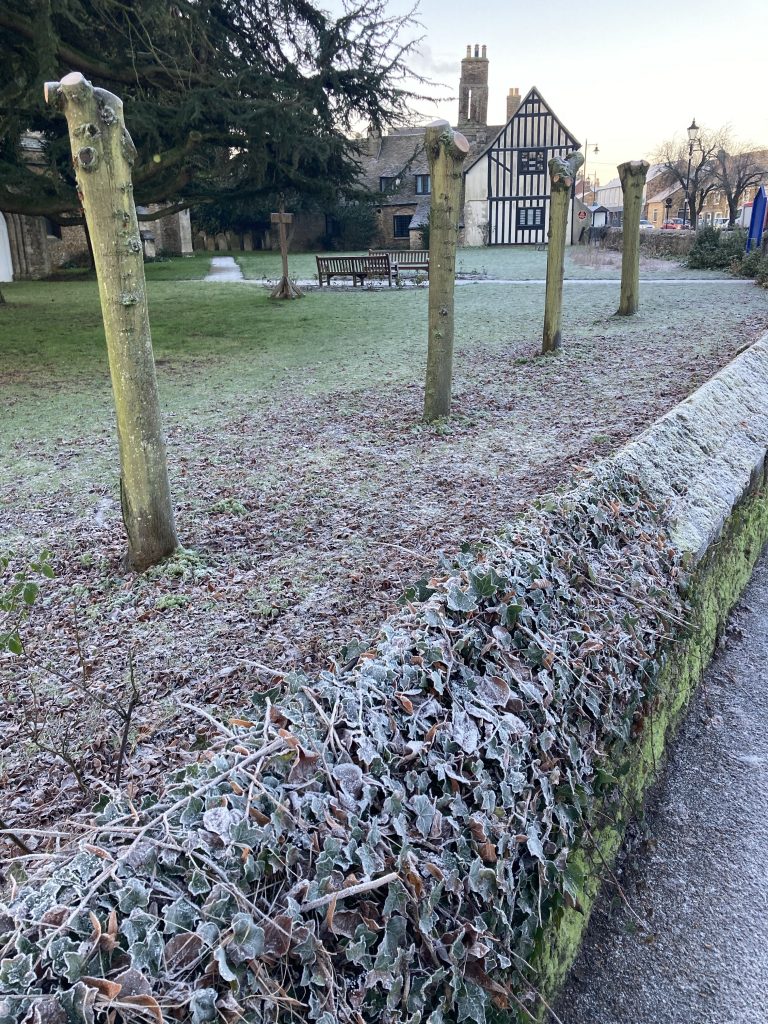
Shooting the above drew my attention to the wall itself, which looks amazing, with all the ancient frozen growth on it. Chilled to an almost grey-green monotone.
In the two close-ups below, the organic stuff almost looks like those electron-microscope images one sees in science books.


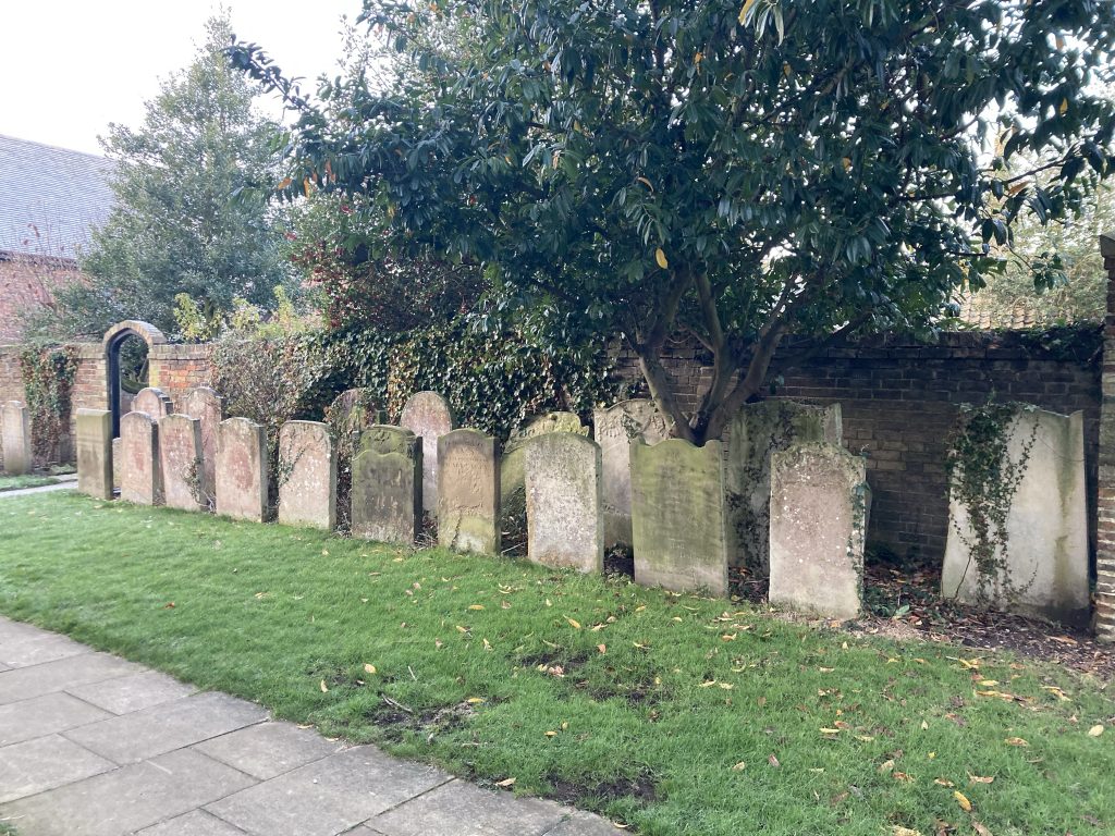
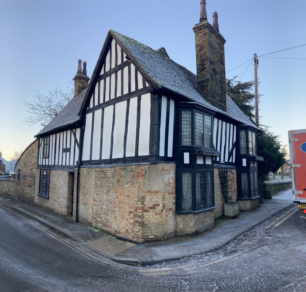
Sadly the church was locked. Another one for the revisiting list. Definitely want to capture the stuff that most interests me on the insides of all these locked up churches.
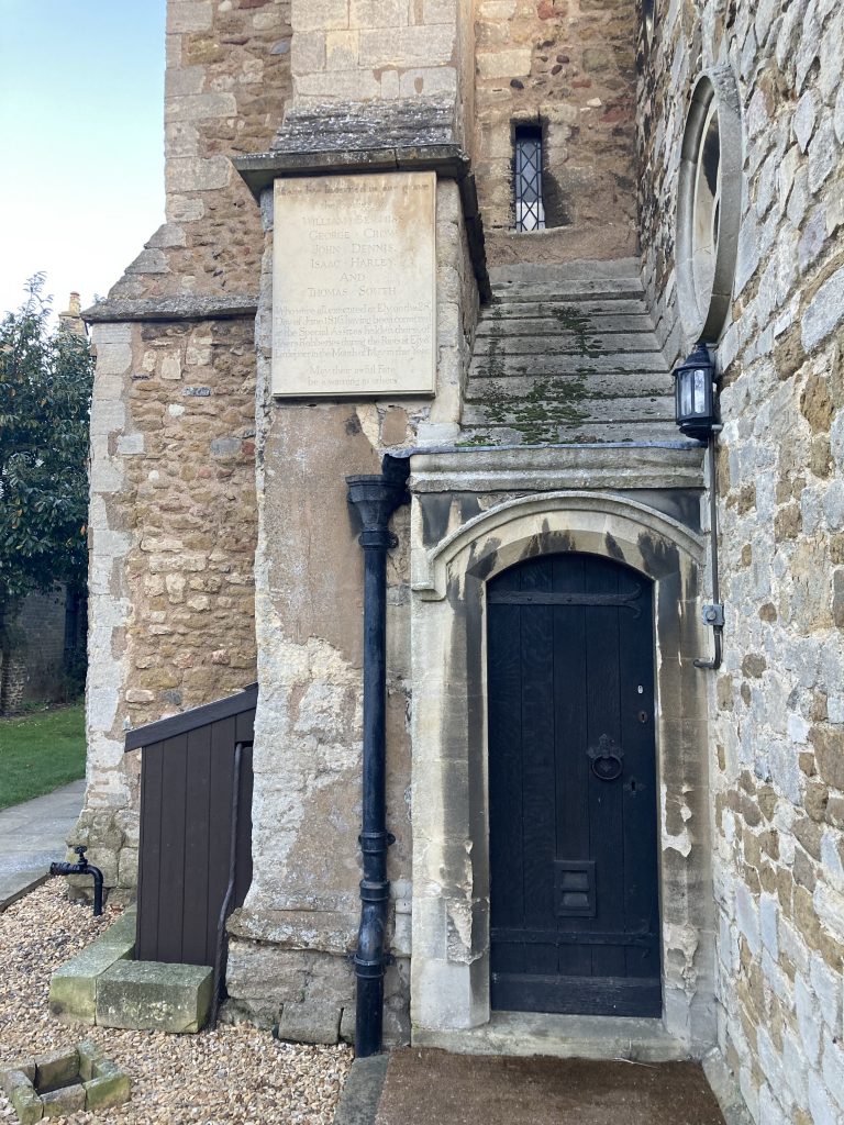
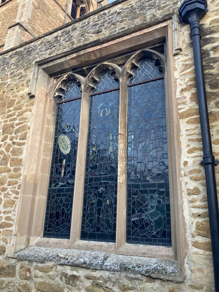
The view above is fun for falling into that category of architectural jumble, that you often seen in places on old buildings. In this instance there’s a bit of added interest:
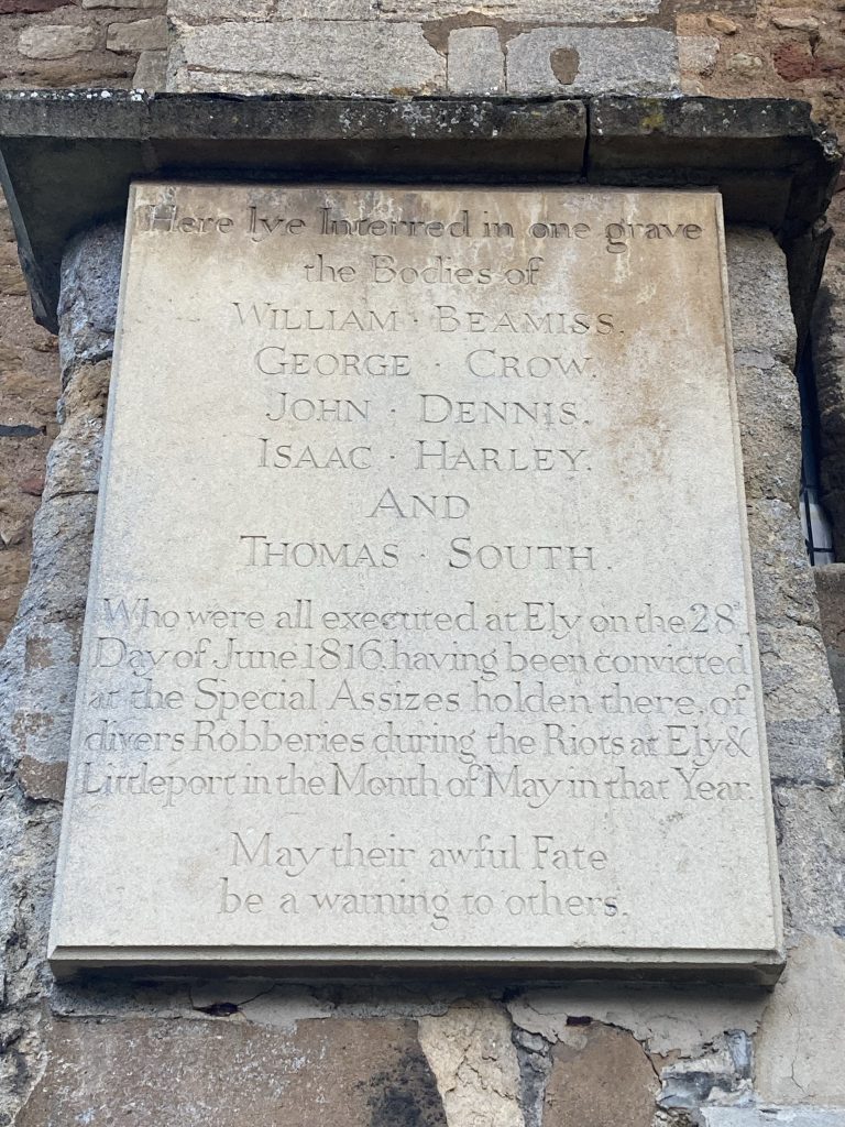
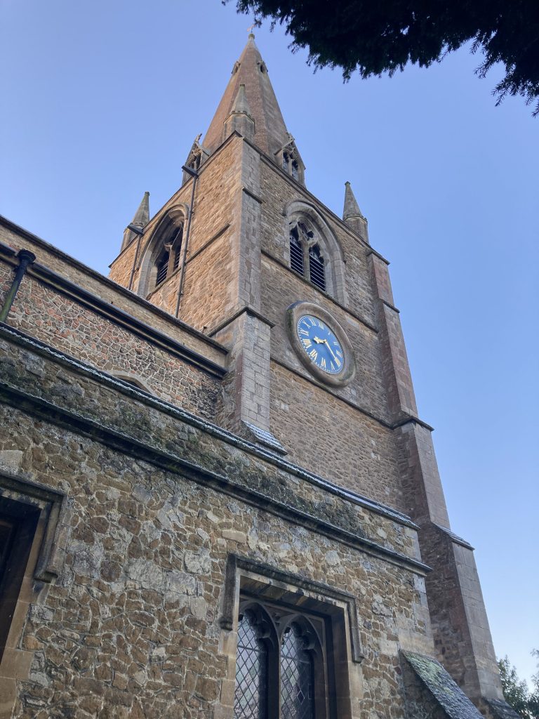
The Ely Riots, which occurred in 1816, the year after British and Allied victory over Boney, at Waterloo, are a reminder of the uglier costs of war, even if you’re supposedly on the winning team.
The Wikipedia entry on The The Ely & Littleport Riots sums it up succinctly:
The riots were caused by high unemployment and rising grain costs, similar to the general unrest which spread throughout England following the Napoleonic Wars.
A fascinating little footnote to the above story is that the Chief Justice of the Isle of Ely was one Edward Christian, who was brother of the famous/infamous Fletcher Christian, of ‘Mutiny on the Bounty’ fame!
Fletcher mutinied in 1789, and yet his brother was appointed Chief Justice in 1800, by James Yorke, who was Bishop of Ely from 1781-1808. It appears Fletcher’s mutinous adventures didn’t ruin the prospects of the entire family!
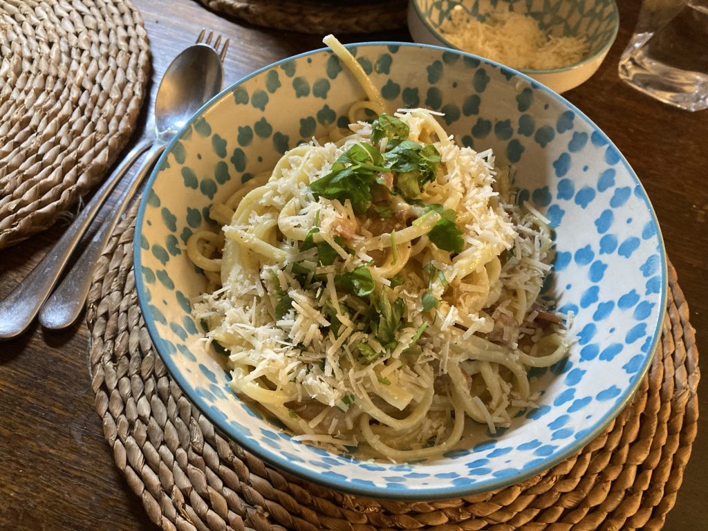
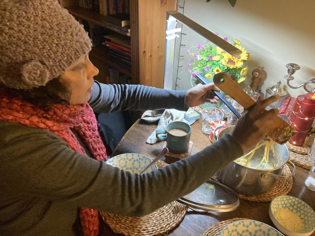
FOOD: Spaghetti Carboniferous…
I had a really good day today. My decision to lie in till midday seems to have been a good one. I’ve not been sneezing constantly. And even the concrete nose effect has lessened. That said, I’m still sniffy and a bit bung-dup!
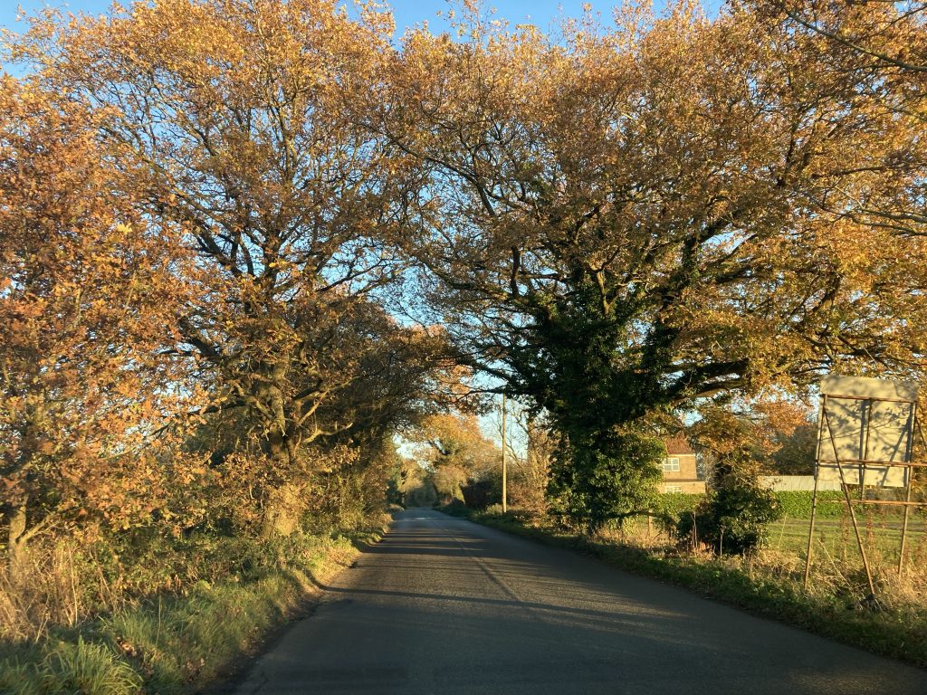
My delivery route took me around the pancake flat Fens today. And it was a cold, crisp, sunny beauty of a day. The autumn colours in the bright ‘Fall’ light… just… wow!
I’ll post on that topic separately. This is about tonight’s dinner. Getting home plenty early enough, and with a lot of the dull quotidian chores that had been piling up done, I resolved to cook us dinner.
I’ve been suffering, mostly mentally, but also physically, quite badly of late. And it’s a bad habit to let that make one turn inwards and neglect life, one’s loved ones, etc. So, to pick up some of the slack that’s been falling Teresa’s way, I’m starting to do more domestically.
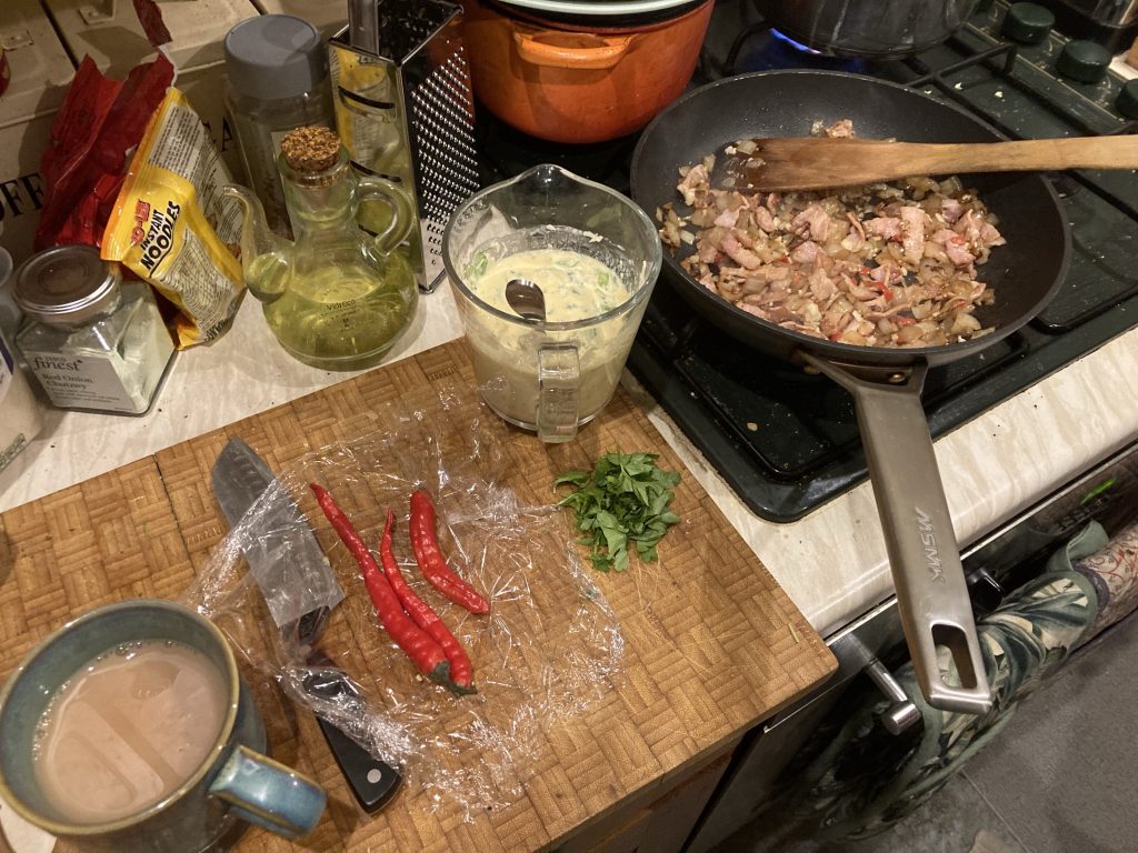
Above I’m nearly there already: I browned the onions much more than I usually do, but just as I always mean to. I got the chillies and parsley free at a church, during todays deliveries.


Though I say do myself, this might’ve been one of my better Spag’ Carburettors. Damn tasty!

Teresa was evidently both very hungry; wolfing hers down ‘toot-sweet’. And, the ultimate compliment, immediately going back for more.
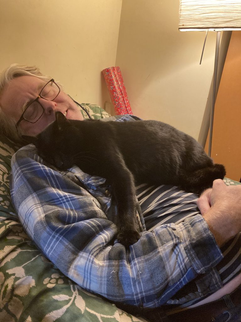
And after dinner, sitting in one of our armchairs, who should bless mr with his fabulous furry company, but dear young Chester. Ah, what bliss it was to have him camp out in my chest for 20-30 wonderful minutes. Purring away like a little generator.I’m frequently rather glum of late. And this was some of the best therapy I’ve experienced in ages.
After that, Teresa and I played there hand of rummy, Teresa beating me 2-1, and then we had our baths. And now I’m abed. And it’s only 7:50 pm! But we like our early nights. Especially in the cold dark winter months.
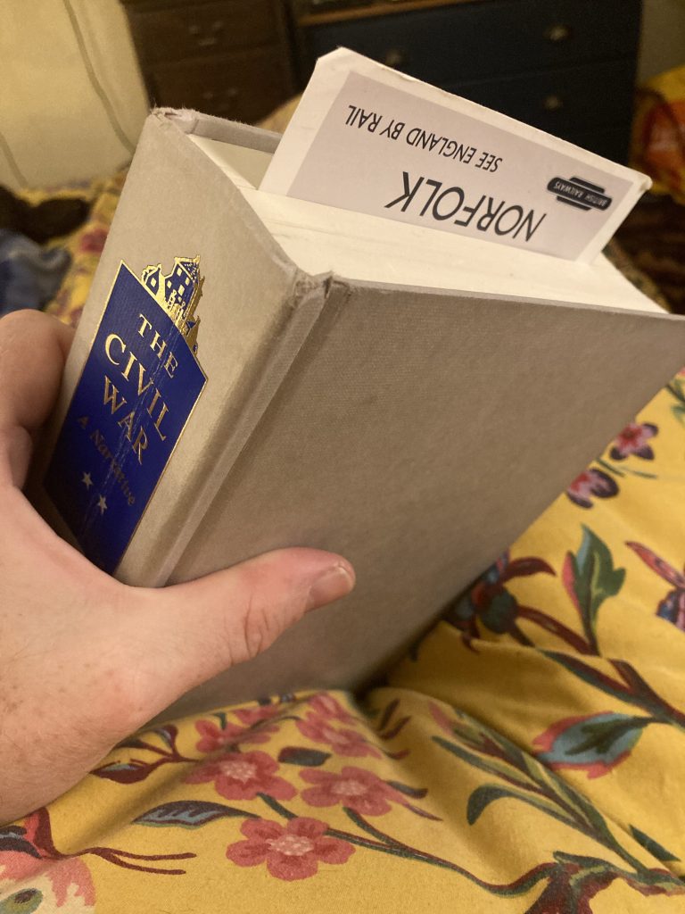
I’m now on page 670 of Shelby Foote’s titanic and magnificent The Civil War, in a chapter called Riot and Resurgence. What a great read it is. A perfect way to wind down for an hour or so before hitting snoozeville.
HEALTH & WELLBEiNG: Concrete Nose

Yesterday I chose to rise from the warmth of a cosy bed into the freezing cold of our unheated home (we’ve forgotten how to programme the boiler! I must remedy that ASAP, now it’s dipping below 0° outdoors!), and invigorate myself with a 10 minute Joe Wicks work-out.
And that was after a bad night of insomnia.
Last night I took Zopiclone, instead of Valerian. And it worked a treat. I slept solidly through till when Teresa gets up, around 5.30. And I’ve dozed on and off till 8am, since then.
But since eight I’ve been blogging, and sneezing continuously. This latter has been coming and going, along with ‘concrete nose’, since the weekend. I seem to have picked up a nasty head cold.
So I’m going to remain abed this morning, methinks. And try and get more restorative or recuperative sleep/rest. Plus it means I can defer re-learning how our central heating, boiler and thermostat system works.
I wish the latter were simpler; I’ve ‘taught’ myself how to operate it on several occasions. But it would appear it’s just not the kind of info my brain seems capable of retaining.
Regarding the ‘concrete nose’, I may be forced to flush my sinuses with my ‘netti pot’. Actually the thing I have isn’t strictly an Indian style netti pot, which look like mini watering cans, but a western adaptation, more prosaically known as a nasal irrigation tool.
Will it help at all, I wonder?
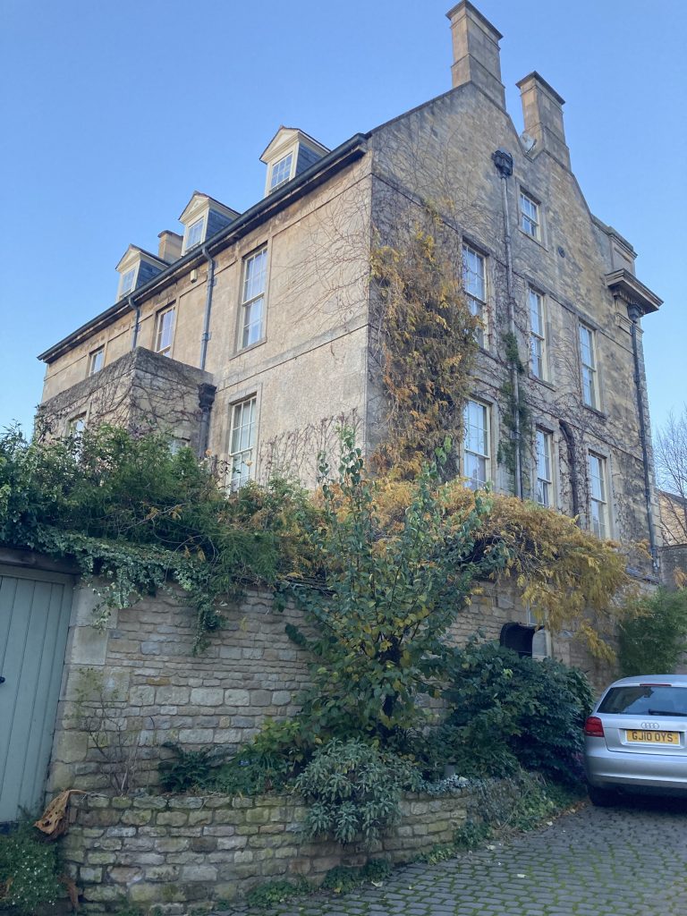
DAYS OUT: Stamford
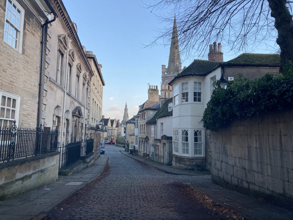
All my Amazon deliveries today were in a very concentrated spot in Stamford. Which made for a nicer than usual (at least of late; too many deliveries in Peterborough!) delivery route, albeit it was, literally, freezing.
Seeing how the other half live, on occasion, is a mixed bag. It’s nice to enjoy the splendour of these beautiful buildings, even if only very momentarily. But it also rubs one’s schnozzer in the fact that this isn’t where one resides oneself.
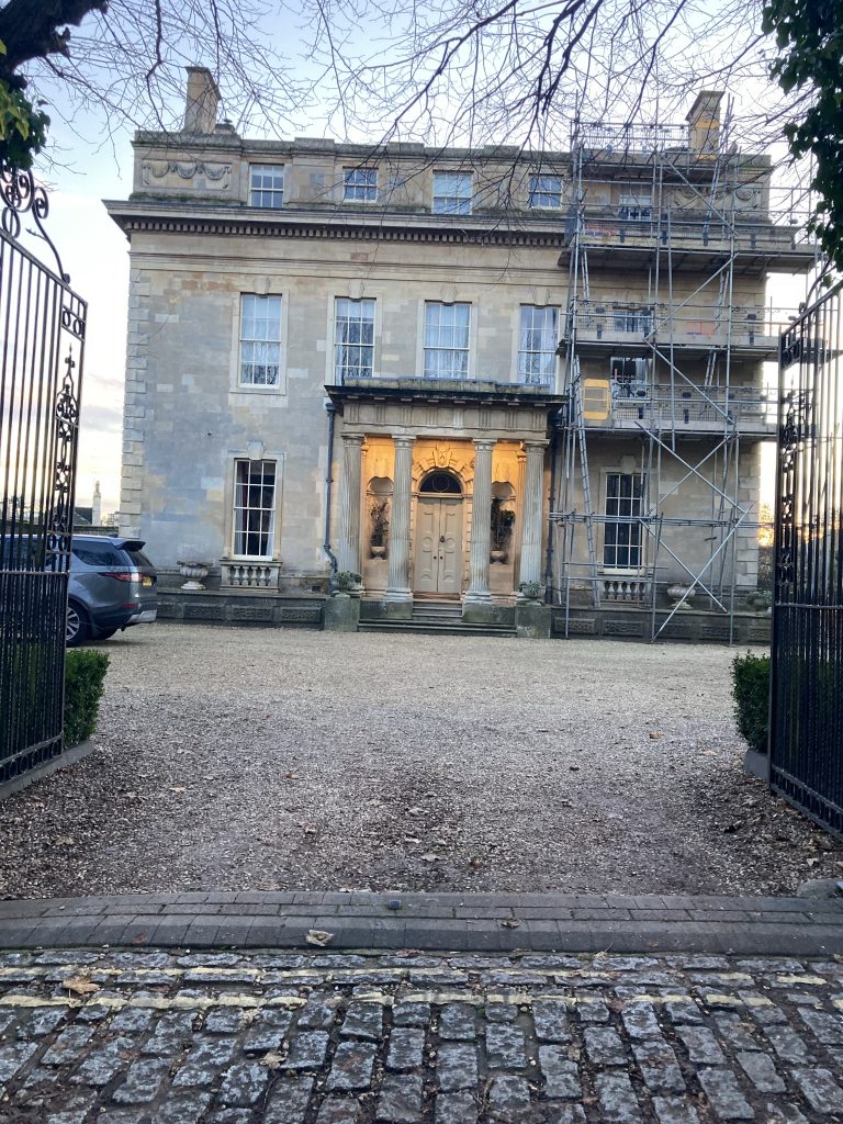
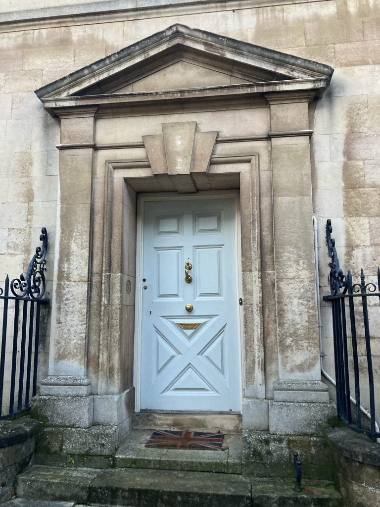
This picture, above, is the rear of the palatial gaff pictured above it, mit portico, etc. Shot from down the bottom of the rather sweet little Barn Hill Mews cul-de-sac, where I had a package to drop.
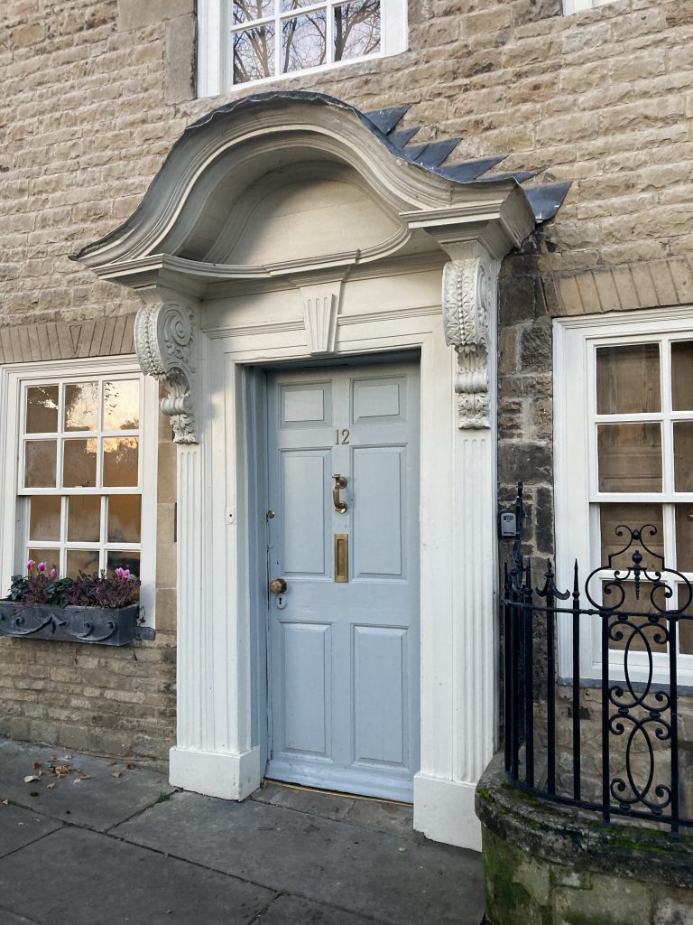
Some prime portals on Barn Hill. Look at these, above and below. Huge doors, massive knockers (snurf!). And check the tiny weird shaped letterbox on the one below. Almost no post will actually be small enough to pass through that little aperture.
I took a few shots in town, as the evening light was lovely. And there’s so much photogenic architecture, all begging to be papp’ed.
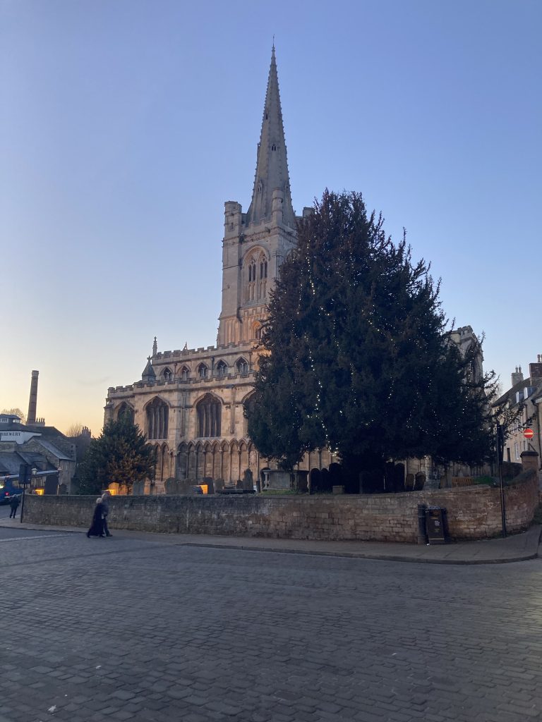
Above, All Saints, shot from Red Lion Square. Just one of Stamfords’ several grand churches. Why, pray, so much impressive ecclesiastical architecture? In looking for an answer I found this:
At this time the town was of great importance having been granted a charter by King Henry III in 1256. It then possessed six monasteries and priories, six religious colleges and no fewer than 14 churches. This unusually high density of religious establishments was renowned throughout Europe.
Read more here.
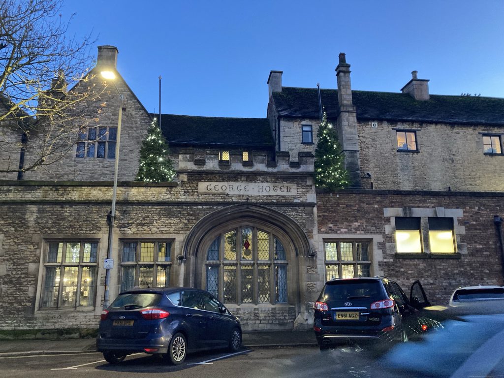
Being in an abstemious phase, I only parked near The George. I dursn’t go inside. As I’m orff the sauce for good. Instead I walked over the bridge – see pics below – to the St Mary’s Bookshop, for to see their Ernst Haeckel Taschen book (a handsome 40th Anniversary edition). Only to decide I could’nae afford it.
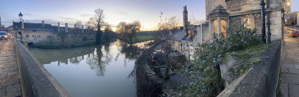
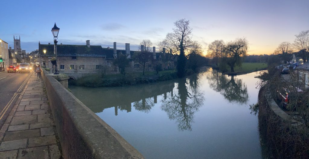
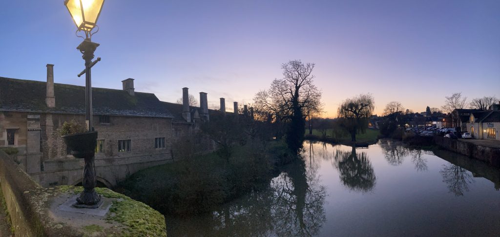
The views from the bridge were lovely at this time (I forget exactly when; poss around 5pm?). With the evening light, and a clear (and freezing) sky.
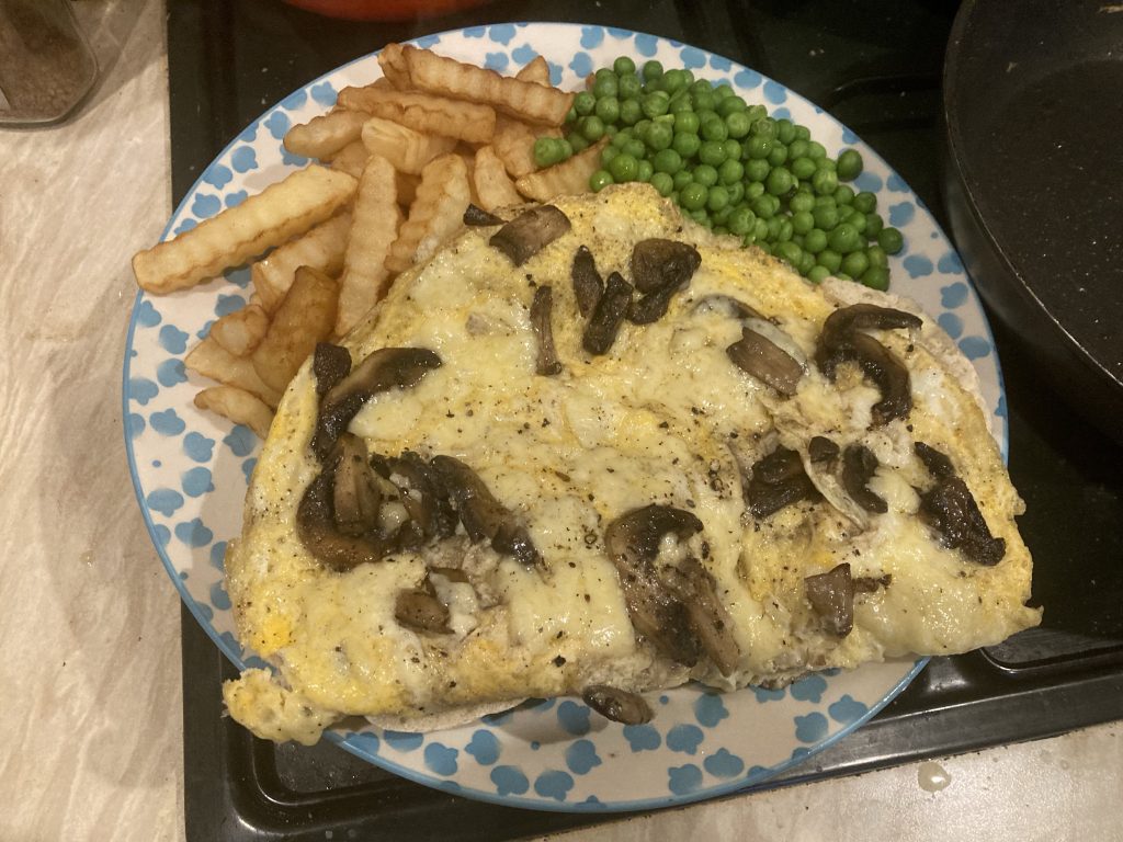
FOOD: Proletarian Fare
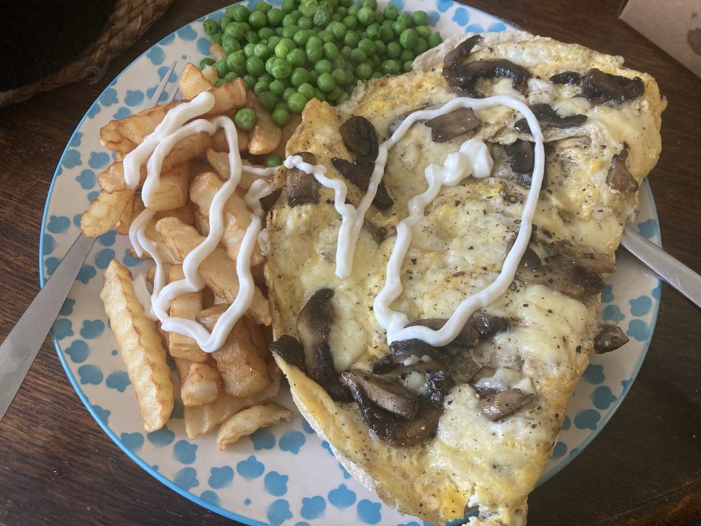
I really wanted to eat lunch out today.
But lack o’ fundage means that’s an extravagance I cannae afford. So I went to Sainsburys, and spent more than I would’ve in the local café (to be pronounced, Caff!).
Sounds daft on first gloss. But of course I’ll get at least two such meals out of that, in terms of certain ingredients – eggs, chips – and much more cheese n’ peas wise.
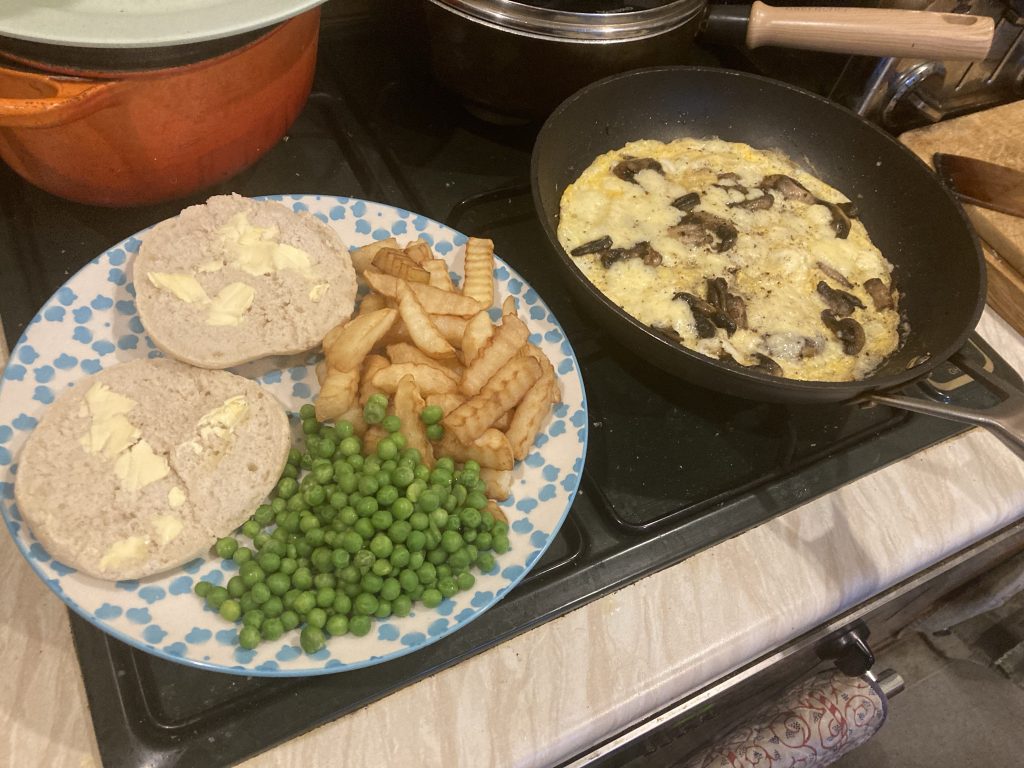
The mushrooms we had already. Oh, and I got some porridge n’ all. Ah, me, the rock n’ roll lifestyle, eh?
The chips were McCain microwaveable ones. Never tried them before. They were ok. The peas were alright, but not the best I’ve had, by a very long margin.
I bought a nice white roll. Much better than ordinary bread. And then slathered the whole (to be pronounced wole, a la Fred Dibnah) lot wi’ salt, pepper, n’ mayo.
As I prepared this modest yet tasty repast, I thought to myself, ‘maybe I should do a recipe book?’ And call it something like Cooking For Proles, or maybe Serfs Up?
MUSiC: LeRoy Hutson, London

Gaaahh!
Poverty and ill health – mental as well as physical, alas – conspire to prevent me making this gig. Which sho’ nuff snuck up on me! It’s tonight, at The Barbican, in the Big Bad Ol’ Smoke.
Tickets are over £40. And I’m scraping bottom (eugh!) fiscally at present. And have been for ages. So it’s a no go. What a bummer.
The Man is 78, as well (five years older than my ailing Pa!). So who knows if or when he’ll be back? I really should’ve planned my life better. For a billion reasons. Missing this is just another one.
But, hey-ho. You gotta roll with the punches. And I just need to be mellow – as Lee Hutson (as he likes to be known these days Stateside) himself exhorts us to be – and accept my current reality.
Mayhap I’ll have a listen to him, this evening, in honour of his visit to our benighted shores?
Love ya, LeRoy… wish I could join you tonight! Have a great gig…
MUSiC: Knower, Real Nice Moment
Until the release of this video I’ve always far preferred Louis Cole’s solo stuff to anything by Knower. The one exception to that being (?), which is real corker.
Partly that’s been because, at least in my limited experience, both Cole’s mellower and funkier moments have been on his solo side. This, however, ticks both those boxes wonderfully.
Mellow, with a super-funky groove, and Cole’s signature haunting harmonies, and a beautiful cast of lovely musical brethren and sistren, old and new.
This is the kind of thing that helps an ageing duffer like me maintain a faith that there are parts of humanity not being crushed into zombie serfdom by ‘the machine’.
DAYS OUT: Sheldrake’s Topping Talk, Ely
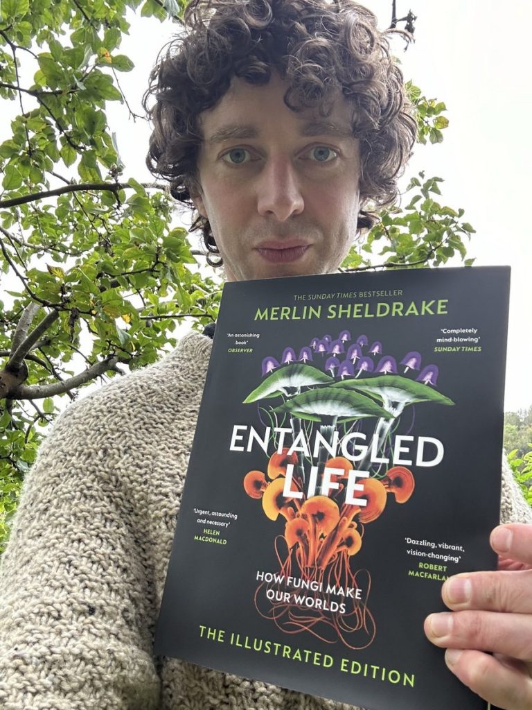
* Image from Sheldrake’s Twitter account.
Well, we went to see Merlin talk about his book, Entangled Life, and it was good. We met Cath Coombs there, but not – at least not until after – her ‘plus one’, Janey, who arrived late.
Cath jokingly (I’m assuming?) said I might be bored, having just read the book. And either because of the ‘orrible ‘ead cold I’ve got – I was sneezing like a mofo all day, but (both amazingly and mercifully!), during the talk – that very nearly was the case.
The talk itself was structured as an interview, with questions from a Topping staff member, to which Merlin responded. This was then continued afterwards, with questions from the audience.
It was, like the book itself, fascinating. Although there was very little that was new or fresh, to me, in the talk, that I hadn’t already encountered in the book. Nevertheless, it was still fascinating. Sheldrake is a charming speaker, and his enthusiasm for his subject is contagious.
Tim Oliver was also there, with son Sam. I said a brief hello to them, both afore and after. Teresa wanted us to go straight home, so we didn’t really get to meet/know Janey, Cath’s friend. I’d have liked to have hung out with Cath, etc, at least briefly.
Hey-ho! Maybe it was my cold/sneezing, and thus being generally tired. Maybe it was Teresa’s slightly anti-social tendencies? All in all I left feeling a bit glum. But maybe that’s just me, at this difficult time in my life?
The picture above accompanies an article that I haven’t read (beyond a quick glance), as yet, which looks intriguing; I might well read it in full, at a later date.
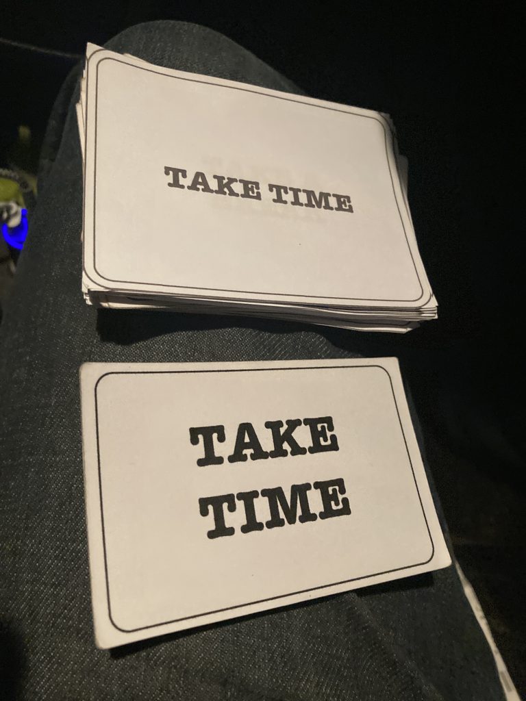
HEALTH & WELLBEiNG: Positive Affirmation Cue-Cards
I headed out to work too early by mistake today. So I’ve wound up eating a salad-bar take out salad, from the Stanground Morrisons, in Peterborough, sat in my car.
I’m feeling an awful amount of anxiety at present. For numerous reasons: drank too much last night; didn’t sleep properly; omnipresent financial struggles, etc.
I have a few tools and strategies, and whatnot, for such times. for starters I might call Samaritans, and get a load off my chest by telling the hapless sod on the other end o’ the line all my troubles.
I try and make sure that there’s positivity in the mix, as if I just vent and focus on the bad stuff, it only makes things worse. Today I had a mediocre chat with a lady Samaritan, followed by a longer and better one with a Scots guy on another helpline.
But I’m posting this now because I’m parked up in Peterborough in the cold, the dark, and the rain, all of which seem ‘orrible apt to my baseline mood.
But I’m determined not to let my dad chemistry… er, wow, there’s a Freudian slip… bad chemistry, that should’ve been, overwhelm me! I’ve decided that today, after many, many, many false starts, re trying to control my drinking, I simply have to face the ugly truth, and concede that I’ve lost control.
To re-assert it, I must simply stop drinking any booze whatsoever. Possibly for the rest of my life. But certainly till I’m happier, healthier, and back in control (or at least more control). That pledge, to myself and to Teresa, begins today.
I’m really posting, however, as a note to myself, re these positive affirmation cue-cards I made, and keep in my wallet. I recently printed a new set, as I’d given half of my old set to dad, after one of his booze-fuelled meltdowns.
He and I have discussed getting a set each properly printed, for arse-elves…
On my call to the lady Samaritan, I told her about how I use these – I was looking at them at the time – and the first one I read off to her was ‘Take Time’. Then I read a bunch more.
She suggested, why didn’t I just focus on one card, and really meditate on it. Which is a suggestion I like. And, lo’, on taking the cards out of my wallet ‘Take Time’ is not just the top card, but the top two!
I have duplicates within each set, plus I have a set and a half, due to the reprinting and giving dad some of them. So most are duplicated at least twice, and some of the same cues are yet more plentiful.
So here I am, early for my work shift. Sat in the car, taking time. Hoping that doing so might allay my anxieties! And you know what, I think it’s working. Only mildly perhaps. But that’s still something.
Another thing I do, to finish on a footnote, so to speak, is the Joe Wicks seniors workout I’ve occasionally referred to before. And again, that can help lift my spirits a little. These tools, ‘umble as they may be, are important!